Andrew Greenstein of the fantastic jersey database website NHL Uniforms put out a great post about many teams getting rid of their alternate jerseys, namely the Edmonton Oilers, Buffalo Sabres, and Florida Panthers-- as well as the lack of possible announcement of any new alternate jerseys coming to the forefront.
More over, the fact that many of the alternate jerseys have gotten so popular or bought more often-- they have been moved from alternate to the regular home jersery. In fact, the Los Angeles Kings, Dallas Stars, New York Islanders Philadelphia Flyers, Sabres, and Oilers have recently had their alternates move to their full-time home jerseys. Many thought the Nashville Predators were supposed to make their old alternate jerseys into the full-time look before they went with a full-gold presence. Also, the Anaheim Ducks seem to be rolling out their alternate more and more; that could get a road counterpart in the next few years.
However, the history of the third jersey is pretty interesting to say the least. The first instance of an alternate jersey was the 1955-56 season when the Boston Bruins used their white, black, and gold motif. They used that for two years, but would stop it in the 1957-58 season, only to bring it back for the 1959-60 season and have it last until the 1964-65 season. They were the only team in that era to use three jerseys in their wardrobe.
The next recorded instance of an alternate is when the Toronto Maple Leafs introduce new home and road jerseys, but kept their old home jerseys as an alternate in the 1970-71 season. It was merely a transition from old to new, as they would go away the next season. It was another 11 seasons before there was another alternate jersey, when the 1981-82 Pittsburgh Penguins worked in a gold jersey to their repertoire, which would last for two seasons, before the gold jersey became the home jersey in the 1983-84 season, lasting just one season, however.
Discounting the entire 75th Anniversary celebration by the NHL where the Original Six had alternate/retro jerseys for the 1991-92 season; the biggest boom and the start of the wide-spread third jersey craze was in the 1995-96 season with five teams kicking off the program (Mighty Ducks, Bruins, Canucks, Penguins, and Kings) and from that point on-- there was quite the boom for teams, as they saw how much of a great money maker it was....except the Blues.
Here's the breakdown of teams with an alternate jersey since that season, not including Winter/Heritage Classic jerseys-- unless they use it past their Winter/Heritage Classic year:
1995-96: 5
1996-97: 6
1997-98: 11
1998-99: 13
1999-2000: 10
2000-01: 11
2001-02: 15
2002-03: 16
2003-04: 21
2005-06: 21
2006-07: 18
2007-08: 0-- New Reebok Edge design
2008-09: 18
2009-10: 23
2010-11: 24
2011-12: 22
Most Seasons With Alternate Jersey: 23, Boston Bruins.
Teams With Never Having An Alternate Jerseys: Detroit Red Wings, New Jersey Devils
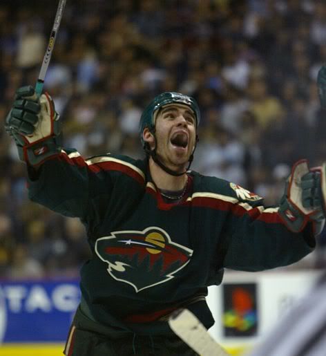
While Greenstein has a point that it's interesting some alternates may be getting less and less prominent and some could be taken out of full rotation while others are being put into it-- the debate on whether or not they are going away is going to be there. They still are something people will clamor to have, and while some will be put into full rotation-- it just gives the team another reason to make another jersey in order to make even more money through merchandising. Plus, as well have seen in the past-- even the bad alternate jerseys are looked back at fondly, as we've seen with the Wild Wing and Burger King jerseys.
Even if they're going away, the fact more people than not will buy the new jerseys regardless of their look is going to be something teams remember and exploit (to a point) when trying to market them to not only their own fan-base, but the jersey collectors alike.
Showing posts with label Third Jerseys. Show all posts
Tuesday, June 26, 2012
Friday, March 23, 2012
My Rage Against "College Numbers" in the NHL
While many people are doing previews of the NCAA Hockey Tournament, I don't know enough about it to actually fake through it. Other places actually have people paying attention to it and god love 'em because they're good at what they do. However, the tournament allows me to talk about my hatred for the "college number" motif that has made it's way into the professional ranks.
With the new EDGE system the NHL brought in almost five years ago, the biggest things that irked me were the templated design, the unnecessary piping on some jerseys, and most importantly-- the front numbers.
Of course, this all started a year before in the 2006-07 season when the Buffalo Sabres brought in their new "buffaslug" design equipped with the front numbers, basically making their design EDGE ready when they were rolled out the next season. With the number on the front right chest area, it just seems a bit too much like amateur hour and very out of place from the traditional hockey design everyone has come to know and love.
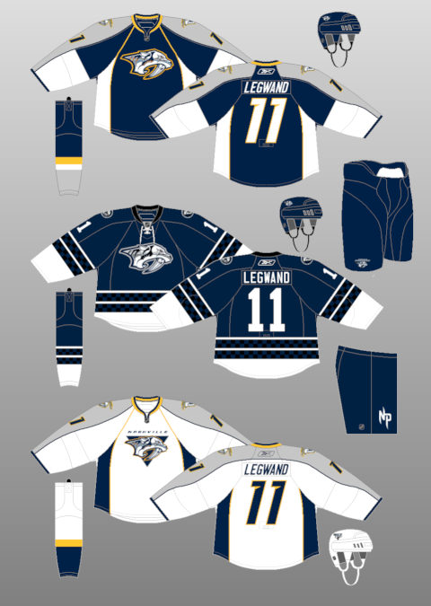
Yet, much to my dismay, the 2007-08 roll out of the the EDGE format really brought my blood to a boil. First, the San Jose Sharks, Tampa Bay Lightning, and New York Islanders had a total overhaul of their jersey, adding the front number like the Sabres did. However, both the Bolts and Isles have overhauled their design again, removing their front numbers-- while the Sabres went modernized retro, but still have the front numbers.
Then the Dallas Stars went from having a logo on both their jerseys to their away jersey showing the Stars logo, while their home jerseys had "DALLAS" in the front with the number of the player underneath it, which is silly because they're at home, the fans know they're in Dallas. That even manifested itself into their away jersey going to the "DALLAS" design, basically doing away with their logo all together. The Islanders would bring back their front numbers with their awkward black third jersey with "ISLANDERS" on the front with the number underneath. That is what the kids call the "college number," as many teams in the NCAA have that sort of design for their jerseys.
I can understand why the college teams have it because it's a traditional design for their area of hockey, but at the same time-- it shouldn't manifest itself into the professional game. The front number in the NHL prior to all of this went away in the 1947-48 season with the Boston Bruins and really shouldn't have come back at all. Hell, I even understand some minor league teams doing it, but with NHL teams putting it out there makes it look a little off-putting. The same goes with the front helmet numbers, which-- no clue why it was still done, but it seems like an unnecessary aesthetic to put out there for the sake of it.
Yes, I am a bit of an aesthetic nerd and take these things a little bit more extreme than others, but the old adage is "If you want to make a million bucks, you got to look like a million bucks." A good looking jersey will not only have your own fans buying the jersey, but other people buying it because of how sharp it actually looks in the grand scheme of things.
Credit to NHL Uniforms for their vast information and pictures of the jersey timelines.
With the new EDGE system the NHL brought in almost five years ago, the biggest things that irked me were the templated design, the unnecessary piping on some jerseys, and most importantly-- the front numbers.
Of course, this all started a year before in the 2006-07 season when the Buffalo Sabres brought in their new "buffaslug" design equipped with the front numbers, basically making their design EDGE ready when they were rolled out the next season. With the number on the front right chest area, it just seems a bit too much like amateur hour and very out of place from the traditional hockey design everyone has come to know and love.
Yet, much to my dismay, the 2007-08 roll out of the the EDGE format really brought my blood to a boil. First, the San Jose Sharks, Tampa Bay Lightning, and New York Islanders had a total overhaul of their jersey, adding the front number like the Sabres did. However, both the Bolts and Isles have overhauled their design again, removing their front numbers-- while the Sabres went modernized retro, but still have the front numbers.
Then the Dallas Stars went from having a logo on both their jerseys to their away jersey showing the Stars logo, while their home jerseys had "DALLAS" in the front with the number of the player underneath it, which is silly because they're at home, the fans know they're in Dallas. That even manifested itself into their away jersey going to the "DALLAS" design, basically doing away with their logo all together. The Islanders would bring back their front numbers with their awkward black third jersey with "ISLANDERS" on the front with the number underneath. That is what the kids call the "college number," as many teams in the NCAA have that sort of design for their jerseys.
I can understand why the college teams have it because it's a traditional design for their area of hockey, but at the same time-- it shouldn't manifest itself into the professional game. The front number in the NHL prior to all of this went away in the 1947-48 season with the Boston Bruins and really shouldn't have come back at all. Hell, I even understand some minor league teams doing it, but with NHL teams putting it out there makes it look a little off-putting. The same goes with the front helmet numbers, which-- no clue why it was still done, but it seems like an unnecessary aesthetic to put out there for the sake of it.
Yes, I am a bit of an aesthetic nerd and take these things a little bit more extreme than others, but the old adage is "If you want to make a million bucks, you got to look like a million bucks." A good looking jersey will not only have your own fans buying the jersey, but other people buying it because of how sharp it actually looks in the grand scheme of things.
Credit to NHL Uniforms for their vast information and pictures of the jersey timelines.
Friday, March 04, 2011
Are the 90's the New Retro??
As many of you know, I'm a big fan of the aesthetics of hockey. If you didn't, you do now. In any case, I peruse sites like the CCSLC, Icethetics, and NHL Uniforms. Recently, a topic on the CCSLC came up about what jerseys the users wanted to see come back and in a majority of the hockey comebacks, it seems that the 1990s style of jerseys were selected. It wasn't too far back that the 1970s crazed was going wild-- which it still is, but it seems that many have been longing for the uniforms of the 1990s as of late.And while we're two decades removed, at what point do retros become retros?? Is there a timeline for such a thing or is it just arbitrarily decided for when one person becomes nostalgic and then becomes a domino effect on such a thing??
Since it's probably the latter, at what point does it all kick in for something to go back to the way it was?? There's very few times where a team does the wrong thing and them reverts back to what they had before, like the Penguins when bringing back the skating penguin and with the Anaheim Ducks putting the old Mighty Ducks logo on their new third jersey's shoulders-- but most of the time, the changes have been for the better. Especially when you consider the tackiness of the jerseys from the '90s, you have to wonder why anyone would want them back.....though, you could say the same about the 1970s movement we've seen.
Yet, at the same time; could it be the tackiness that's actually makes us want it to come back in full effect. Don't know at what people some people got "too cool for the room" when it came to those designs, but it seems everyone is so very happy genuflecting on the good ol' days of jerseys past. Even though there are some that aren't up to par; that could be a ploy to make you realize how good your team has it when what they're wearing now. And, let's be honest, people would buy up the retro jerseys when they come out like it's nothing. It'd definitely be a chance for people to get what they may have missed out on and can't readily get on the eBay.
Of course, whether or not most of these designs come back is another story. We all have a scheme that we hold near and dear to our hearts and regardless of how awful they may have looked at the time, the yearning for having those back onto the ice to rekindle the fond memories many had is always going to be present. This is one of the times where you have to envy the likes of the Montreal Canadiens and Detroit Red Wings, who haven't had many drastic jersey or identity changes since the 1970s.
Labels:
New Jerseys,
NHL Fashion,
Retro Jerseys,
Third Jerseys
Friday, November 26, 2010
Ducks Fly Together
The Anaheim Ducks unveiled their third jerseys today and I have to say, this is what their jerseys should have looked like from the name change, rather than the dull wordmark they have on their jerseys right now.However, while it is a sharp looking design, and very orange, there's a couple things that bother me about the whole thing. First, it's the whole ordeal of the "alternate" jersey being the same color as the home jersey. Makes no sense in my eyes to do that; but whatever floats their boat. The second issue is the unnecessary piping, which is my biggest peeve, outside of the front numbers. The piping around the shoulder yoke and to outline the pattern on the sleeves and underneath the arms is not needed and the jersey would improve without it, I'm sure.
That said, I do like how much more orange it is (just look at the socks) rather than what they've had before. Also, the shoulder patch brings back the old Mighty Ducks logo; almost combining the two eras of the team like so much Jan Rubes from the movies. It's definitely passable in terms of enjoyability, but not without it's faults, that much I know.
Labels:
Anaheim Ducks,
Anaheim Mighty Ducks,
Third Jerseys
Friday Five: Stuff To The Brim
After American Thanksgiving, we're at the cresendo of another week-- which means it's time for the Friday Five and tackling the stories from the week-- huzzah!!1. With yet another blue alternate jersey being introduced, how much is this like the black alternates that seemed to pop up every now and again back-in-the-day??
The blue jerseys are whatever, they seem to really be like the black jerseys have been in the past, but there's two things that bug me about it. First, it's putting blue in there for blue sake, though that really only applies to the Penguins. They have that "Vegas Gold" in their palate, but they went "retro" for their jersey?? A bit bothersome. Second, the ALTERNATE being blue when the HOME jersey is already blue. It's not much of an alternate if it's the same color as the home jersey-- may as well call it "cash grab" jersey.
That said, I like the idea of having a home jersey and a clash kit, eliminating the whites if you wanted and adding more color to the game....though that's as gimmicky as some jerseys being made now.
2. Rumors abound about Chris Chelios returning to the game by way of the KHL. What more does he have to prove??
In Soviet Russia, elderly signs YOU!! WHAT A COUNTRY!!!
But, seriously-- I don't know much Chelios has left to prove, but if he has the drive to be competitive and play in a professional league, as well as someone willing to pay him; can't fault him for making some cash. That said, he couldn't find like a senior league team around the area or in Canada to play for so he could compete for the Allan Cup?? Come on, now.
3. Outside of the jerseys, the Blue Jackets are playing amazing; but can they keep the pace up??
You have enjoy the Jackets because they seem like an unassuming team because many think that the bottom could still fall out. Which it could do, but the tandem of Steve Mason and Mathieu Garon is playing fantastic, Rick Nash is proving his worth, and the role players are chipping in with some secondary scoring. If (and that's a big IF) all the key cogs can keep up the pace and stay healthy-- they could be a team to watch when it comes to late in the season. If there's more injuries-- it could be a rough second-half for the Jackets.
4. It took 21 rounds, 42 shooters to end a shootout in Germany. While many people hate the shootout, doesn't a longer one create that drama??
There's plenty to dislike about the skills competition to end the game, but I think the longer it's drawn out, the more drama that's created; even in the deepest of skeptics....or not. Either way, I think that there's plenty more that can be done to prevent a shootout, like extending the overtime period. The funny thing about this is that people bitch about games ending in ties, then they bitch about the solution that's come from not making a tie. Can't win there.
5. With the introduction of Boomer in Columbus; who are the most bizarre mascot you can think of when it comes to the lexicon of hockey??
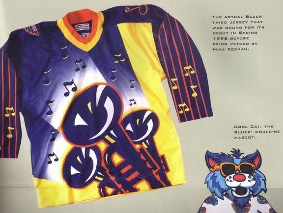
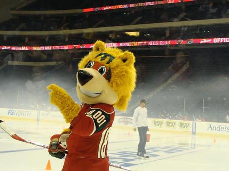
As a Caps fan, before Slapshot, there was Winger-- or as I like to call him, Ephrim the Retarded Eagle, mostly due to his out of proportion body. In St. Louis, Louie the Polar Bear is something out of sort, which I don't think is better than their possible mascot-- Cool Cat, which would have been with those crazed third jerseys in the Keenan era. However, you look at Nordy of the Minnesota Wild, the mix of the bear, fox, and yokel makes him epic......plus he has a mullet.
---------
That's another week in the books, and I hope you are as stuffed on Turkey as you are of this drivel. To contribute to make it better, email me at Scotty.Wazz@Gmail.com with your subject and it will probably make the cut when it comes to what to talk about. Huzzah!!
Wednesday, November 24, 2010
Mascot Off To A Booming Start
This is Boomer. He is the new Columbus Blue Jackets' mascot, but only when they wear their spiffy new third jerseys. According to CBJ's press release, this is the description of Boomer:Also during the live unveiling, the team introduced a second, kid-friendly mascot, "Boomer," a cushy cannon character with a friendly face and fluffy moustache. This season, Boomer’s game-night appearances at Nationwide Arena will be reserved specially for those games in which the team wears the Third Jersey. Boomer will make his first start in conjunction with the official on-ice debut of the Third Jersey this Friday.The jersey itself is something that I don't like, mostly because of the fact of navy blue being the new black in third jerseys, being overused. Plus, the logo seems to be overused with the logo being surrounded by text; however, I enjoy them keeping with the Civil War theme, so you have to like it, even though it looks a bit plain. It also incorporates the initials on the back neck line of former owner John H. McConnell, as the back neck line is another thing teams are using a lot of.
Yet, the big pull is Boomer....who, let's be honest-- looks very much like a penis. The jokes are just there, only with looking at the thing, the Face Off Hockey Show and Lyle Richardson of Spector's Hockey did 15 minutes of innuendo jokes on the November 24th show and it's been joked about on the Twitter, too. The question is how does this get through the marketing department without someone actually saying, "Hey, this could be a little racy." Not only did it have to get through the Jackets' marketing department, but it had to get through the NHL, too.
The shape itself and and the wheels on the side speak for itself, but the moustache is the real kicker. It's definitely something that will be (cannon) fodder for the short time until the novelty wears off (maybe), but you have to hand it to the Blue Jackets for thinking outside of the box....so to speak. They're going with two crazy mascots: A "bee" who gets mistaken as a fictional blue jacket bug because of the name and a cannon that looks sexual in nature and could have many lewd jokes made about it.
Labels:
Columbus Blue Jackets,
Mascots,
New Jerseys,
RBK Edge,
Third Jerseys
Tuesday, September 28, 2010
What's in a Nameplate??
As many of you who have followed this blog know, I'm kind of a fan of the aesthetics of a hockey team. It's part of why I started the Hockey Team Identity Project with The Girl. Now, you all know about my gripes about front numbers, templated design, and unnecessary piping on the new Reebok Edge systems, as I have voiced my displeasure on The Show and here. However, there's something new that's popping up that's starting to become my top annoyance, and it's really showing through in the new Canadian Hockey League third jerseys coming out.Mismatched nameplates.
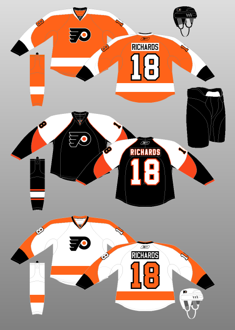
Now, this first came out with the Philadelphia Flyers presenting their third jerseys, which was a homage to their old jerseys in the 1960's and 70's, but they added the touch that wasn't there. Putting a white nameplate with black lettering on the orange jersey. For their Winter Classic jerseys, they put a black nameplate with white lettering on their white jerseys; which has now become their new jersey designs starting this season. While it's something that may not be too bad, considering it hadn't happened in a long while....or ever in the NHL (lack of fact checking makes me say that), it seems that it's gone above and beyond overkill now in the CHL.
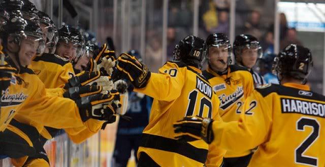
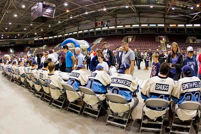
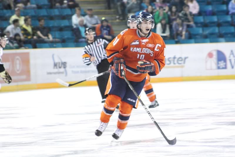
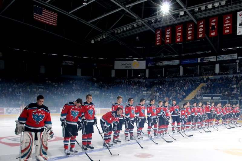
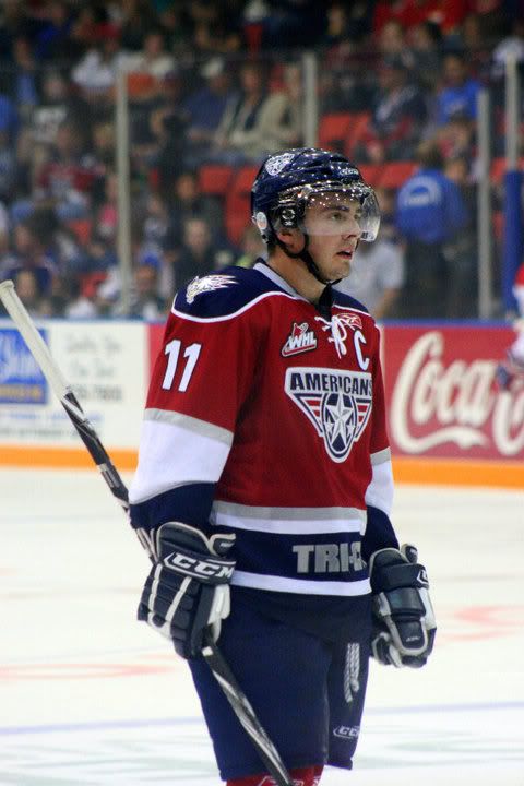
The CHL instituted third jersey for this year and so far, there's far too many teams using this new gimmick. The Kootenay Ice (pictured above) is one of the first, while the Kingston Frontnacs and Mississauga St. Michael's Majors have also instituted the contrasting nameplates. All the while the front numbers make an appearance with the Kamloops Blazers' third jerseys; but some teams like the Kelowna Rockets and Tri-City Americans have some kind of sanity when it comes with their new third jerseys.
But with the nameplates, I don't get the whole ordeal. To be honest, I don't think there were many teams who used it when they first instituted the rule of having names on the back of jerseys. It's almost like the ties on the collar, it creates a retro kind of feel, without actually having to deal with the heritage of a team. There's times where it's a neat idea and some times gives the look a very unique feel, but to do it in an overkill way kills any kind of uniqueness that a team could have by doing it.
Maybe, just maybe-- this will be the last of the craze, but at the same time-- I'm sure this could be the beginning of a trend that will rank up there with bad ideas. I understand that people do like the retro feel of some jerseys; but in the end-- to put unnecessary retro themes on teams that aren't really that retro (Kootenay was founded in 1996 when they were in Edmonton). It's to the point where you should almost have an unwritten rule of jerseys and how the make-up of one could be-- like if you've only been around for a decade, make something to not stray too much from the current identity; while a team that's been around for 25 seasons can actually make some retro designs for the years they've attributed into the league...or something.
In any case, I'll be hating this just like all the other stuff the Reebok Edge has given us.
Labels:
Junior Hockey,
Philadelphia Flyers,
RBK Edge,
Third Jerseys
Sunday, March 14, 2010
The Good, The Bad, The Ugly in the AHL's Specialty Jerseys
While cruising through the AHL website, I came across their "Week in Pictures" and decided to look at Week 23, which is the latest week. Now, I get that minor league teams like their gimmick jerseys and promotions, but it almost seems like this is going too far. It's brought to you by the Binghamton Senators and it's....well, you can take a look-see.
I don't know if they got really sloppy with the Mickey D's Shamrock Shakes when they were bringing over the jerseys and socks, but oy vey-- who thought this was going to be a good idea. While I will say they cover most of the colors of the rainbow, it's poorly executed and really should be retired never to be seen again. Not only are the jerseys and socks hideous, but the fact there's that white stripe down the front of the sock really bugs the hell out of me. Always has, always will.
Now, on the flip side, the best representation of promotional jerseys were the San Antonio Rampage. Teams in all level have been doing plenty of things to honor the Military, but mostly with warm-up jerseys and stuff like that-- at least in the NHL. However, the jerseys that the Rampage put out for their Military Appreciate Night could trump all.
The Rampage do a great job representing all branches of the Military in their crest, with the Rampage logo in the middle of them all. Also on the front, was a nice subtle name-tag, replicating the uniform worn by the men and women of the Armed Forces. The nameplate on the back is a white font on a black background, much like the Philadelphia Flyers' white-retros.
There's plenty of hits and misses when it comes to the minor league jerseys and this displays one of each. Granted, I bet that there's going to be a lot more St. Patrick's Day jerseys in the same template of the B-Sens, especially since that's how most holiday jerseys have worked in the past. So, be on the lookout for those, mostly because they could be as horrific as that.
I don't know if they got really sloppy with the Mickey D's Shamrock Shakes when they were bringing over the jerseys and socks, but oy vey-- who thought this was going to be a good idea. While I will say they cover most of the colors of the rainbow, it's poorly executed and really should be retired never to be seen again. Not only are the jerseys and socks hideous, but the fact there's that white stripe down the front of the sock really bugs the hell out of me. Always has, always will.Now, on the flip side, the best representation of promotional jerseys were the San Antonio Rampage. Teams in all level have been doing plenty of things to honor the Military, but mostly with warm-up jerseys and stuff like that-- at least in the NHL. However, the jerseys that the Rampage put out for their Military Appreciate Night could trump all.
The Rampage do a great job representing all branches of the Military in their crest, with the Rampage logo in the middle of them all. Also on the front, was a nice subtle name-tag, replicating the uniform worn by the men and women of the Armed Forces. The nameplate on the back is a white font on a black background, much like the Philadelphia Flyers' white-retros.There's plenty of hits and misses when it comes to the minor league jerseys and this displays one of each. Granted, I bet that there's going to be a lot more St. Patrick's Day jerseys in the same template of the B-Sens, especially since that's how most holiday jerseys have worked in the past. So, be on the lookout for those, mostly because they could be as horrific as that.
Tuesday, November 24, 2009
At Least They Didn't Put "FLA" On The Front
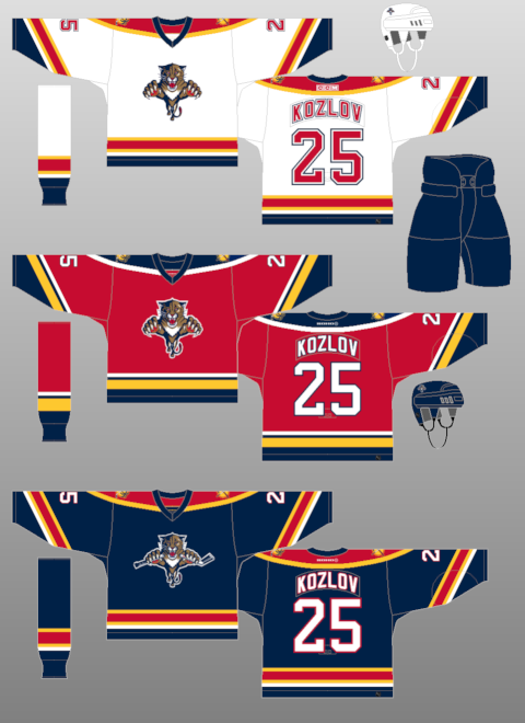
The Florida Panthers revealed their third jerseys on Monday night and it's....different.As you see, it's got the mix of navy blue and baby blue and kind of rips off both the Pittsburgh Penguins thirds and the St. Louis Blues' third. So, as you can tell-- the creativity machine has been put into retirement with all of this coming to a head.
The logos themselves-- I have to say I enjoy the stylized panther-head logo. It's a little more sharper and modern than what they have on their regular jerseys. However, the sun logo with "FLA" on the shoulders....not a fan. Not only is it an eyesore to me and very out of place with the yellow sun standing out on the shoulder yoke, the FLA looks way too big for the logo and just not flowing with the rest of the scheme.
For a team who used to have a bitchin' red jersey design and solid foundation for jersey awesomeness; the templated piping with their Edge jerseys and unoriginality of their third jerseys, this is an ultimate example of horrific things can get if you don't have the best marketing team or any desire for creativity.
Though it just shows that blue is the new black. This year alone, the Predators went to a whole blue motif, the Avalanche going with the blues, combined with the other blue thirds out there (Blues, Sabres, Canucks, Pens, Isles, Oilers)-- it seems that any shade of blue is something that teams want to go to. You can bet the Capitals would have blues as a third since they don't have anymore options to go to, as well as the Rangers would probably go to a navy options like they did back in the day.
But in the end, there's more bad than good when it comes to the Panthers new thirds. It's something that could have been done a lot better, maybe even bringing the team back to their days of glory, when they made the playoffs and turned a lot of heads. Sadly, it's all for naught.
Thanks again to NHLUniforms.com for the image direction.
Labels:
Florida Panthers,
RBK Edge,
Retro Jerseys,
Third Jerseys
Thursday, November 12, 2009
Definition of "Meh"
As speculated months ago from my post about the Death of Creativity, the Colorado Avalanche unveiled their third jerseys and it was the same design as was speculated. Very meh and very underwhelming considering the leaks that came out and the lack of disagreement upon the leaks. It almost made this unveiling something we were waiting to get over with.Another "meh" looking design is the next slated third jersey coming out, which is the Florida Panthers on the 23rd of this month. The Panthers are putting out strategic leaks, including the new crest on the jersey, as well as someone from the CCSLC posting a picture of part of the new third. And I have to say, I'm a bit underwhelmed by this, as well. I mean, the Panthers already have a navy jersey, and templated at that. You'd think with their old school red jerseys when they first busted onto the scene, they'd revert back to that color. It almost doesn't make sense to have two navy jerseys-- kind of like the Bruins having a black third jerseys with their black home jerseys. Same with the Predators this year and their navy third jerseys. Usually a third jersey is something completely different from the regular sets.
The entire third jerseys unveiled this year isn't that radical at all. They are kind of going through the motions and are just putting out something just to make some kind of cash. The Wild's thirds are very meh, with the green-- and the Predators jerseys are nothing ground breaking. Maybe it's the Edge system that's handcuffing the teams, but when you look at the Blues thirds and all the retro jerseys that are around; they are able to make something look decent and profitable. It goes back to the creativity issue and why some teams are lacking it. Maybe make some of these designs from CCSLC or other boards a look and a chance. You never know how much of a hit these designs could actually be, because most people seem to like it when it's posted out in public.
Yet, in the end-- it's a cash grab-- let's be honest. Even if the minority of people aren't down with it, there's going to be a majority of people slapping some cash down in order to get into the trend of the new jersey buying. Sunrise, sunset.
Labels:
Colorado Avalanche,
Florida Panthers,
Minnesota Wild,
Nashville Predators,
New Jerseys,
RBK Edge,
Retro Jerseys,
Third Jerseys
Friday, November 06, 2009
Defending the Barber-Pole
The man with an amazing Andre the Giant impression, Greg Wyshynski, and his crew over at Yahoo's Puck Daddy unveiled the first of their "Best and Worst of the Decade" session with the best and worst jerseys. It was a tough task, as I don't think there has been more changes in jersey style, design, and fabrics as it has been in the past 10 years. Yet, I have to disagree with the Montreal Canadiens' barber-pole jerseys as the worst in the last decade. I'm not going to say it's the best, but hardly the worst; especially considering the Predators' mustards were not included, nor were the Coyotes' green jerseys-- though I liked the greens for a small time. Lest we forget the Canucks' gradient thirds or Penguins robo-penguin, either.But, like I said-- plenty of jerseys in the past 10 years, and I don't even Wysh for not tapping on all of the jerseys that have been thrown out to the public for the decade.
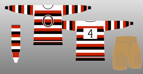
However, if you want to talk about the whole retro movement when it comes to the culture of sports-- fact of the matter is that nothing says more retro than the barber-pole jersey when it comes to hockey. For the most part, the barber-pole was the template at the time. Most of the original teams used a form of the barber-pole design, with the original Ottawa Senators using them in the inaugural season of the NHL in 1917-18, with the Hamilton Tigers adding to it in 1920-21. In 1925-26, the Boston Bruins and Montreal Wanderers developed a form of the barber-pole, with moderations here and there-- whether it be just on the sleeps or thicker lines and broken up patterns. By the 1927-28 season, the Senators, Bruins, Montreal Maroons, Chicago Blackhawks, Detroit Cougars, and Toronto Maple Leafs had a variation of the barber-pole in their motif. Not as wild as the New York Americans, who were basically wearing the United States flag as a jersey.
Through the 20s and 30s, the jersey style stayed in tact, with many teams trying it out and many keeping it for quite a while. However, but the 1938-39 season, the Chicago Blackhawks were pretty much the last to have a barber-pole jersey in the traditional sense of the style. The Hawks then retired their barber-pole at the end of the 1954-55 season. The style had laided dormant for many years, until the NHL's 75th anniversary, when the Hawks, Bruins, Red Wings and All-Star jerseys all had a retro barber-pole design to them, even if the ASG ones only had them in the arms. Even in the junior ranks, the Ottawa 67's used the barber-pole for numerous amount of years in the OHL, as did the Chicoutimi Sagueneens in the QMJHL.
While most of the retros are brought back because of how hideously classic they are (Canucks' flying V, Pens' baby blues, Flyers' mismatched nameplates, Cooperalls), I believe the barber-poles are more tradition than tacky. They bring the game back to a simpler time when you didn't need the flash and dash to sell jerseys, you just needed the team colors and maybe a logo. Most the time, the logos were only letters and it couldn't be simpler than that. I know that many have called for the Ottawa Senators to change their third jersey look to incorporate the shoulder patch logo in a mini-barber-pole design. We all know Pascal Leclaire is into the barber-pole, as his pads definitely say.
If you haven't already-- check out NHLUniforms.com, where I got all the hotlinks and historical rundown from it all. Great site for jersey and logo freaks.
Saturday, October 24, 2009
The Jersey Issue, What Makes a Jersey, and Blurst of Jerseys
Now that I have your attention......The Hockey News' "Greatest Jerseys of All Time" issue is on the newsstands and I did in-fact pick it up. Now, I have to say, it was a decent read in terms of how they were able to uncover the facts of some the jerseys that they did and actually getting some of the vintage sweaters from the pre-Original Six days from the Hockey Hall of Fame and put it on display as they did.The issue itself was a little bit of a letdown. There's a nice pictorial of jerseys throughout most of the issue, but it seems to jump around from topic to topic. The articles that were thrown in there were actually very well put out; like the debate of white jerseys being worn on the road, the wool jerseys being phased out, the jerseys of Mike Sillinger , and plenty more. There's a lot of helpful tidbits of knowledge you may have or may not have known when it comes to the hockey jerseys we've known since the first day we set eyes on the game of hockey. However, the layout is so frantic, it's hard to keep a good flow to the whole thing. Too much of a rapid change, which makes it a little frantic. I will say, the history they gave on each team, including the longest name on the back of the jersey, was a very nice touch to the issue.
But the eternal debate is what makes a good jersey, what makes a memorable jersey; especially with the new teams and new identities coming out. Personally, the logo will make or break a jersey. You can have a greatest jersey design in the world, but if the logo is crap or positioned horribly, it breaks a jersey into horri-bad status. That's where many jerseys go wrong, the logo kills it all.
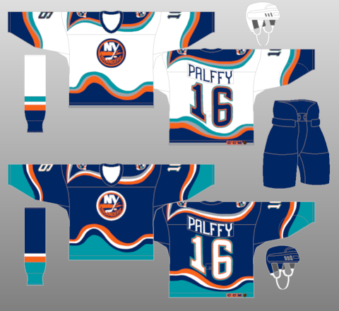
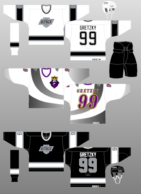
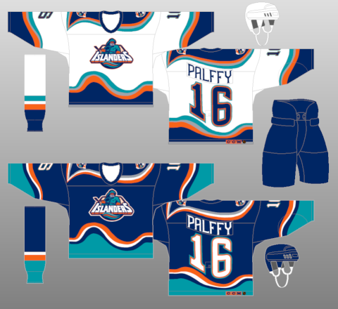
A couple examples are the Islanders' fisherman jersey-- the logo itself was quirky, but awful for the jersey design it was on. Yet, if you put the logo they have right now onto the jersey-- like they did-- and it looks pretty decent with the jersey designed they picked out. Sure, the waves were a bit on the radical side, but it worked in one instances and not the other. An example of the logo being good, but placement and jersey being wrong is the LA Kings third jerseys from 1996. The logo itself is pretty nice, it's a solid logo when you look at it just as a logo. But, you look at the placement on the jersey; which was the upper left breast; along with the random black-to-gray swoosh on it-- that equals an awful jersey.
But, you can't go on with a jersey post without doing your best and worst jerseys. Of course, I could do a hack bit like that......and I probably will, but I'm not going to do it in the traditional way. My thoughts are that I have too much of a quirky personality to limit them all. However, I'll do my best for favorites and hatred.
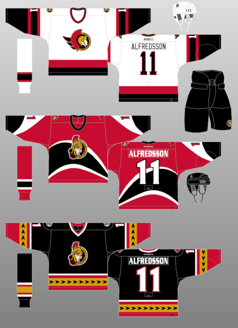
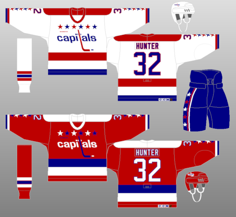
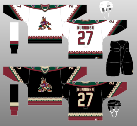
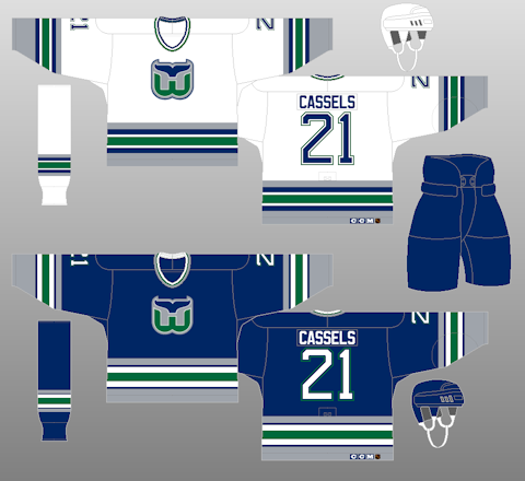
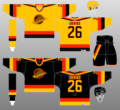
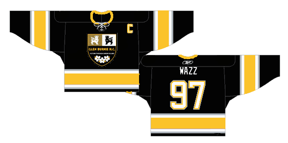
Favorites: Ottawa Senators 1930-31, Ottawa Senators thirds (black) 2000-07, Washington Capitals 1987-95, Phoenix Coyotes 1996-2003, Hartford Whalers 1992-97, Vancouver Canucks 1985-89 Baltimore Bandits 1996-97 (Honorable Mention: Glen Burnie HC 2005-07)
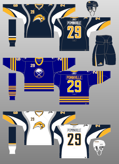
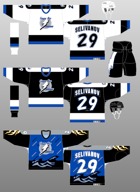
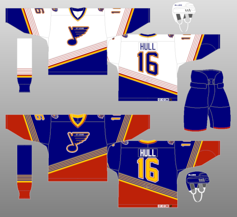
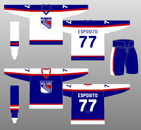
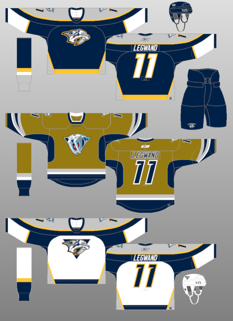
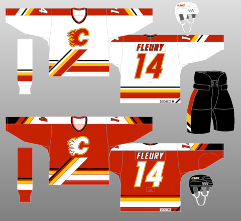
Not So Much: Buffalo Sabres 2006-Present, Tampa Bay Lightning thirds (storm) 1996-99, St. Louis Blues 1995-98, New York Rangers 1976-78, Nashville Predators thirds (mustard) 2001-07, Calgary Flames 1995-2000
But, as we all know-- it's all in the eye of the beholder. One persons trash is another person's treasure. Which is why many of the horrible jerseys and trends (Cooperalls) from yesteryear are so revered this many years later. Why else would the "Flying V" Canucks jerseys be ironically hip because of how terrible they were??
Wednesday, September 02, 2009
Flames Third and 30th Officially Revealed
The Calgary Flames join the long line of teams to hark back to the '80s with their latest third jerseys. Also, they officially unveiled their 30th Anniversary logo, which was leaked on their website last month.The jerseys themselves are classic. They are the original Flames wear and one where they had most of their glory days and when they won their Stanley Cup. Plus, it breaks up the streak of most teams donning the black third jerseys, like they did with their horse-head jersey back in the late '90s. It's the one I most remember of the Flames and will give the "'C' of Red" even more clout when they play in the Saddledome.
As far as the 30th Anniversary logo goes...I'm not too sure. It has the the silhouette of the downtown Calgary skyline with the Calgary Tower prominently displayed and the only red in the skyline. However, the large 30 in the logo is a bit off-putting. It doesn't really flow with the whole font or feeling of it to be honest. It seems to overshadow the design of the great logo, otherwise. However, if the team feels it's good, sobeit.As a whole, it's a passing day for the Flames. They put out a great jersey design, one of which many where waiting on for a while, and they have a semi-decent anniversary logo to go on throughout the whole season. It's better than most.
Labels:
Calgary Flames,
New Jerseys,
Retro Jerseys,
Third Jerseys
Tuesday, August 25, 2009
Wild-ly Dull
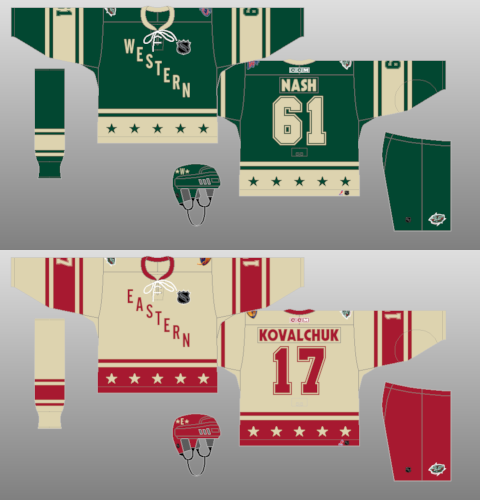
The leak is out for the third jersey for the Minnesota Wild by way of Icethetics. Essentially what the style is looks back to the Western Conference jerseys from the All-Star Game in 2004 when it was in Minnesota. However, it has a cursive script with Minnesota in the large letters and Wild at the bottom, which is the tail of the "a" in Minnesota....which doesn't makes sense because the end of the "a" has to double back in order to work. Also, it has the unneeded piping on the shoulders, which we all know I flipping hate.As a whole, the style and look is classy. Minnesota is one of the area which is related to hockey and it's tradition. It's something that will keep the vibe there of a home-grown feel that the Wild seems to have with their organization and their fans. However, there's so much they could have done with the third jersey.
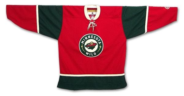
Of course, their last third jersey, which I like to think of as "The Christmas Jersey", morphed into their home jersey once the Edge came into play. This new jersey brought about the green feel they had when they came into the league. However, it doesn't have the pizzaz or eyecatching wonderment you often think about when it comes to third jerseys. The wordmark is overused and is a little "meh", especially when it looks just too streamlined when it comes to the color green. It's almost too much green in the scheme (poet and don't even know it) and makes me hate it. Green isn't my favorite color in the first place, but the Wild made it work with the gold and red accents they had in their old green jerseys. This just seems dull, out of place, and not something I will go crazy for.
Of course, this is just a leak and who knows if this is something to throw off the smell of the real jersey and what it could look like on the ice; but right now, I'm not a big fan of it at all.
Tuesday, August 18, 2009
Death of Creativity
While I know that the "college" style of jersey and use of nickname/city name is in vogue for the NHL teams, I hate it. To me, it shows a bit of laziness on the part of the people who are putting together the jersey itself. I mean, not only is this lazy in terms of using a city name, but it's basically the Avalanche's old third jersey , but with color changes here and there. I loathe the Dallas Stars identity with "Dallas" on their jerseys; the Atlanta Thrashers atrocity speaks for itself, and while the Lightning and Senators hit it on the head in terms of jersey design, the use of nicknames when they could have done so much more with it makes me shake my head.
It just makes me wish for happier time where people were somewhat excited to see what a new third jersey could be. Recently, the use of nick/city name for the third jersey or a retro design shows that people within the organizations making up these third jerseys are just phoning it in and not really caring about what actually looks good, because they know it will sell. Once a third is on the market, regardless of how it looks, it will often sell hot when they reveal it and sell better than some other jerseys in the cartel. That's why we saw a lot of third jerseys become the regular jerseys in the pre-Edge NHL; like the Capitals black and coppers, the Senators reds, and the Stars star jersey to name a few.
Even the logos and jerseys that fail should be given credit for effort to think outside the box rather than be a cookie-cutter design or style. I mean, the Kings third jersey had a great logo for the Burger King, but the fact of the matter was that they were utilized horribly with the logo being on the top left hand side of the jersey. The Anaheim Mighty Ducks had Wild Wing bust out of the ice on the jersey and while it was campy and totally for kids-- it was something unique. In the same era, the Lightning's first attempt was something unique with rain and raging seas on their jersey. The Buffaslug was even something of a risk, which didn't pay off, but it tried to combine the era of the Buffalo Sabres to a hybrid, which has fallen short. While these jerseys aren't looked at highly in the court of public opinion, they took a risk and should be commended for trying something different and thinking outside the box. Hell, even the Blues un-used jersey was different, but horrendous at the same time.
While the marketing and creation (if they exist) departments of each teams should be definitely question in terms of decision making when making the final approval, you have to wonder how much input Reebok has on this whole process. It could be a long shot, but you have to wonder why we have gone from one extreme of teams taking a risk on something to just minimalist approach where it's just like creativity has gone out the door while we have much more technology and design tools than we did back then. It seems savvy to hate on Reebok for the Edge jersey and Nike for the Swift design.....but it could be a smoking gun.
I've spoke the praises of the CCSLC on FOHS and maybe on here, I can't remember-- but there are so many great designers with great ideas, why aren't their stuff picked up and ran with by the teams?? It's something that they may need to look into if things like this fail again. Especially with the notion that the Ottawa Senators may be changing their thirds to something that has been presented online from a designer making a mock-up.
If push came to shove-- I'd love to have 30 risks on the third jerseys and have all of them fail than one use of a wordmark if there's something that could be done. There's so much out there for some teams with their identity that they can create something spectacular, but more often than not they will play it much too safe and end up ruining something that could have been so great. Maybe I'm overreacting, but I'm getting tired of the laziness that recently has come about when it comes to third jerseys.
Monday, November 24, 2008
Third Jersey Finale
Two more third jerseys come out, not the best of times, not the worst of times.....but times nonetheless.
First, we'll let Olaf Kolzig get this drink while we look at the new Bolts jersey. I have to say, they pulled it off a lot better than the Senators have, though I'll say the Sens one grew on me if only for the look of the jersey and not what's on the crest. The great thing about the Bolts jersey is that they keep the stripes under the arms, which has been there since the teams' inception back in '92-'93. And while it looks like a little bit like the '02-'03 AS jerseys, it give a solid effort in terms of putting a wordmark on it.
Now, we get to the fail. We talked about the Coyotes' jersey when it was leaked and debated whether or not it was roadkill or not. However, I said wait until the whole uniform was presented. And let's say I'm not a fan. Sure, they added the black socks-- but the whole maroon helmet, gloves, and pants ruin it as a whole, not to mention the right-handed captaincy letters. If the Coyotes went the way of the Hurricanes and gone all black-- it wouldn't have been that bad.
So, that's it. That's all the third jerseys to be unveils. You can look at the tags, or go to NHLUniforms.com and check out the display of the '08-'09 jerseys, as well as check everything out there because it's a great database.
First, we'll let Olaf Kolzig get this drink while we look at the new Bolts jersey. I have to say, they pulled it off a lot better than the Senators have, though I'll say the Sens one grew on me if only for the look of the jersey and not what's on the crest. The great thing about the Bolts jersey is that they keep the stripes under the arms, which has been there since the teams' inception back in '92-'93. And while it looks like a little bit like the '02-'03 AS jerseys, it give a solid effort in terms of putting a wordmark on it.
Now, we get to the fail. We talked about the Coyotes' jersey when it was leaked and debated whether or not it was roadkill or not. However, I said wait until the whole uniform was presented. And let's say I'm not a fan. Sure, they added the black socks-- but the whole maroon helmet, gloves, and pants ruin it as a whole, not to mention the right-handed captaincy letters. If the Coyotes went the way of the Hurricanes and gone all black-- it wouldn't have been that bad.So, that's it. That's all the third jerseys to be unveils. You can look at the tags, or go to NHLUniforms.com and check out the display of the '08-'09 jerseys, as well as check everything out there because it's a great database.
Labels:
Phoenix Coyotes,
Tampa Bay Lightning,
Third Jerseys
Wednesday, November 19, 2008
Third Jerseys Galore
Thanks to the fine folks at Icethetics, we have a wack of third jersey leaks to go over and some that have already been presented. First, however, let's get to the ones that have been released, which include some modern-retro designs that have been put out.
These are the Penguins new duds, which are the same ones they wore for last year's Winter Classic. Now, I'm not the biggest Penguins fan, but they came up aces with this jersey. It could be the best executed 3rd jersey and modern-retro one out there to date. It's solid, top to bottom, and really is the front-runner for best in class.
The one above is the Flyers modern retro, which brings back the orange jersey that has been a staple for the Flyers, but there's something about the white nameplate that doesn't do it for me. It's a simple effect for the jersey itself, but the nameplate really puts me off the whole thing.
For the newer ones, the jersey will be a linked pop-up because I don't have the patiences to deal with adding the photos, and really for the three leaked ones, those are all thanks to Icethetics (as you see by the watermark) and don't want to steal their thunder.....okay, it's just laziness.
Dallas Stars: Well, what a pathetic effort this was. Basically, you take your home jersey, turn it white and there ya go-- way to think out of the box. My hatred for the front numbers and the college arched name grows moreso with this jersey because there's so much more that could have been done, aside from making a white version of the home jersey. Make it green or something to set it apart.
San Jose Sharks: Now this one, I'm kinda split over. While I like the Sharks logo that they place there, you'd think they want to exploit their teal overlords a little more. Having this "black armor", as they call it, is a little too much. It looks a bit to bland, but I'm sure it will grow on me the more I see it out there.
LA Kings: There could have been so much more to this. They tease the back in black thing, they go over the history of the Gretzky era jerseys....and they come up with a sloppy logo with a whack of unnecessary piping on the sleeves and leaving much to be desired. It almost looks like a practice jersey.
Ottawa Senators: One word: FAIL!! You would think that a team who has two, TWO, alternate logos they could have gone with, they'd do more with it than a crappy wordmark. The jersey design itself is solid and works the red off the black main very well, but the wordmark is all?? Yuck. With their modern-retro "O" or 2-d Senators at their disposal, you'd think they'd utilize it and make a whack of money of it....but no, they didn't. As a fan, I'm highly disappointed in the Senators and what they have done. This concept from someone who I can't remember offhand would have been better than what they have.
So that's it for now. What have we learned?? Well, most in these batches of new jerseys are all black and somewhat bland, leaving much to be desired for some. While simplier could be better for some, I liked the days where teams would think outside the box. While some may not like the Ducks or Kings first third jerseys or the Blues prototype....it was thinking outside the box-- it was taking a chance and trying to make it work rather than working off a template.
These are the Penguins new duds, which are the same ones they wore for last year's Winter Classic. Now, I'm not the biggest Penguins fan, but they came up aces with this jersey. It could be the best executed 3rd jersey and modern-retro one out there to date. It's solid, top to bottom, and really is the front-runner for best in class.
The one above is the Flyers modern retro, which brings back the orange jersey that has been a staple for the Flyers, but there's something about the white nameplate that doesn't do it for me. It's a simple effect for the jersey itself, but the nameplate really puts me off the whole thing.For the newer ones, the jersey will be a linked pop-up because I don't have the patiences to deal with adding the photos, and really for the three leaked ones, those are all thanks to Icethetics (as you see by the watermark) and don't want to steal their thunder.....okay, it's just laziness.
Dallas Stars: Well, what a pathetic effort this was. Basically, you take your home jersey, turn it white and there ya go-- way to think out of the box. My hatred for the front numbers and the college arched name grows moreso with this jersey because there's so much more that could have been done, aside from making a white version of the home jersey. Make it green or something to set it apart.
San Jose Sharks: Now this one, I'm kinda split over. While I like the Sharks logo that they place there, you'd think they want to exploit their teal overlords a little more. Having this "black armor", as they call it, is a little too much. It looks a bit to bland, but I'm sure it will grow on me the more I see it out there.
LA Kings: There could have been so much more to this. They tease the back in black thing, they go over the history of the Gretzky era jerseys....and they come up with a sloppy logo with a whack of unnecessary piping on the sleeves and leaving much to be desired. It almost looks like a practice jersey.
Ottawa Senators: One word: FAIL!! You would think that a team who has two, TWO, alternate logos they could have gone with, they'd do more with it than a crappy wordmark. The jersey design itself is solid and works the red off the black main very well, but the wordmark is all?? Yuck. With their modern-retro "O" or 2-d Senators at their disposal, you'd think they'd utilize it and make a whack of money of it....but no, they didn't. As a fan, I'm highly disappointed in the Senators and what they have done. This concept from someone who I can't remember offhand would have been better than what they have.
So that's it for now. What have we learned?? Well, most in these batches of new jerseys are all black and somewhat bland, leaving much to be desired for some. While simplier could be better for some, I liked the days where teams would think outside the box. While some may not like the Ducks or Kings first third jerseys or the Blues prototype....it was thinking outside the box-- it was taking a chance and trying to make it work rather than working off a template.
Friday, November 14, 2008
Canucks Third Baffles
The Vancouver Canucks officially released their third jersey this afternoon....and it's really uninspired. Basically, it's the same jersey design with a different logo and shoulder patches.
As you see Mattias Ohlund displaying the jersey, it's a modified version of the stick-in-rink design that they use on their normal shoulder patches.
Now, as I mentioned with the Bruins design, I don't understand why a team would have an alternate jersey the same color as the home jersey that is used, yet-- the Canucks have taken this to another level. Not only is it the same color, it's the same jersey. How is that an alternate?? How can you claim it as an alternate if it's the same friggin' thing?? At least the Thrashers made an effort to make some kind of alternate, as hideous as it may be.
The only really bold change to the whole jersey is that the white striping is thicker at the hem and arms, but that's about it. That's the only vast difference of the entire jersey set. People will still buy it because the Canucks fans like the stick-in-rink design that the team uses, but I don't see why they wouldn't have made that the logo when they came out with the redesign last season. It would have completely made it an epic win rather than have people wonder why "Vancouver" was put above the orca logo.
There have been some leaks to the San Jose Sharks third, but until there's a better picture, I won't be critiquing it as of yet.
As you see Mattias Ohlund displaying the jersey, it's a modified version of the stick-in-rink design that they use on their normal shoulder patches.Now, as I mentioned with the Bruins design, I don't understand why a team would have an alternate jersey the same color as the home jersey that is used, yet-- the Canucks have taken this to another level. Not only is it the same color, it's the same jersey. How is that an alternate?? How can you claim it as an alternate if it's the same friggin' thing?? At least the Thrashers made an effort to make some kind of alternate, as hideous as it may be.
The only really bold change to the whole jersey is that the white striping is thicker at the hem and arms, but that's about it. That's the only vast difference of the entire jersey set. People will still buy it because the Canucks fans like the stick-in-rink design that the team uses, but I don't see why they wouldn't have made that the logo when they came out with the redesign last season. It would have completely made it an epic win rather than have people wonder why "Vancouver" was put above the orca logo.
There have been some leaks to the San Jose Sharks third, but until there's a better picture, I won't be critiquing it as of yet.
Saturday, November 08, 2008
The Blurst of the AHL Thirds
Before I start, I want to say that it's safe to click the links, they'll all pop up.I've talked a lot about the NHL thirds, but the AHL is coming out with third jerseys as well this season. Now, there are some solid ideas, like the Philadelphia Phantoms and Portland Pirates (yay alliteration) kept it simple by putting their usual logos on different colored jerseys; which could be a little hack, but it works out for them.
However, there are some disturbing trends that keep on popping up. Five of the 10 jerseys that have been unveiled in the AHL shop are white alternates, while four of the ten use text as their alternate jersey with three being white and using text, the Syracuse Crunch, Hershey Bears, and WBS Penguins. While I can understand the Crunch and Pens, the Bears primary jerseys already use text across the front, which makes the third one really worthless. The other white jerseys show the Bridgeport Sound Tigers putting their logo on a white jersey, as they don't have a white jersey in their arsenal already, only orange and blue, while the Toronto Marlies decide to put a random Saint Bernard on their jersey....which, if anyone can tell me the reason for that-- I'd be so happy.
Another new shot is the Worcester Sharks, who opted for the text route, but on a grey jersey. I'm a big fan of the grey jersey design, mostly because I think it looks a bit drab on the ice and out of place. If it works for them, then more power to them, but it wouldn't be my first choice when all is said and done.
The Milwaukee Admirals check in with their hockey playing skeleton on a light blue jersey, which works fairly solid. For some reason, I never really liked that logo. There's something a little too cartoony about it and could have been done a lot better. However, for the light blue it works out to be a solid design.
Finally, it's the Binghamton Senators, who have a solid primary logo and jersey design, but they went really out there for this third jersey. Not only do they use the away jersey design without missing a beat, but they use a Senators who looks older than time itself and could do some side work as a Disney villain for the new "Aladdin" flick. It's a horrible design and horrible jersey choice, and while I like the Senators organization, but I can't support this new third.
So that's the AHL thirds right now and how I see them. If others come out, I'll critique those.....or not.
Wednesday, October 29, 2008
Isles Continue The Retro Trend

First off, you'll see how happy Bill Guerin looks in the new third jerseys. Maybe he's just elated to play on Long Island. Whatever it is, gotta love the captain's excitement about not only the jersey, but the team as a whole.
Anyway, this Islanders jersey is continuing in the retro theme of the Oilers and Leafs. However, the numbers on the back, the name on the back, and the captain's "C" look very huge on this jersey. Obviously, they are trying to keep the same feel of the era it came from in this modern design.
One thing that really gets me is the immediate stop on the back of the socks. Reebok has the ability to keep the new sock and let it go all the way around the sock, as well as make and immediate drop off of the stripe like seen on the Lightning and Senators socks.....but for it to immediate stop in the back with no rhyme or reason to, it's shocking to me.
All around, it keeps the feels of the era it came from and is a solid effort from Reebok on this one. I don't know what to expect with some of the bad ones that could be coming along.
Subscribe to:
Posts (Atom)