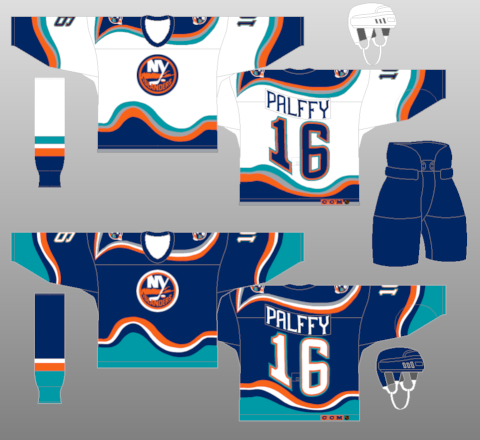
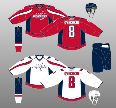
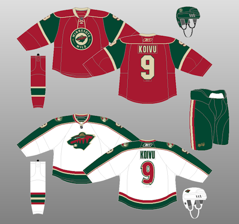
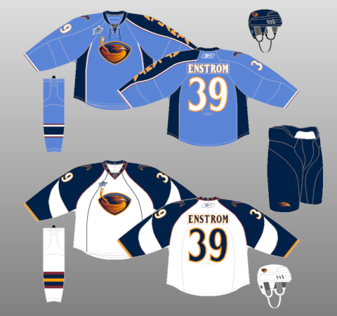
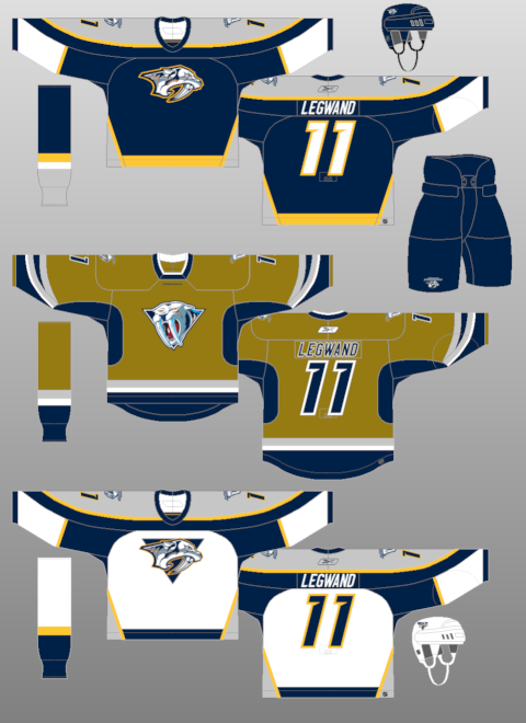
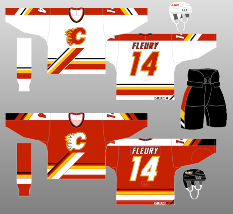
Andrew Greenstein of the fantastic jersey database website NHL Uniforms put out a great post about many teams getting rid of their alternate jerseys, namely the Edmonton Oilers, Buffalo Sabres, and Florida Panthers-- as well as the lack of possible announcement of any new alternate jerseys coming to the forefront.
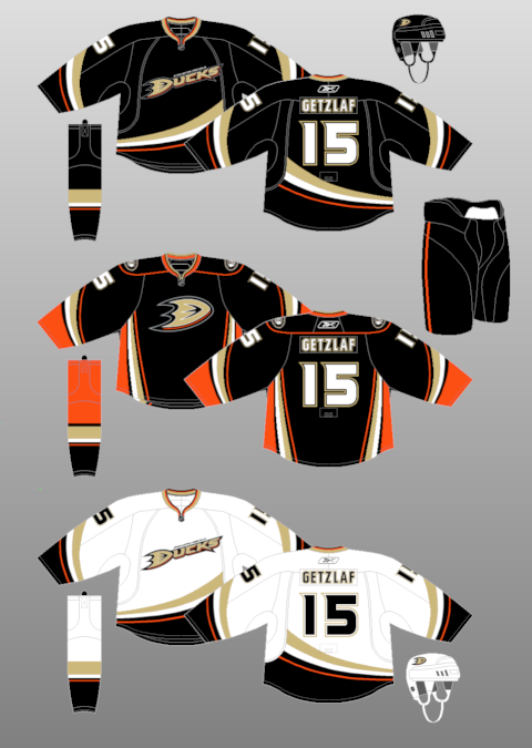
More over, the fact that many of the alternate jerseys have gotten so popular or bought more often-- they have been moved from alternate to the regular home jersery. In fact, the Los Angeles Kings, Dallas Stars, New York Islanders Philadelphia Flyers, Sabres, and Oilers have recently had their alternates move to their full-time home jerseys. Many thought the Nashville Predators were supposed to make their old alternate jerseys into the full-time look before they went with a full-gold presence. Also, the Anaheim Ducks seem to be rolling out their alternate more and more; that could get a road counterpart in the next few years.
However, the history of the third jersey is pretty interesting to say the least. The first instance of an alternate jersey was the 1955-56 season when the Boston Bruins used their white, black, and gold motif. They used that for two years, but would stop it in the 1957-58 season, only to bring it back for the 1959-60 season and have it last until the 1964-65 season. They were the only team in that era to use three jerseys in their wardrobe.
The next recorded instance of an alternate is when the Toronto Maple Leafs introduce new home and road jerseys, but kept their old home jerseys as an alternate in the 1970-71 season. It was merely a transition from old to new, as they would go away the next season. It was another 11 seasons before there was another alternate jersey, when the 1981-82 Pittsburgh Penguins worked in a gold jersey to their repertoire, which would last for two seasons, before the gold jersey became the home jersey in the 1983-84 season, lasting just one season, however.
Discounting the entire 75th Anniversary celebration by the NHL where the Original Six had alternate/retro jerseys for the 1991-92 season; the biggest boom and the start of the wide-spread third jersey craze was in the 1995-96 season with five teams kicking off the program (Mighty Ducks, Bruins, Canucks, Penguins, and Kings) and from that point on-- there was quite the boom for teams, as they saw how much of a great money maker it was....except the Blues.
Here's the breakdown of teams with an alternate jersey since that season, not including Winter/Heritage Classic jerseys-- unless they use it past their Winter/Heritage Classic year:
1995-96: 5
1996-97: 6
1997-98: 11
1998-99: 13
1999-2000: 10
2000-01: 11
2001-02: 15
2002-03: 16
2003-04: 21
2005-06: 21
2006-07: 18
2007-08: 0-- New Reebok Edge design
2008-09: 18
2009-10: 23
2010-11: 24
2011-12: 22
Most Seasons With Alternate Jersey: 23, Boston Bruins.
Teams With Never Having An Alternate Jerseys: Detroit Red Wings, New Jersey Devils
While Greenstein has a point that it's interesting some alternates may be getting less and less prominent and some could be taken out of full rotation while others are being put into it-- the debate on whether or not they are going away is going to be there. They still are something people will clamor to have, and while some will be put into full rotation-- it just gives the team another reason to make another jersey in order to make even more money through merchandising. Plus, as well have seen in the past-- even the bad alternate jerseys are looked back at fondly, as we've seen with the Wild Wing and Burger King jerseys.
Even if they're going away, the fact more people than not will buy the new jerseys regardless of their look is going to be something teams remember and exploit (to a point) when trying to market them to not only their own fan-base, but the jersey collectors alike.
Showing posts with label New Jerseys. Show all posts
Tuesday, June 26, 2012
Friday, March 23, 2012
My Rage Against "College Numbers" in the NHL
While many people are doing previews of the NCAA Hockey Tournament, I don't know enough about it to actually fake through it. Other places actually have people paying attention to it and god love 'em because they're good at what they do. However, the tournament allows me to talk about my hatred for the "college number" motif that has made it's way into the professional ranks.
With the new EDGE system the NHL brought in almost five years ago, the biggest things that irked me were the templated design, the unnecessary piping on some jerseys, and most importantly-- the front numbers.
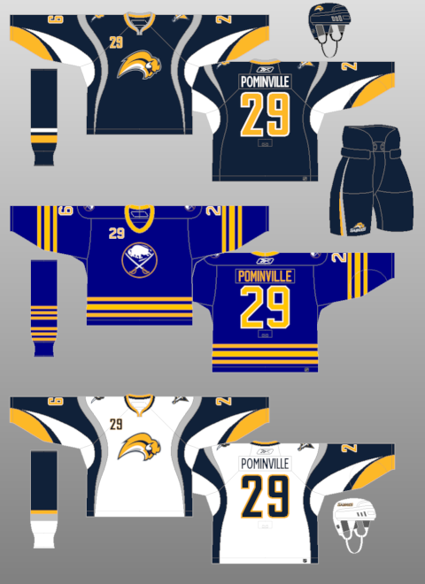
Of course, this all started a year before in the 2006-07 season when the Buffalo Sabres brought in their new "buffaslug" design equipped with the front numbers, basically making their design EDGE ready when they were rolled out the next season. With the number on the front right chest area, it just seems a bit too much like amateur hour and very out of place from the traditional hockey design everyone has come to know and love.
Yet, much to my dismay, the 2007-08 roll out of the the EDGE format really brought my blood to a boil. First, the San Jose Sharks, Tampa Bay Lightning, and New York Islanders had a total overhaul of their jersey, adding the front number like the Sabres did. However, both the Bolts and Isles have overhauled their design again, removing their front numbers-- while the Sabres went modernized retro, but still have the front numbers.
Then the Dallas Stars went from having a logo on both their jerseys to their away jersey showing the Stars logo, while their home jerseys had "DALLAS" in the front with the number of the player underneath it, which is silly because they're at home, the fans know they're in Dallas. That even manifested itself into their away jersey going to the "DALLAS" design, basically doing away with their logo all together. The Islanders would bring back their front numbers with their awkward black third jersey with "ISLANDERS" on the front with the number underneath. That is what the kids call the "college number," as many teams in the NCAA have that sort of design for their jerseys.
I can understand why the college teams have it because it's a traditional design for their area of hockey, but at the same time-- it shouldn't manifest itself into the professional game. The front number in the NHL prior to all of this went away in the 1947-48 season with the Boston Bruins and really shouldn't have come back at all. Hell, I even understand some minor league teams doing it, but with NHL teams putting it out there makes it look a little off-putting. The same goes with the front helmet numbers, which-- no clue why it was still done, but it seems like an unnecessary aesthetic to put out there for the sake of it.
Yes, I am a bit of an aesthetic nerd and take these things a little bit more extreme than others, but the old adage is "If you want to make a million bucks, you got to look like a million bucks." A good looking jersey will not only have your own fans buying the jersey, but other people buying it because of how sharp it actually looks in the grand scheme of things.
Credit to NHL Uniforms for their vast information and pictures of the jersey timelines.
With the new EDGE system the NHL brought in almost five years ago, the biggest things that irked me were the templated design, the unnecessary piping on some jerseys, and most importantly-- the front numbers.
Of course, this all started a year before in the 2006-07 season when the Buffalo Sabres brought in their new "buffaslug" design equipped with the front numbers, basically making their design EDGE ready when they were rolled out the next season. With the number on the front right chest area, it just seems a bit too much like amateur hour and very out of place from the traditional hockey design everyone has come to know and love.
Yet, much to my dismay, the 2007-08 roll out of the the EDGE format really brought my blood to a boil. First, the San Jose Sharks, Tampa Bay Lightning, and New York Islanders had a total overhaul of their jersey, adding the front number like the Sabres did. However, both the Bolts and Isles have overhauled their design again, removing their front numbers-- while the Sabres went modernized retro, but still have the front numbers.
Then the Dallas Stars went from having a logo on both their jerseys to their away jersey showing the Stars logo, while their home jerseys had "DALLAS" in the front with the number of the player underneath it, which is silly because they're at home, the fans know they're in Dallas. That even manifested itself into their away jersey going to the "DALLAS" design, basically doing away with their logo all together. The Islanders would bring back their front numbers with their awkward black third jersey with "ISLANDERS" on the front with the number underneath. That is what the kids call the "college number," as many teams in the NCAA have that sort of design for their jerseys.
I can understand why the college teams have it because it's a traditional design for their area of hockey, but at the same time-- it shouldn't manifest itself into the professional game. The front number in the NHL prior to all of this went away in the 1947-48 season with the Boston Bruins and really shouldn't have come back at all. Hell, I even understand some minor league teams doing it, but with NHL teams putting it out there makes it look a little off-putting. The same goes with the front helmet numbers, which-- no clue why it was still done, but it seems like an unnecessary aesthetic to put out there for the sake of it.
Yes, I am a bit of an aesthetic nerd and take these things a little bit more extreme than others, but the old adage is "If you want to make a million bucks, you got to look like a million bucks." A good looking jersey will not only have your own fans buying the jersey, but other people buying it because of how sharp it actually looks in the grand scheme of things.
Credit to NHL Uniforms for their vast information and pictures of the jersey timelines.
Wednesday, August 31, 2011
Modernized Retro Strikes Again
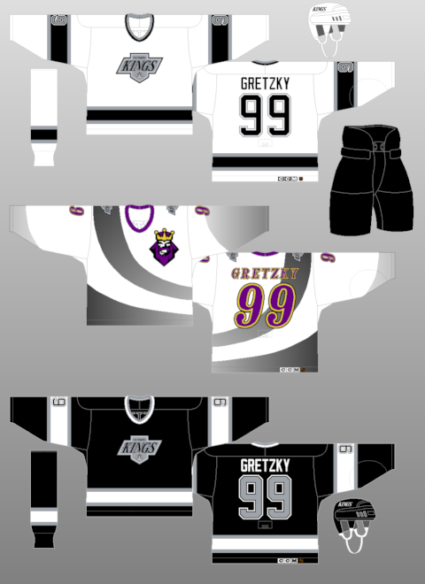
Some big news on Tuesday....well, at least for the last Tuesday for August anyway-- was the Los Angeles Kings putting out a release saying that they are ditching the purple from their color scheme and going with a "modernized retro" version of the Gretzky era black/silver motif. At the Draft, they introduced the white jersey to go along with the black jersey, which used to be the third jersey.
These jerseys are (I believe) the fifth "modernized retro" edition behind the Capitals, Penguins, Sabres, Flyers, and Oilers. They harken back to the Wayne Gretzky era and how they brought the Kings to higher levels of notoriety. Of course, it brings up the unnecessary piping issue again, but at least they don't have front numbers to them all.
However, I have an issue with ditching the purple out of the scheme. Not only is purple a regal color-- something you'd think the Kings would want to have-- they couldn't have gone with a more bland combination of black, silver, and white. The purple and black were unique combination and something that you didn't see much in sports. Hell, I don't believe purple has been used in the NHL prior or since (Mighty Ducks wore plum, Avalanche burgundy; so calm with that chatter). It's bad enough that we have teams going to navy alternate in the past couple of years and before that-- all black everything. Now, we lose a very unique color in the lexicon of sports.
Granted, I could be saying this because I'm a Mount St. Joseph alumni ('01), where our colors were purple and cream-- but I liked the look the Kings already had. It make things pop uniform wise and was something that went with their whole theme of their identity. People fawned over their purple and yellow retro jerseys-- but they can't go ahead and embrace the purple as it was already?? It's confusing, people.
In the end, it's all about nostalgia nowadays. If people clamor to one style over another-- a team will eventually turn to that. Look at all these "Turn Back The Clock" nights and yearn for the past, even though they were probably horrible decisions then and now. But, I'll miss the purple on the jerseys and hope that the Baltimore Ravens, Minnesota Vikings, Sacramento Kings, Phoenix Suns, and Colorado Rockies can hold down the purple reign (HA-- PUNS!!) in sports.
Sunday, August 07, 2011
Is the Buffaslug is the New Fisherman??
Now, I've gone on before about the '90s era of jersey becoming the new found retro (with the same Ziggy Palffy photo...) and I think I may have found the new trend of one logo/identity that will be hail as awful at the time, but when looking back on it was so bad that it was actually cool, neat, and hip to have in the present day.The Buffaslug.
Now, this isn't because I bought an authentic jersey and fancy Buffaslug hat on the very cheap and hoping to get on the ground floor; but when I look at it in-depth-- this could be something that in a few years could be the nostalgic dream for some fans and collectors alike. Much like how the Gorton's Fisherman Islanders jersey is fondly look back and has many people pining to get their hands on a jersey.
Sure, the two have their difference, but if you'll allow me the time and the begging capabilities, I'll see if I can show the similarities and change your mind on how you look at the Buffaslug.
1. Both were quite the change for each identity, but different for each team. The Islanders went from their normal blue and orange to a drastic addition of teal and silver and switching from royal blue to navy blue-- quite the change from a team who had the tradition of the royal and orange. The Sabres were going back a yellow and blue scheme (again, navy instead of royal), but it was from a drastic overhaul prior where the team went from their traditional set to a whole new color scheme of black, silver, and red. The Sabres at least tried to right things.
2. The logos were....interesting. The Islanders at least tried to capture the spirit of their name; getting an actual mascot/logo on there rather than the "NY" combination in a circle with a hockey stick coming from the "Y" and a silhouette of Long Island behind it all. The Buffaslug trying to almost modernize the original Sabres logo, but it also combined the "angry goathead" they had in the black and red days. Both, very drastic changes, but tried to capture the spirit of the thing.
3. Both teams reside in New York.
4. The fact remains that it was a stop gap to get to a new modernized version of the identity they had before. After the Fisherman failed, the Islanders kept the wavy jersey pattern with the old logo for a season before going back to a more traditional look, but with a navy blue and orange motif. The Sabres did the same, moving back from the Buffaslug to a modernized version of their original scheme, again switching out the royal blue for navy to go along with their yellow look.
5. Each will have their lovers and their haters. Personally, the kid in me enjoyed the Fisherman jersey when it came out because it was something you didn't see in other logos and it was bright and colorful-- as a 12 year old, that's what you go for. Still to this day I regret not getting a Fisherman jersey. The Buffaslug will have people remembering it for being closely related to the Flinstones' Royal Order of Water Buffalo hat, but it's something that won't go away from the memory of people too soon and some will look back on it fondly and maybe actually want it come back-- if only for a goof.
6. With both, the alternate logo seemed to go with it as well. The Islanders had a great alternate logo with the wavy jersey of the lighthouse with the crazed colors to it. That went away when the jersey went away and it shouldn't have. The Buffaslug also ushered out the "B" with the sabre through the openings-- which was there for the black and red era and was a fairly bad-ass looking alternate as well.
Both are long dead and buried, but much like the underground movement of the Fisherman jersey coming back; so, too, could the Buffaslug. It's a far reach, but it's one of those logos that seemed like a good idea, but the execution is very off.
Labels:
Buffalo Sabres,
New Jerseys,
New York Islanders,
Retro Jerseys
Thursday, August 04, 2011
The "O" Stands For "Oh Em Gee"
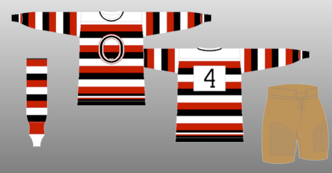
Lame title, I know, but still.It has been a couple of days since the leak of the new Ottawa Senators heritage design came out on the fantastic Icethetics website and I have to say, I'm still in awe over the design of the jersey. It's something that should have happened post-lockout, but maybe they were a little gun-shy on what the reception would be.
However, the reception seems to be positive across the board. The new look, as seen above, is a bit of the good ol' "modernized retro" scheme we've come to find so near and dear to our hearts. It's a simple design of the teams first jerseys, but also brings back the tradition of the old Ottawa Senators for the early 1900s up until the mid 1930s with the barberpole design on the sleeves and partially on the front.
I've been a big fan of the barberpole design because it does harken back to the old days of hockey, pre-Original 6 when not every team had two jerseys. Some people hate the barberpole design, and with the Montreal Canadiens jersey a few seasons ago-- I could see why-- that's a bit overdoing it. With what the Sens have done, and even the Flames with their Heritage Classic jerseys, they take a more tame approach to the look and feel of the jersey. It's not all over, but it's something where they keep the sleeve design, but on the torso, it's a stripe or two and that's it. Simple, smart, tradition.
Whether or not the Sens keep this look after their 20th Anniversary season (and god I hope they do), but the big thing can be said about this-- it's a good look. It's better than the Super Nintendo third jerseys they have now and better than most of the looks that they have had in the past. Makes you feel hopeful that this look is going to move things in the right direction.....at least from a jersey standpoint-- the actual team play is another story.
Friday, March 04, 2011
Are the 90's the New Retro??
As many of you know, I'm a big fan of the aesthetics of hockey. If you didn't, you do now. In any case, I peruse sites like the CCSLC, Icethetics, and NHL Uniforms. Recently, a topic on the CCSLC came up about what jerseys the users wanted to see come back and in a majority of the hockey comebacks, it seems that the 1990s style of jerseys were selected. It wasn't too far back that the 1970s crazed was going wild-- which it still is, but it seems that many have been longing for the uniforms of the 1990s as of late.And while we're two decades removed, at what point do retros become retros?? Is there a timeline for such a thing or is it just arbitrarily decided for when one person becomes nostalgic and then becomes a domino effect on such a thing??
Since it's probably the latter, at what point does it all kick in for something to go back to the way it was?? There's very few times where a team does the wrong thing and them reverts back to what they had before, like the Penguins when bringing back the skating penguin and with the Anaheim Ducks putting the old Mighty Ducks logo on their new third jersey's shoulders-- but most of the time, the changes have been for the better. Especially when you consider the tackiness of the jerseys from the '90s, you have to wonder why anyone would want them back.....though, you could say the same about the 1970s movement we've seen.
Yet, at the same time; could it be the tackiness that's actually makes us want it to come back in full effect. Don't know at what people some people got "too cool for the room" when it came to those designs, but it seems everyone is so very happy genuflecting on the good ol' days of jerseys past. Even though there are some that aren't up to par; that could be a ploy to make you realize how good your team has it when what they're wearing now. And, let's be honest, people would buy up the retro jerseys when they come out like it's nothing. It'd definitely be a chance for people to get what they may have missed out on and can't readily get on the eBay.
Of course, whether or not most of these designs come back is another story. We all have a scheme that we hold near and dear to our hearts and regardless of how awful they may have looked at the time, the yearning for having those back onto the ice to rekindle the fond memories many had is always going to be present. This is one of the times where you have to envy the likes of the Montreal Canadiens and Detroit Red Wings, who haven't had many drastic jersey or identity changes since the 1970s.
Labels:
New Jerseys,
NHL Fashion,
Retro Jerseys,
Third Jerseys
Friday, February 04, 2011
Friday Five: Skating and Fighting are Two Things Goalies Do
It's been quite the odd week coming out of All-Star Weekend, which seemed to give a nice punch in the arms to the traditional ASG. Plus, we saw others going back onto the IR after another a poor decision-- which is something you could say throughout his career.1. Rick DiPietro is back on the IR with facial fractures and knee swelling. How's that make everyone feel??
You have to feel bad for DiPietro, but when you see him make a poor decision like fighting with 17 second left in the game-- you kinda knew something like this would come from it. The knee swelling is nothing new, though and odds are he would probably be out a bit from that, but when he got lit up by Brent Johnson-- you knew it was just a matter of time before this news would come out. Worse off, Evgeni Nabokov still sits-- which maybe isn't a bad thing. As friend of FOHS, Anthony pointed out-- Nabby could ruin the Isles lottery chances if he played out of his mind and got the Isles on a little run-- which would make the Isles fans hate him more.
2. Which was more unlikely to see-- goalie race at the skills competition or the goalie fight??
Both are very rare and should be looked at in awe. However, it's more likely to get the goalie fight than to have a goalie race, that is only one race and happens once-a-year, if the Olympics to see. Even so, unless the games get out of hand-- we won't get a goalie fight in the NHL all that often, because we haven't seen one since 2007 in the regular season. Oddly enough, I liked both sides of things, but the race was more of a dance-off, where the fights are actually settling things once and for all. But the goalie race is all but a guarantee for ASG weekend now, but goalie fights are much more unlikely in the NHL.
3. After this All-Star Weekend, how much more of a change can we expect out of future events??
There will probably be some adjustments to some of the events during the Skills session, but in the end not much will be needed to be changed. The NHL did a lot of tinkering and it seemed to work on an idea that many hate because of the fact it's not real competition. When all is said and done-- the atmosphere was right, the festivities were great by all accounts, and things worked out well. To be honest, I believe you have to have the ASGs in places that are not hardcore hockey moments,
4. With the retirement of Craig Conroy, have we seen the last of the non-cliched players in the league??
I don't think we'll see one that was a good as Conroy. We have the Sean Avery and BizNasty types, but people hate him. It'll be a long time before we see a likable guy who doesn't throw out cliche lines again. With all the media training some people get in juniors and such-- a lot of guys lose their personality and only the muckers and grinders have personality-- but not many care for what they have to say because they're trying to put themselves over. Maybe PK Subban will carry the torch, but odds are he'll get roped in before he could actually make the dent Conroy did.
5. While the Bolts jerseys are getting pans and praised-- are there any jerseys that you hated or liked, then had a change of heart??
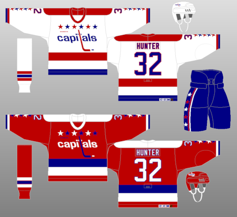
First and foremost, I hate the Caps new Edge jerseys when they first came out; as I mentioned when in Sombrero Guy's hotel room before we went to the Draft in Columbus. Yet, I love the Caps unis, especially the weagle patch. I think I finally came around to the Minnesota Wild's Christmas jerseys they use, as I did with the Atlanta Thrashers' baby-blue jerseys with the one-sleeve. At first I liked the Ducks' jerseys when they dropped the "mighty"-- but I turned on them when I thought there were really plain and then realized their alternates are what they should have done. Pretty sure that's all, but probably much more.
---------
And that's another week in the books. If you have questions or idea-- email me Scotty.Wazz@Gmail.com and give me some ideas or whatever. If you don't-- same clap-trap you get every week.
Labels:
All-Star Game,
Anaheim Ducks,
Friday Five,
Goaltending Controversy,
Minnesota Wild,
New Jerseys,
New York Islanders,
RBK Edge,
Retirement,
Rick DiPietro,
Tampa Bay Lightning,
Washington Capitals
Tuesday, February 01, 2011
On the Topic of the Second Half
The unofficial second-half of the season starts, even though many teams have played over 50 games. Yet, there's a lot to be settled, especially in the Western Conference; as five points separate 8th and 14th place, so there's going to be a shootout towards the end of the season. Plus, not only that-- but the shuffle for the top-spot and the shuffle to get out of the cellar (or stay in it) will be happening. For me....here's the storylines:WILD WEST RACE
Obviously, this is going to be the biggest thing going down the pike. With so many teams close enough together for the last playoff spot, the pressure on those teams will be immense. Could the Calgary Flames, who were written off in the first months, actually make the playoffs against all odds?? Will the Blues finally get the Jaroslav Halak that made him the folk hero in Montreal last playoffs?? Do the Blackhawks have what it takes to hang onto the last spots in the playoffs or will they be a one-and-done champion?? The West is always a conference for parity and this year continues that trend.

SOUTH-BEAST DIVISION
There's a high possibility that four of the teams in the Southeast Division could make the playoffs, which could put the halt on the dismissiveness against this division. Granted, the Thrashers and Hurricanes are battling it out for the last playoff spot and it'll be likely for only three teams-- but still, it's much better than the division winner only getting in. The talent is finally showing in the Southeast Division and this could be the year it takes everyone by the ear.
PRESIDENTIAL RACE
The Philadelphia Flyers and Vancouver Canucks are tied up in points for tops in the NHL. While there may not have been many questions about the Canucks, who just seemed to falter in the playoffs when playing the Blackhawks; but the Flyers could be the surprise, if only because there were questions about the goaltending (since answered by Sergei Bobrovsky) and dealing with injuries. They've done just fine and the Flyers could be the team to beat out of the East and in the NHL when the second-season comes.
WHO FLINCHES FIRST??
The Trade Deadline is 27 days away and it's all a matter of who is going to be what the first domino is going to be. The fact of the matter is that the salary cap has hamstrung a lot of teams and maybe some parts will go unfixed because the money doesn't allow it. Who knows if we're going to see a lot of movement (especially on the chicken fingers), but the posturing between everyone could be the real thrill to watch.
FUTURE LOOK: ALL BLUE EVERYTHING
This isn't much of a second-half of the season story, but one to kick it off. The Tampa Bay Lightning are going to ditch the black and go simple and blue with their new logo and jersey for next season. The logo is very simplistic, with a nice touch of having "Tampa Bay" only on the away jerseys. It's a downer because their look was pretty solid with the black, blue, silver, and white-- plus they had their "BOLTS" jersey debuting last year, too. Plus, while it's nice to change, going along with the ownership shift-- I don't think going with all-blue is the right way; because lightning doesn't happen when there's all-blue skies. That should fun to see, as that's the first of what could be many changes, if you listen to rumors.
---------
That's how I see the second-half as we restart the games that matter now. After this month is when we'll know the contenders and pretenders. Plus, we all know that even if teams make wholesale changes-- the chemistry may not be there and may do more to hinder than help. Drop the puck and let's get going.
Wednesday, November 24, 2010
Mascot Off To A Booming Start
This is Boomer. He is the new Columbus Blue Jackets' mascot, but only when they wear their spiffy new third jerseys. According to CBJ's press release, this is the description of Boomer:Also during the live unveiling, the team introduced a second, kid-friendly mascot, "Boomer," a cushy cannon character with a friendly face and fluffy moustache. This season, Boomer’s game-night appearances at Nationwide Arena will be reserved specially for those games in which the team wears the Third Jersey. Boomer will make his first start in conjunction with the official on-ice debut of the Third Jersey this Friday.The jersey itself is something that I don't like, mostly because of the fact of navy blue being the new black in third jerseys, being overused. Plus, the logo seems to be overused with the logo being surrounded by text; however, I enjoy them keeping with the Civil War theme, so you have to like it, even though it looks a bit plain. It also incorporates the initials on the back neck line of former owner John H. McConnell, as the back neck line is another thing teams are using a lot of.
Yet, the big pull is Boomer....who, let's be honest-- looks very much like a penis. The jokes are just there, only with looking at the thing, the Face Off Hockey Show and Lyle Richardson of Spector's Hockey did 15 minutes of innuendo jokes on the November 24th show and it's been joked about on the Twitter, too. The question is how does this get through the marketing department without someone actually saying, "Hey, this could be a little racy." Not only did it have to get through the Jackets' marketing department, but it had to get through the NHL, too.
The shape itself and and the wheels on the side speak for itself, but the moustache is the real kicker. It's definitely something that will be (cannon) fodder for the short time until the novelty wears off (maybe), but you have to hand it to the Blue Jackets for thinking outside of the box....so to speak. They're going with two crazy mascots: A "bee" who gets mistaken as a fictional blue jacket bug because of the name and a cannon that looks sexual in nature and could have many lewd jokes made about it.
Labels:
Columbus Blue Jackets,
Mascots,
New Jerseys,
RBK Edge,
Third Jerseys
Friday, December 04, 2009
Looking at the Olympic Threads
Thanks to the talented Sean Leahy via the IIHF website, the Olympic jerseys were unveiled to the masses. While there was big to-do about the Canadian jerseys, since countries were able to put their Hockey Federations logo as the crest; not much else was brought to the table in terms of what these countries are going to wear. Since I like jerseys and aesthetics of things-- here's my take. You can follow along with the link above, which will pop into a new window.
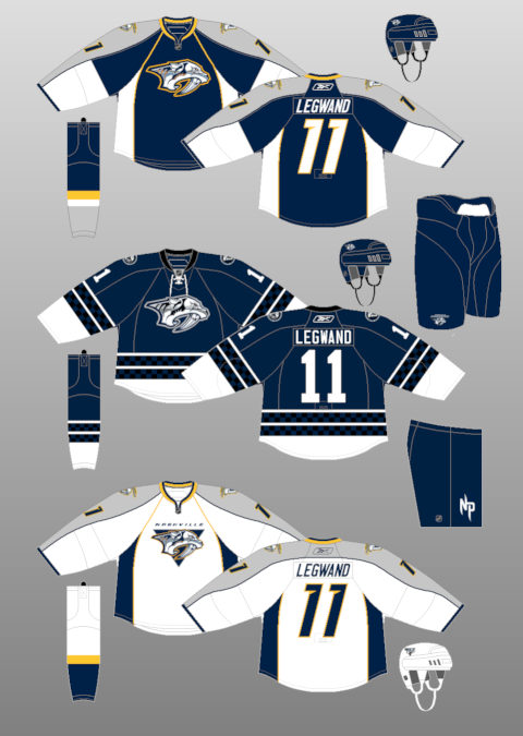
BELARUS: They keep the same scheme per usual, which is a good way to use the green and red combination without making one color look completely out of place....right Minnesota Wild?? Can't go wrong with the country crest.
CANADA: Probably the biggest topic over the summer, the Canadians got with the traditonal maple leaf with a Native design within the leaf, to tie in the appeal to Vancouver. The jersey remains the same as the past few World Championships, however.
CHINA: First off, I didn't know they even qualified for the Games, but they keep your basic red and yellow design the country uses with a simplistic wordmark on the front. You don't see much of the red/yellow scheme and I believe it looks damn sharp.
CZECH REPUBLIC: You don't get much of a change, but for some reason the bicep stripe irks me. It almost looks like a football kind of gimmick and they look like Ole Miss.
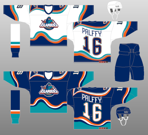
FINLAND: While the white jersey seems a little off with the streaks from the shoulder to the elbow, the big deal with the red crest on it. The crest in the past has been blue, but they went a little radical in terms of changing up the color as a whole. It's pretty out of place, when all is said and done.
GERMANY: The coolest part of the jersey is the sublaminated eagles on the sleeves below the forearm. The Germans designs are always awesome for the color scheme and the crest of the eagle. Could be the best of the bunch.
LATVIA: The template approach is alive with these maroon wonders, but at the same time-- they keep a nice look to them. The crest is saying solid and should be a solid look for them out on the rink.
NORWAY: The biggest tragedy could be the Norwegians, who had a simple, but classy design and have been resigned to the diagonal wordmark. It's too much of a plain design, even with the call-back to their heritage jerseys.
RUSSIA: The craziness of the blue on the white jerseys are odd to me. Especially considering they have used plenty of red in the past with their jerseys-- it seems a touch out of place. However, it works with their flag having the blue in it and creates a bit of uniqueness to it.
SLOVAKIA: They Slovaks keep the same scheme they always have. Not much of a change at all, in all honesty.
SWEDEN: They keep the triple crowns and really didn't change much. Have to love the simplicity working in this essense.
SWITZERLAND: This is where simplicity goes wrong in all of this. A small cross on the top left corner where the captain's letters should go, then move the captain's letters going next to the next. Probably the worst jersey out there, especially when they had a simple wordmark from past Olympics.
USA: The US jersey harks back to the 1980s jerseys, plus they get back to the 1960 team with the only third jersey out there. It works in the sense that they could pull off simplicity, like Sweden, and make it work out well.
While it's easy to take shots at the Nike Swift design and the templated gimmick, it's a given. Ready the past post about all of that and you'll be saved. There's what you have to look forward to when the skates hit the GM Place ice in February.
BELARUS: They keep the same scheme per usual, which is a good way to use the green and red combination without making one color look completely out of place....right Minnesota Wild?? Can't go wrong with the country crest.
CANADA: Probably the biggest topic over the summer, the Canadians got with the traditonal maple leaf with a Native design within the leaf, to tie in the appeal to Vancouver. The jersey remains the same as the past few World Championships, however.
CHINA: First off, I didn't know they even qualified for the Games, but they keep your basic red and yellow design the country uses with a simplistic wordmark on the front. You don't see much of the red/yellow scheme and I believe it looks damn sharp.
CZECH REPUBLIC: You don't get much of a change, but for some reason the bicep stripe irks me. It almost looks like a football kind of gimmick and they look like Ole Miss.
FINLAND: While the white jersey seems a little off with the streaks from the shoulder to the elbow, the big deal with the red crest on it. The crest in the past has been blue, but they went a little radical in terms of changing up the color as a whole. It's pretty out of place, when all is said and done.
GERMANY: The coolest part of the jersey is the sublaminated eagles on the sleeves below the forearm. The Germans designs are always awesome for the color scheme and the crest of the eagle. Could be the best of the bunch.
LATVIA: The template approach is alive with these maroon wonders, but at the same time-- they keep a nice look to them. The crest is saying solid and should be a solid look for them out on the rink.
NORWAY: The biggest tragedy could be the Norwegians, who had a simple, but classy design and have been resigned to the diagonal wordmark. It's too much of a plain design, even with the call-back to their heritage jerseys.
RUSSIA: The craziness of the blue on the white jerseys are odd to me. Especially considering they have used plenty of red in the past with their jerseys-- it seems a touch out of place. However, it works with their flag having the blue in it and creates a bit of uniqueness to it.
SLOVAKIA: They Slovaks keep the same scheme they always have. Not much of a change at all, in all honesty.
SWEDEN: They keep the triple crowns and really didn't change much. Have to love the simplicity working in this essense.
SWITZERLAND: This is where simplicity goes wrong in all of this. A small cross on the top left corner where the captain's letters should go, then move the captain's letters going next to the next. Probably the worst jersey out there, especially when they had a simple wordmark from past Olympics.
USA: The US jersey harks back to the 1980s jerseys, plus they get back to the 1960 team with the only third jersey out there. It works in the sense that they could pull off simplicity, like Sweden, and make it work out well.
While it's easy to take shots at the Nike Swift design and the templated gimmick, it's a given. Ready the past post about all of that and you'll be saved. There's what you have to look forward to when the skates hit the GM Place ice in February.
Labels:
International Hockey,
New Jerseys,
Nike Swift,
Olympics
Thursday, November 12, 2009
Definition of "Meh"
As speculated months ago from my post about the Death of Creativity, the Colorado Avalanche unveiled their third jerseys and it was the same design as was speculated. Very meh and very underwhelming considering the leaks that came out and the lack of disagreement upon the leaks. It almost made this unveiling something we were waiting to get over with.Another "meh" looking design is the next slated third jersey coming out, which is the Florida Panthers on the 23rd of this month. The Panthers are putting out strategic leaks, including the new crest on the jersey, as well as someone from the CCSLC posting a picture of part of the new third. And I have to say, I'm a bit underwhelmed by this, as well. I mean, the Panthers already have a navy jersey, and templated at that. You'd think with their old school red jerseys when they first busted onto the scene, they'd revert back to that color. It almost doesn't make sense to have two navy jerseys-- kind of like the Bruins having a black third jerseys with their black home jerseys. Same with the Predators this year and their navy third jerseys. Usually a third jersey is something completely different from the regular sets.
The entire third jerseys unveiled this year isn't that radical at all. They are kind of going through the motions and are just putting out something just to make some kind of cash. The Wild's thirds are very meh, with the green-- and the Predators jerseys are nothing ground breaking. Maybe it's the Edge system that's handcuffing the teams, but when you look at the Blues thirds and all the retro jerseys that are around; they are able to make something look decent and profitable. It goes back to the creativity issue and why some teams are lacking it. Maybe make some of these designs from CCSLC or other boards a look and a chance. You never know how much of a hit these designs could actually be, because most people seem to like it when it's posted out in public.
Yet, in the end-- it's a cash grab-- let's be honest. Even if the minority of people aren't down with it, there's going to be a majority of people slapping some cash down in order to get into the trend of the new jersey buying. Sunrise, sunset.
Labels:
Colorado Avalanche,
Florida Panthers,
Minnesota Wild,
Nashville Predators,
New Jerseys,
RBK Edge,
Retro Jerseys,
Third Jerseys
Saturday, October 24, 2009
The Jersey Issue, What Makes a Jersey, and Blurst of Jerseys
Now that I have your attention......The Hockey News' "Greatest Jerseys of All Time" issue is on the newsstands and I did in-fact pick it up. Now, I have to say, it was a decent read in terms of how they were able to uncover the facts of some the jerseys that they did and actually getting some of the vintage sweaters from the pre-Original Six days from the Hockey Hall of Fame and put it on display as they did.The issue itself was a little bit of a letdown. There's a nice pictorial of jerseys throughout most of the issue, but it seems to jump around from topic to topic. The articles that were thrown in there were actually very well put out; like the debate of white jerseys being worn on the road, the wool jerseys being phased out, the jerseys of Mike Sillinger , and plenty more. There's a lot of helpful tidbits of knowledge you may have or may not have known when it comes to the hockey jerseys we've known since the first day we set eyes on the game of hockey. However, the layout is so frantic, it's hard to keep a good flow to the whole thing. Too much of a rapid change, which makes it a little frantic. I will say, the history they gave on each team, including the longest name on the back of the jersey, was a very nice touch to the issue.
But the eternal debate is what makes a good jersey, what makes a memorable jersey; especially with the new teams and new identities coming out. Personally, the logo will make or break a jersey. You can have a greatest jersey design in the world, but if the logo is crap or positioned horribly, it breaks a jersey into horri-bad status. That's where many jerseys go wrong, the logo kills it all.
A couple examples are the Islanders' fisherman jersey-- the logo itself was quirky, but awful for the jersey design it was on. Yet, if you put the logo they have right now onto the jersey-- like they did-- and it looks pretty decent with the jersey designed they picked out. Sure, the waves were a bit on the radical side, but it worked in one instances and not the other. An example of the logo being good, but placement and jersey being wrong is the LA Kings third jerseys from 1996. The logo itself is pretty nice, it's a solid logo when you look at it just as a logo. But, you look at the placement on the jersey; which was the upper left breast; along with the random black-to-gray swoosh on it-- that equals an awful jersey.
But, you can't go on with a jersey post without doing your best and worst jerseys. Of course, I could do a hack bit like that......and I probably will, but I'm not going to do it in the traditional way. My thoughts are that I have too much of a quirky personality to limit them all. However, I'll do my best for favorites and hatred.
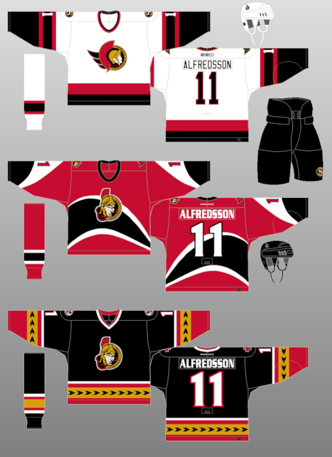
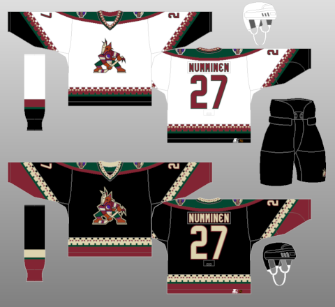
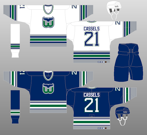
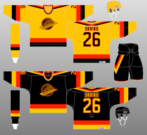
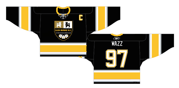
Favorites: Ottawa Senators 1930-31, Ottawa Senators thirds (black) 2000-07, Washington Capitals 1987-95, Phoenix Coyotes 1996-2003, Hartford Whalers 1992-97, Vancouver Canucks 1985-89 Baltimore Bandits 1996-97 (Honorable Mention: Glen Burnie HC 2005-07)
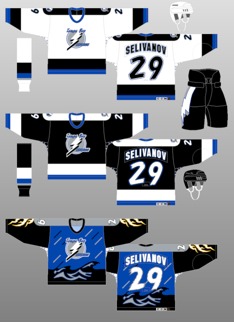
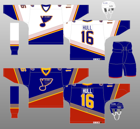
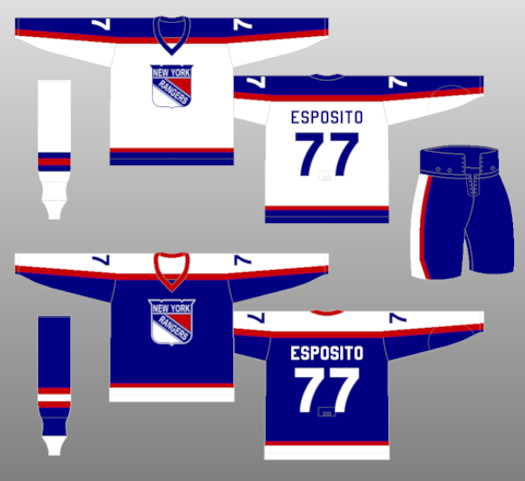
Not So Much: Buffalo Sabres 2006-Present, Tampa Bay Lightning thirds (storm) 1996-99, St. Louis Blues 1995-98, New York Rangers 1976-78, Nashville Predators thirds (mustard) 2001-07, Calgary Flames 1995-2000
But, as we all know-- it's all in the eye of the beholder. One persons trash is another person's treasure. Which is why many of the horrible jerseys and trends (Cooperalls) from yesteryear are so revered this many years later. Why else would the "Flying V" Canucks jerseys be ironically hip because of how terrible they were??
Wednesday, September 09, 2009
The CHL Edge is Here
Today, the entire CHL rolled out their Edge jersey designs. I'll go league by league and you can take a look for yourself at the links attached, which will pop up so you could follow along.WESTERN LEAGUE: While you have some teams that went through the templated designed (like the Lethbridge Hurricanes and Kootenay Ice), the fact remains that some teams actually stuck to their old jerseys, with maybe some piping here and there. The Everett Silvertips kept their forest design at the bottom, while the Prince Albert Raiders, Red Deer Rebels, Spokane Chiefs, Medicine Hat Tigers, and others kept their trademark look. The Kelowna Rockets stylized their look a bit, but kept rocking the Ogopogo with fantasticness.
The big leap could be the Calgary Hitmen, who will use just a black mask for their white jerseys and, while they keep sort of a template design, they have the team colors on part of the sleeve on each of their jerseys. It looks pretty fancy and pulls off well.
Best Look: Kelowna Rockets-- I have a soft spot for the red, teal, black, and copper look. And they didn't stray away from much of the original design.
Worst Look: Brandon Wheat Kings-- something about their jerseys are much too plain and look like a practice jersey. They could have done much more.
ONTARIO LEAGUE: In this instance, there's some spot of template designs, but it seems that some teams are willing to take some risks. Some took a little much, like Mississauga and the piping and name at the hem; and some took just right like the barbershop design on Ottawa's sleeves. The Brampton Battalion were able to keep their insignias on their sleeves, as well.
London and Kingston both went to retro designs from the 70s, I believe-- though I think Kingston's looks classier than London's, but that's because I hate the Stars design.
Best Look: Ottawa 67's-- something about the barberpole speaks to me, and I enjoy that they were able to do it so classily....though that's not a word.
Worst Look: Mississauga St. Michael's Majors-- The big "M" on it, along with the team name on the hem on the homes and city name on the aways; not to mention the piping-- it's just a jumbled mess.
QUEBEC LEAGUE: The Q could be the template capital of the world. There's too many jerseys that look the same, just paint-by-numbers attached-- it's horrific. Some teams like Rouyn-Noranda Huskies' gradients, the Gatineau Olympiques' bright orange jerseys, or Chicoutimi Saqueneens' shoulder-poles think outside the box to a point. Overall, there's nothing that's breaking too much away from the pack.
Again, some teams stuck to their guns with their old designs like Montreal Juniors and Quebec Remparts; but it just seems like a complete dulls-ville for the Quebec League.
Best Look: Cape Breton Screaming Eagles-- they don't have a template gig, plus they are going with classic colors of black and yellow in sort of a Bruins motif, but lighter on the yellow. Classy look for them.
Worst Look: Montreal Juniors-- with the college number system and too plain design, all they needed was unnecessary piping for me to hate them to death.
--------------------
So that's that-- the unveiling was nice, not too many leaks out there on the open market and in general, aside from the QMJHL, I'm pleased with what many teams were able to do with the perimeters. They were able to make or keep their old identity without blending in with other teams out there in the league.
Thoughts, ideas?? Leave them in the comments.
Wednesday, September 02, 2009
Flames Third and 30th Officially Revealed
The Calgary Flames join the long line of teams to hark back to the '80s with their latest third jerseys. Also, they officially unveiled their 30th Anniversary logo, which was leaked on their website last month.The jerseys themselves are classic. They are the original Flames wear and one where they had most of their glory days and when they won their Stanley Cup. Plus, it breaks up the streak of most teams donning the black third jerseys, like they did with their horse-head jersey back in the late '90s. It's the one I most remember of the Flames and will give the "'C' of Red" even more clout when they play in the Saddledome.
As far as the 30th Anniversary logo goes...I'm not too sure. It has the the silhouette of the downtown Calgary skyline with the Calgary Tower prominently displayed and the only red in the skyline. However, the large 30 in the logo is a bit off-putting. It doesn't really flow with the whole font or feeling of it to be honest. It seems to overshadow the design of the great logo, otherwise. However, if the team feels it's good, sobeit.As a whole, it's a passing day for the Flames. They put out a great jersey design, one of which many where waiting on for a while, and they have a semi-decent anniversary logo to go on throughout the whole season. It's better than most.
Labels:
Calgary Flames,
New Jerseys,
Retro Jerseys,
Third Jerseys
Tuesday, August 18, 2009
Death of Creativity
While I know that the "college" style of jersey and use of nickname/city name is in vogue for the NHL teams, I hate it. To me, it shows a bit of laziness on the part of the people who are putting together the jersey itself. I mean, not only is this lazy in terms of using a city name, but it's basically the Avalanche's old third jersey , but with color changes here and there. I loathe the Dallas Stars identity with "Dallas" on their jerseys; the Atlanta Thrashers atrocity speaks for itself, and while the Lightning and Senators hit it on the head in terms of jersey design, the use of nicknames when they could have done so much more with it makes me shake my head.
It just makes me wish for happier time where people were somewhat excited to see what a new third jersey could be. Recently, the use of nick/city name for the third jersey or a retro design shows that people within the organizations making up these third jerseys are just phoning it in and not really caring about what actually looks good, because they know it will sell. Once a third is on the market, regardless of how it looks, it will often sell hot when they reveal it and sell better than some other jerseys in the cartel. That's why we saw a lot of third jerseys become the regular jerseys in the pre-Edge NHL; like the Capitals black and coppers, the Senators reds, and the Stars star jersey to name a few.
Even the logos and jerseys that fail should be given credit for effort to think outside the box rather than be a cookie-cutter design or style. I mean, the Kings third jersey had a great logo for the Burger King, but the fact of the matter was that they were utilized horribly with the logo being on the top left hand side of the jersey. The Anaheim Mighty Ducks had Wild Wing bust out of the ice on the jersey and while it was campy and totally for kids-- it was something unique. In the same era, the Lightning's first attempt was something unique with rain and raging seas on their jersey. The Buffaslug was even something of a risk, which didn't pay off, but it tried to combine the era of the Buffalo Sabres to a hybrid, which has fallen short. While these jerseys aren't looked at highly in the court of public opinion, they took a risk and should be commended for trying something different and thinking outside the box. Hell, even the Blues un-used jersey was different, but horrendous at the same time.
While the marketing and creation (if they exist) departments of each teams should be definitely question in terms of decision making when making the final approval, you have to wonder how much input Reebok has on this whole process. It could be a long shot, but you have to wonder why we have gone from one extreme of teams taking a risk on something to just minimalist approach where it's just like creativity has gone out the door while we have much more technology and design tools than we did back then. It seems savvy to hate on Reebok for the Edge jersey and Nike for the Swift design.....but it could be a smoking gun.
I've spoke the praises of the CCSLC on FOHS and maybe on here, I can't remember-- but there are so many great designers with great ideas, why aren't their stuff picked up and ran with by the teams?? It's something that they may need to look into if things like this fail again. Especially with the notion that the Ottawa Senators may be changing their thirds to something that has been presented online from a designer making a mock-up.
If push came to shove-- I'd love to have 30 risks on the third jerseys and have all of them fail than one use of a wordmark if there's something that could be done. There's so much out there for some teams with their identity that they can create something spectacular, but more often than not they will play it much too safe and end up ruining something that could have been so great. Maybe I'm overreacting, but I'm getting tired of the laziness that recently has come about when it comes to third jerseys.
Sunday, June 28, 2009
Flags + Fire Reference = Flames Affiliate
The Abbotsford Heat, formerly the Quad City Flames and Ak-Sar-Ben Knights, are going to playing next season as the Calgary Flames affiliate. This past week, they put out their new identity which is something that was a change from the usual take the Flames jersey, paste a Flames-esque logo on the jersey, and play. Parts of that is true, but still.

As you see from the new set, the logo itself at the top is kind of....meh. Of course, the assumption that the Flames would bring back the old Atlanta Flames "A" for the jersey would have actually made sense and move some merchandise for those who love that logo and look for the Flames. In fact, looking at the logo-- it almost looks like it's a logo from a lacrosse team.
The jerseys are pretty much the Flames jerseys, but with the yellow in the Flames template being replaced with silver and the Alberta flag being replaced with the British Columbia flag, which make sense since the Heat will actually play in BC. I mean, I guess the scheme works, but you have to wonder....when has heat ever been silver?? I mean, I think heat, I think red, orange, yellow, and black as the aftermath. Maybe that's just me-- I'm old school like that.
As a whole, it's something we've come to expect from the Flames when it comes to their franchise affiliate and having something to do with the Flames name. It's been very rare that the Flames have had an affiliate without the matching named. I would have loved to see the flaming "A" on the jersey with like a Flames' template motif, minus the black on it-- just to see how it could hold up, but it is not to be. Once they take the ice, it'll be easier to judge, but now we have just take from this hope for the best later.

As you see from the new set, the logo itself at the top is kind of....meh. Of course, the assumption that the Flames would bring back the old Atlanta Flames "A" for the jersey would have actually made sense and move some merchandise for those who love that logo and look for the Flames. In fact, looking at the logo-- it almost looks like it's a logo from a lacrosse team.
The jerseys are pretty much the Flames jerseys, but with the yellow in the Flames template being replaced with silver and the Alberta flag being replaced with the British Columbia flag, which make sense since the Heat will actually play in BC. I mean, I guess the scheme works, but you have to wonder....when has heat ever been silver?? I mean, I think heat, I think red, orange, yellow, and black as the aftermath. Maybe that's just me-- I'm old school like that.As a whole, it's something we've come to expect from the Flames when it comes to their franchise affiliate and having something to do with the Flames name. It's been very rare that the Flames have had an affiliate without the matching named. I would have loved to see the flaming "A" on the jersey with like a Flames' template motif, minus the black on it-- just to see how it could hold up, but it is not to be. Once they take the ice, it'll be easier to judge, but now we have just take from this hope for the best later.
Labels:
AHL,
Calgary Flames,
Minor League Affiliations,
New Jerseys,
RBK Edge
Friday, June 05, 2009
Le-GUH-cy
The heat for a second team in the Greater Toronto Area is going strong, with a group putting forth their plan for an expansion team in Toronto. They have plans for an arena, ticket plans, and a name with logo and jerseys already. That's right-- the Legacy is in plan, apparently, for expansion consideration. They have a website and everything, too.I'll get to the aestethics in a second, but the proposal is a little bit head-scratching in some parts when you look at it. First off, the fact they're going to built a 30,000 seat arena and expect to fill it night-in and night-out, which could be a little outlandish if the economy continues to be this craptastic. Yet, it seems that there's reportedly $1 billion (CDN) is already ready to go ahead with this whole thing, all in private money. Don't know if it's unmarked, unsequential bills....but we'll find out in time, I'm sure.
Another thing is the timing of this whole ordeal, with the NHL dealing with Jim Balsillie trying to get the Coyotes to Hamilton-- they don't need this thing in their mind as well. The NHL has stated they have no plans of expanding. Andrew Lopez, who is the head of this venture, has said that if the NHL says no-- this plan is dead as dirt....which is silly to roll out this whole thing, create a big swaray, and make a huge headline.....then to abandon it just like that. Since Lopez hasn't talked to the NHL yet, you can be assured that they'll shoot this down fairly quickly. Personally, this reminds me of Jim Balsillie trying to get his foot in the door with the Penguins and Predators; not having the approval of the NHL first may be the worst thing you can do and Lopez may soon find this out.
Now, onto the name, logo, and jerseys...which...oof-ta, as the kids may say. First, the name-- I think that the WWE could be suing for naming rights. However, the name is not that intimidating, unless you're going out for a fraternity or sorority-- that's when a legacy gets a little scary. The logo (as seen above) is decent, but pretty busy. It's simple, but complicated-- with the Toronto skyline being the thing that clutters up the whole ordeal. Also, the stripes are a little much, especially for a Canadian team. The jerseys they brought out (seen below) are nothing special, but could work with the basic feel.
So, yet another group is putting the cart before the horse in terms of trying to get not only another team in Canada, but another team in the GTA. The Leafs, of course, won't like this and will fight it to the death-- but I think this threat isn't going to be as strong as the one they are facing in Balsillie. Yet, I don't think that these guys coming out of the woodwork with their ideas to get a team back in Canada, especially when there's issues abound elsewhere. If anything, the NHL is going to be stricter when it comes to the proposals put forth and probably have the kibosh be put on them quicker than usual. However, best of luck to the crew trying to get the Legacy idea off the ground, though I think it's in vain.
Friday, May 29, 2009
CHL Living On The Edge
Due to a small leak by the Halifax Mooseheads, it seems the Canadian Hockey League is switching to the RBK Edge templated jersey system. On Wednesday, the Mooseheads put up the screenshot above, which looks like it's the new Edge system design. This would make sense since most of the players from the CHL get drafted into the design in the NHL or get sent to the AHL, where they have the Edge design as well.However, this irks me because this could be yet another way to go a templated design and have not any originality of it all. It also makes sense this would happen with the Windsor Spitfires switching jerseys mid-season to a design that is already in the Edge way of life, the Washington Capitals template. The Mooseheads are taking the Wild design and all kinds of fun stealing should follow I'm sure.
We'll keep an eye on this because I believe the CHL could be some of the best jerseys out there in the hockey world and who knows what kind of awfulness could come from this whole switch to the new streamlined designed of uniform system.
Thanks to "Dante X" at the CCSLC for the catch of design change.
EDIT: As I was looking more through the CCSLC, the London Knights have gotten a new retro logo for their jerseys next season. In the press release, it also says that the CHL and Reebok have the jersey agreement that can't be revealed until September. Fun.....
Thursday, December 04, 2008
Holy Toledo, Nice Color Scheme
The newest ECHL team on the block next season will be the Toledo Walleye and they unveiled their new jerseys recently, and I have to say I'm fairly impressed. The color scheme is great with the baby blue, navy blue, and yellow mixed very well with the colors being accented when needed. The logo itself is original, and while it does look a bit cartoony and unrealistic (when did fish get hands to put into the gloves??), it's the minors and it's something that'll sell to anyone.The one thing I'll have to wait and see about is the "fins" underneath the shoulder patches. You really can't judge that until the it's put over top of shoulder pads because then it'll fit like it needs to and maybe give the desired effect that the team wanted.
I don't know about you, though-- but the Walleye could be my new favorite ECHL team in logo/jersey combo alone; though the Reading Royals scheme is very slick....but they're affiliated with the Toronto Maple Leafs, so I'm not fond of them anymore.
Subscribe to:
Posts (Atom)