Andrew Greenstein of the fantastic jersey database website NHL Uniforms put out a great post about many teams getting rid of their alternate jerseys, namely the Edmonton Oilers, Buffalo Sabres, and Florida Panthers-- as well as the lack of possible announcement of any new alternate jerseys coming to the forefront.
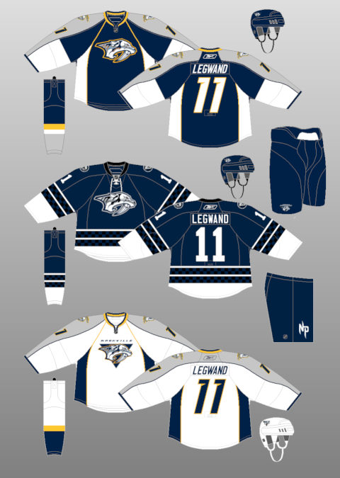
More over, the fact that many of the alternate jerseys have gotten so popular or bought more often-- they have been moved from alternate to the regular home jersery. In fact, the Los Angeles Kings, Dallas Stars, New York Islanders Philadelphia Flyers, Sabres, and Oilers have recently had their alternates move to their full-time home jerseys. Many thought the Nashville Predators were supposed to make their old alternate jerseys into the full-time look before they went with a full-gold presence. Also, the Anaheim Ducks seem to be rolling out their alternate more and more; that could get a road counterpart in the next few years.
However, the history of the third jersey is pretty interesting to say the least. The first instance of an alternate jersey was the 1955-56 season when the Boston Bruins used their white, black, and gold motif. They used that for two years, but would stop it in the 1957-58 season, only to bring it back for the 1959-60 season and have it last until the 1964-65 season. They were the only team in that era to use three jerseys in their wardrobe.
The next recorded instance of an alternate is when the Toronto Maple Leafs introduce new home and road jerseys, but kept their old home jerseys as an alternate in the 1970-71 season. It was merely a transition from old to new, as they would go away the next season. It was another 11 seasons before there was another alternate jersey, when the 1981-82 Pittsburgh Penguins worked in a gold jersey to their repertoire, which would last for two seasons, before the gold jersey became the home jersey in the 1983-84 season, lasting just one season, however.
Discounting the entire 75th Anniversary celebration by the NHL where the Original Six had alternate/retro jerseys for the 1991-92 season; the biggest boom and the start of the wide-spread third jersey craze was in the 1995-96 season with five teams kicking off the program (Mighty Ducks, Bruins, Canucks, Penguins, and Kings) and from that point on-- there was quite the boom for teams, as they saw how much of a great money maker it was....except the Blues.
Here's the breakdown of teams with an alternate jersey since that season, not including Winter/Heritage Classic jerseys-- unless they use it past their Winter/Heritage Classic year:
1995-96: 5
1996-97: 6
1997-98: 11
1998-99: 13
1999-2000: 10
2000-01: 11
2001-02: 15
2002-03: 16
2003-04: 21
2005-06: 21
2006-07: 18
2007-08: 0-- New Reebok Edge design
2008-09: 18
2009-10: 23
2010-11: 24
2011-12: 22
Most Seasons With Alternate Jersey: 23, Boston Bruins.
Teams With Never Having An Alternate Jerseys: Detroit Red Wings, New Jersey Devils
While Greenstein has a point that it's interesting some alternates may be getting less and less prominent and some could be taken out of full rotation while others are being put into it-- the debate on whether or not they are going away is going to be there. They still are something people will clamor to have, and while some will be put into full rotation-- it just gives the team another reason to make another jersey in order to make even more money through merchandising. Plus, as well have seen in the past-- even the bad alternate jerseys are looked back at fondly, as we've seen with the Wild Wing and Burger King jerseys.
Even if they're going away, the fact more people than not will buy the new jerseys regardless of their look is going to be something teams remember and exploit (to a point) when trying to market them to not only their own fan-base, but the jersey collectors alike.
Showing posts with label Retro Jerseys. Show all posts
Tuesday, June 26, 2012
Sunday, August 07, 2011
Is the Buffaslug is the New Fisherman??
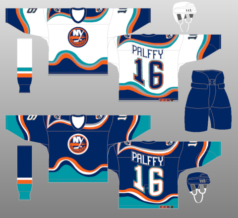
Now, I've gone on before about the '90s era of jersey becoming the new found retro (with the same Ziggy Palffy photo...) and I think I may have found the new trend of one logo/identity that will be hail as awful at the time, but when looking back on it was so bad that it was actually cool, neat, and hip to have in the present day.The Buffaslug.
Now, this isn't because I bought an authentic jersey and fancy Buffaslug hat on the very cheap and hoping to get on the ground floor; but when I look at it in-depth-- this could be something that in a few years could be the nostalgic dream for some fans and collectors alike. Much like how the Gorton's Fisherman Islanders jersey is fondly look back and has many people pining to get their hands on a jersey.
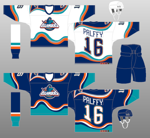
Sure, the two have their difference, but if you'll allow me the time and the begging capabilities, I'll see if I can show the similarities and change your mind on how you look at the Buffaslug.
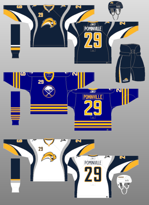
1. Both were quite the change for each identity, but different for each team. The Islanders went from their normal blue and orange to a drastic addition of teal and silver and switching from royal blue to navy blue-- quite the change from a team who had the tradition of the royal and orange. The Sabres were going back a yellow and blue scheme (again, navy instead of royal), but it was from a drastic overhaul prior where the team went from their traditional set to a whole new color scheme of black, silver, and red. The Sabres at least tried to right things.
2. The logos were....interesting. The Islanders at least tried to capture the spirit of their name; getting an actual mascot/logo on there rather than the "NY" combination in a circle with a hockey stick coming from the "Y" and a silhouette of Long Island behind it all. The Buffaslug trying to almost modernize the original Sabres logo, but it also combined the "angry goathead" they had in the black and red days. Both, very drastic changes, but tried to capture the spirit of the thing.
3. Both teams reside in New York.
4. The fact remains that it was a stop gap to get to a new modernized version of the identity they had before. After the Fisherman failed, the Islanders kept the wavy jersey pattern with the old logo for a season before going back to a more traditional look, but with a navy blue and orange motif. The Sabres did the same, moving back from the Buffaslug to a modernized version of their original scheme, again switching out the royal blue for navy to go along with their yellow look.
5. Each will have their lovers and their haters. Personally, the kid in me enjoyed the Fisherman jersey when it came out because it was something you didn't see in other logos and it was bright and colorful-- as a 12 year old, that's what you go for. Still to this day I regret not getting a Fisherman jersey. The Buffaslug will have people remembering it for being closely related to the Flinstones' Royal Order of Water Buffalo hat, but it's something that won't go away from the memory of people too soon and some will look back on it fondly and maybe actually want it come back-- if only for a goof.
6. With both, the alternate logo seemed to go with it as well. The Islanders had a great alternate logo with the wavy jersey of the lighthouse with the crazed colors to it. That went away when the jersey went away and it shouldn't have. The Buffaslug also ushered out the "B" with the sabre through the openings-- which was there for the black and red era and was a fairly bad-ass looking alternate as well.
Both are long dead and buried, but much like the underground movement of the Fisherman jersey coming back; so, too, could the Buffaslug. It's a far reach, but it's one of those logos that seemed like a good idea, but the execution is very off.
Labels:
Buffalo Sabres,
New Jerseys,
New York Islanders,
Retro Jerseys
Thursday, August 04, 2011
The "O" Stands For "Oh Em Gee"
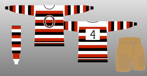
Lame title, I know, but still.It has been a couple of days since the leak of the new Ottawa Senators heritage design came out on the fantastic Icethetics website and I have to say, I'm still in awe over the design of the jersey. It's something that should have happened post-lockout, but maybe they were a little gun-shy on what the reception would be.
However, the reception seems to be positive across the board. The new look, as seen above, is a bit of the good ol' "modernized retro" scheme we've come to find so near and dear to our hearts. It's a simple design of the teams first jerseys, but also brings back the tradition of the old Ottawa Senators for the early 1900s up until the mid 1930s with the barberpole design on the sleeves and partially on the front.
I've been a big fan of the barberpole design because it does harken back to the old days of hockey, pre-Original 6 when not every team had two jerseys. Some people hate the barberpole design, and with the Montreal Canadiens jersey a few seasons ago-- I could see why-- that's a bit overdoing it. With what the Sens have done, and even the Flames with their Heritage Classic jerseys, they take a more tame approach to the look and feel of the jersey. It's not all over, but it's something where they keep the sleeve design, but on the torso, it's a stripe or two and that's it. Simple, smart, tradition.
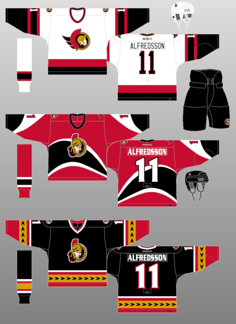
Whether or not the Sens keep this look after their 20th Anniversary season (and god I hope they do), but the big thing can be said about this-- it's a good look. It's better than the Super Nintendo third jerseys they have now and better than most of the looks that they have had in the past. Makes you feel hopeful that this look is going to move things in the right direction.....at least from a jersey standpoint-- the actual team play is another story.
Friday, March 04, 2011
Are the 90's the New Retro??
As many of you know, I'm a big fan of the aesthetics of hockey. If you didn't, you do now. In any case, I peruse sites like the CCSLC, Icethetics, and NHL Uniforms. Recently, a topic on the CCSLC came up about what jerseys the users wanted to see come back and in a majority of the hockey comebacks, it seems that the 1990s style of jerseys were selected. It wasn't too far back that the 1970s crazed was going wild-- which it still is, but it seems that many have been longing for the uniforms of the 1990s as of late.And while we're two decades removed, at what point do retros become retros?? Is there a timeline for such a thing or is it just arbitrarily decided for when one person becomes nostalgic and then becomes a domino effect on such a thing??
Since it's probably the latter, at what point does it all kick in for something to go back to the way it was?? There's very few times where a team does the wrong thing and them reverts back to what they had before, like the Penguins when bringing back the skating penguin and with the Anaheim Ducks putting the old Mighty Ducks logo on their new third jersey's shoulders-- but most of the time, the changes have been for the better. Especially when you consider the tackiness of the jerseys from the '90s, you have to wonder why anyone would want them back.....though, you could say the same about the 1970s movement we've seen.
Yet, at the same time; could it be the tackiness that's actually makes us want it to come back in full effect. Don't know at what people some people got "too cool for the room" when it came to those designs, but it seems everyone is so very happy genuflecting on the good ol' days of jerseys past. Even though there are some that aren't up to par; that could be a ploy to make you realize how good your team has it when what they're wearing now. And, let's be honest, people would buy up the retro jerseys when they come out like it's nothing. It'd definitely be a chance for people to get what they may have missed out on and can't readily get on the eBay.
Of course, whether or not most of these designs come back is another story. We all have a scheme that we hold near and dear to our hearts and regardless of how awful they may have looked at the time, the yearning for having those back onto the ice to rekindle the fond memories many had is always going to be present. This is one of the times where you have to envy the likes of the Montreal Canadiens and Detroit Red Wings, who haven't had many drastic jersey or identity changes since the 1970s.
Labels:
New Jerseys,
NHL Fashion,
Retro Jerseys,
Third Jerseys
Friday, October 15, 2010
Friday Five: Injuries Akimbo
It's time for a Friday Five again....because, well, it's Friday. That's how gimmicks go. We're only a week old into the season and we have injuries out of the wazzoo. Shocking how quick it's all going this way so quickly. We'll looking into that and some more fun stuff.1. If you're the Ottawa Senators, how much of a failure is the Pascal Leclaire experiment??
It's only a failure if you thought that Leclaire was going to be the game-changer the Sens hyped him up to be. He's a fragile guy and really hasn't done much to really warrant being a solid goalie, aside from one good season. Though one season is usually all it takes (right Jim Carey??), but for people to think he'd be a franchise goalie is insanity. The Houses of the Hockey have a great expose about Leclaire's injury history, so with that-- it's not a shock at all it's a failure. I mean, Damian Rhodes was the goalie of the future for this team at one time. That tells you all you need to know.
2. Last week was fighting, now it's concussions. The concussions are running rampant, is there anything to do to limit that??
Hockey helmet companies are doing all they can to limit the concussions, but it doesn't seem to actually be working just yet. With the game run on emotions and what-not, there's not much you can do to limit or deter players from playing the game they've always played. It's a shame, but the honest truth is that unless you take hitting out of the game, not will limit concussions. You look at the John Tavares hit and his was a whiplash occurrence, so it's not like it takes head-shot for these guys to go down; just happenstance.
3. Speaking of head injuries-- is it all that crazy of these Leafs fans to be crazed about their 3-0 start??
I'll be the first to say the Leafs (a team I loathe) have been off to a surprising start and could be a playoff team if they can keep this up. The problem is that it seems the Leafs are the most prepared team and with that advantage, should be having and enjoying the success they've gotten. However, they still have 79 games left to keep up this pace and whether or not they can sustain a healthy pace is yet to be seen. If other teams start to catch up and pass the Leafs-- then you'll see the true will of this team.
4. It seems that the Coyotes are thinking about finally ending this fiasco....again. Will it happen or won't it??
Depends on if you believe reports that Matthew Hulsizer is going to finally purchase the team. If you think he's legit, then it could be over soon. That's bad news for the "Bett and Bals" series. However, we've been through this dance before and nothing has come out of it. While there's been reports of a deal being in place, it's the same song and dance we've heard before. I won't believe the team being safe until they are sold, the papers are signed, the team starts selling 2011-12 season tickets and they drop the puck in October of 2011 at Jobing.com Arena-- then it's something that I could believe.
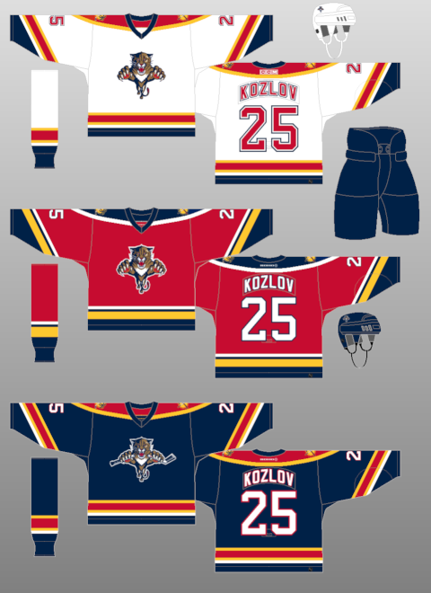
5. Speaking of teams in trouble, the Florida Panthers are having "retro" nights to celebrate 1996. How soon is too soon for retro nights?? (Bottom of this page on Icethetics)
The Panthers need to do something to get the butts in the seats and remembering the old 1996 Stanley Cup team is the one way to remember the glory the Panthers had. But, it's far too early for a retro night. If there's rules, you should have to be in existence for at least 25 years before you start going all retro on people. It's not like the Panthers have had too drastic of a change in the uniform, unless you count those hideous third jerseys that they have now. Yet-- it seems that if the Colorado Avalanche is going to celebrate their 1996 team-- why not the Panthers; why shouldn't they cash in??
---------
That's another week. If you didn't like this or have some suggestions for next week's F5; toss me an email at Scotty.Wazz@Gmail.com to give your two-cents in there and maybe....just maybe...your question will show up here.
Tuesday, November 24, 2009
At Least They Didn't Put "FLA" On The Front
The Florida Panthers revealed their third jerseys on Monday night and it's....different.As you see, it's got the mix of navy blue and baby blue and kind of rips off both the Pittsburgh Penguins thirds and the St. Louis Blues' third. So, as you can tell-- the creativity machine has been put into retirement with all of this coming to a head.
The logos themselves-- I have to say I enjoy the stylized panther-head logo. It's a little more sharper and modern than what they have on their regular jerseys. However, the sun logo with "FLA" on the shoulders....not a fan. Not only is it an eyesore to me and very out of place with the yellow sun standing out on the shoulder yoke, the FLA looks way too big for the logo and just not flowing with the rest of the scheme.
For a team who used to have a bitchin' red jersey design and solid foundation for jersey awesomeness; the templated piping with their Edge jerseys and unoriginality of their third jerseys, this is an ultimate example of horrific things can get if you don't have the best marketing team or any desire for creativity.
Though it just shows that blue is the new black. This year alone, the Predators went to a whole blue motif, the Avalanche going with the blues, combined with the other blue thirds out there (Blues, Sabres, Canucks, Pens, Isles, Oilers)-- it seems that any shade of blue is something that teams want to go to. You can bet the Capitals would have blues as a third since they don't have anymore options to go to, as well as the Rangers would probably go to a navy options like they did back in the day.
But in the end, there's more bad than good when it comes to the Panthers new thirds. It's something that could have been done a lot better, maybe even bringing the team back to their days of glory, when they made the playoffs and turned a lot of heads. Sadly, it's all for naught.
Thanks again to NHLUniforms.com for the image direction.
Labels:
Florida Panthers,
RBK Edge,
Retro Jerseys,
Third Jerseys
Thursday, November 12, 2009
Definition of "Meh"
As speculated months ago from my post about the Death of Creativity, the Colorado Avalanche unveiled their third jerseys and it was the same design as was speculated. Very meh and very underwhelming considering the leaks that came out and the lack of disagreement upon the leaks. It almost made this unveiling something we were waiting to get over with.Another "meh" looking design is the next slated third jersey coming out, which is the Florida Panthers on the 23rd of this month. The Panthers are putting out strategic leaks, including the new crest on the jersey, as well as someone from the CCSLC posting a picture of part of the new third. And I have to say, I'm a bit underwhelmed by this, as well. I mean, the Panthers already have a navy jersey, and templated at that. You'd think with their old school red jerseys when they first busted onto the scene, they'd revert back to that color. It almost doesn't make sense to have two navy jerseys-- kind of like the Bruins having a black third jerseys with their black home jerseys. Same with the Predators this year and their navy third jerseys. Usually a third jersey is something completely different from the regular sets.
The entire third jerseys unveiled this year isn't that radical at all. They are kind of going through the motions and are just putting out something just to make some kind of cash. The Wild's thirds are very meh, with the green-- and the Predators jerseys are nothing ground breaking. Maybe it's the Edge system that's handcuffing the teams, but when you look at the Blues thirds and all the retro jerseys that are around; they are able to make something look decent and profitable. It goes back to the creativity issue and why some teams are lacking it. Maybe make some of these designs from CCSLC or other boards a look and a chance. You never know how much of a hit these designs could actually be, because most people seem to like it when it's posted out in public.
Yet, in the end-- it's a cash grab-- let's be honest. Even if the minority of people aren't down with it, there's going to be a majority of people slapping some cash down in order to get into the trend of the new jersey buying. Sunrise, sunset.
Labels:
Colorado Avalanche,
Florida Panthers,
Minnesota Wild,
Nashville Predators,
New Jerseys,
RBK Edge,
Retro Jerseys,
Third Jerseys
Friday, November 06, 2009
Defending the Barber-Pole
The man with an amazing Andre the Giant impression, Greg Wyshynski, and his crew over at Yahoo's Puck Daddy unveiled the first of their "Best and Worst of the Decade" session with the best and worst jerseys. It was a tough task, as I don't think there has been more changes in jersey style, design, and fabrics as it has been in the past 10 years. Yet, I have to disagree with the Montreal Canadiens' barber-pole jerseys as the worst in the last decade. I'm not going to say it's the best, but hardly the worst; especially considering the Predators' mustards were not included, nor were the Coyotes' green jerseys-- though I liked the greens for a small time. Lest we forget the Canucks' gradient thirds or Penguins robo-penguin, either.But, like I said-- plenty of jerseys in the past 10 years, and I don't even Wysh for not tapping on all of the jerseys that have been thrown out to the public for the decade.
However, if you want to talk about the whole retro movement when it comes to the culture of sports-- fact of the matter is that nothing says more retro than the barber-pole jersey when it comes to hockey. For the most part, the barber-pole was the template at the time. Most of the original teams used a form of the barber-pole design, with the original Ottawa Senators using them in the inaugural season of the NHL in 1917-18, with the Hamilton Tigers adding to it in 1920-21. In 1925-26, the Boston Bruins and Montreal Wanderers developed a form of the barber-pole, with moderations here and there-- whether it be just on the sleeps or thicker lines and broken up patterns. By the 1927-28 season, the Senators, Bruins, Montreal Maroons, Chicago Blackhawks, Detroit Cougars, and Toronto Maple Leafs had a variation of the barber-pole in their motif. Not as wild as the New York Americans, who were basically wearing the United States flag as a jersey.
Through the 20s and 30s, the jersey style stayed in tact, with many teams trying it out and many keeping it for quite a while. However, but the 1938-39 season, the Chicago Blackhawks were pretty much the last to have a barber-pole jersey in the traditional sense of the style. The Hawks then retired their barber-pole at the end of the 1954-55 season. The style had laided dormant for many years, until the NHL's 75th anniversary, when the Hawks, Bruins, Red Wings and All-Star jerseys all had a retro barber-pole design to them, even if the ASG ones only had them in the arms. Even in the junior ranks, the Ottawa 67's used the barber-pole for numerous amount of years in the OHL, as did the Chicoutimi Sagueneens in the QMJHL.
While most of the retros are brought back because of how hideously classic they are (Canucks' flying V, Pens' baby blues, Flyers' mismatched nameplates, Cooperalls), I believe the barber-poles are more tradition than tacky. They bring the game back to a simpler time when you didn't need the flash and dash to sell jerseys, you just needed the team colors and maybe a logo. Most the time, the logos were only letters and it couldn't be simpler than that. I know that many have called for the Ottawa Senators to change their third jersey look to incorporate the shoulder patch logo in a mini-barber-pole design. We all know Pascal Leclaire is into the barber-pole, as his pads definitely say.
If you haven't already-- check out NHLUniforms.com, where I got all the hotlinks and historical rundown from it all. Great site for jersey and logo freaks.
Saturday, October 24, 2009
The Jersey Issue, What Makes a Jersey, and Blurst of Jerseys
Now that I have your attention......The Hockey News' "Greatest Jerseys of All Time" issue is on the newsstands and I did in-fact pick it up. Now, I have to say, it was a decent read in terms of how they were able to uncover the facts of some the jerseys that they did and actually getting some of the vintage sweaters from the pre-Original Six days from the Hockey Hall of Fame and put it on display as they did.The issue itself was a little bit of a letdown. There's a nice pictorial of jerseys throughout most of the issue, but it seems to jump around from topic to topic. The articles that were thrown in there were actually very well put out; like the debate of white jerseys being worn on the road, the wool jerseys being phased out, the jerseys of Mike Sillinger , and plenty more. There's a lot of helpful tidbits of knowledge you may have or may not have known when it comes to the hockey jerseys we've known since the first day we set eyes on the game of hockey. However, the layout is so frantic, it's hard to keep a good flow to the whole thing. Too much of a rapid change, which makes it a little frantic. I will say, the history they gave on each team, including the longest name on the back of the jersey, was a very nice touch to the issue.
But the eternal debate is what makes a good jersey, what makes a memorable jersey; especially with the new teams and new identities coming out. Personally, the logo will make or break a jersey. You can have a greatest jersey design in the world, but if the logo is crap or positioned horribly, it breaks a jersey into horri-bad status. That's where many jerseys go wrong, the logo kills it all.
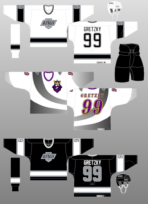
A couple examples are the Islanders' fisherman jersey-- the logo itself was quirky, but awful for the jersey design it was on. Yet, if you put the logo they have right now onto the jersey-- like they did-- and it looks pretty decent with the jersey designed they picked out. Sure, the waves were a bit on the radical side, but it worked in one instances and not the other. An example of the logo being good, but placement and jersey being wrong is the LA Kings third jerseys from 1996. The logo itself is pretty nice, it's a solid logo when you look at it just as a logo. But, you look at the placement on the jersey; which was the upper left breast; along with the random black-to-gray swoosh on it-- that equals an awful jersey.
But, you can't go on with a jersey post without doing your best and worst jerseys. Of course, I could do a hack bit like that......and I probably will, but I'm not going to do it in the traditional way. My thoughts are that I have too much of a quirky personality to limit them all. However, I'll do my best for favorites and hatred.
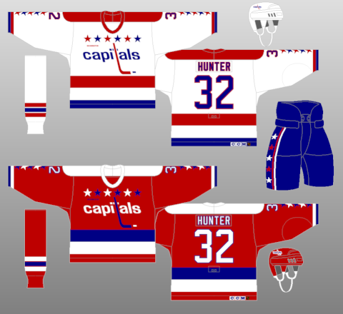
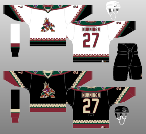
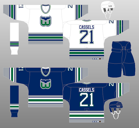
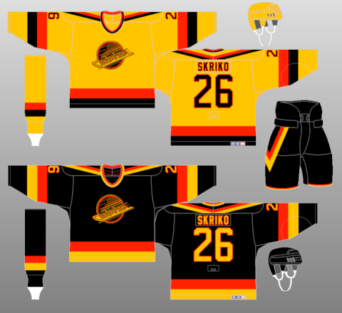
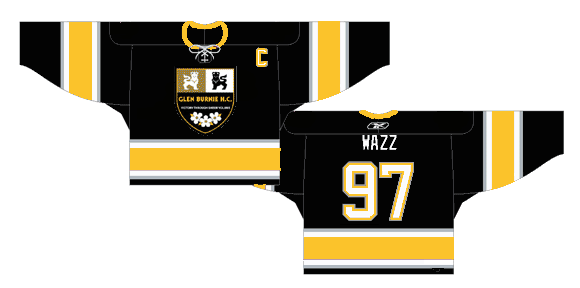
Favorites: Ottawa Senators 1930-31, Ottawa Senators thirds (black) 2000-07, Washington Capitals 1987-95, Phoenix Coyotes 1996-2003, Hartford Whalers 1992-97, Vancouver Canucks 1985-89 Baltimore Bandits 1996-97 (Honorable Mention: Glen Burnie HC 2005-07)
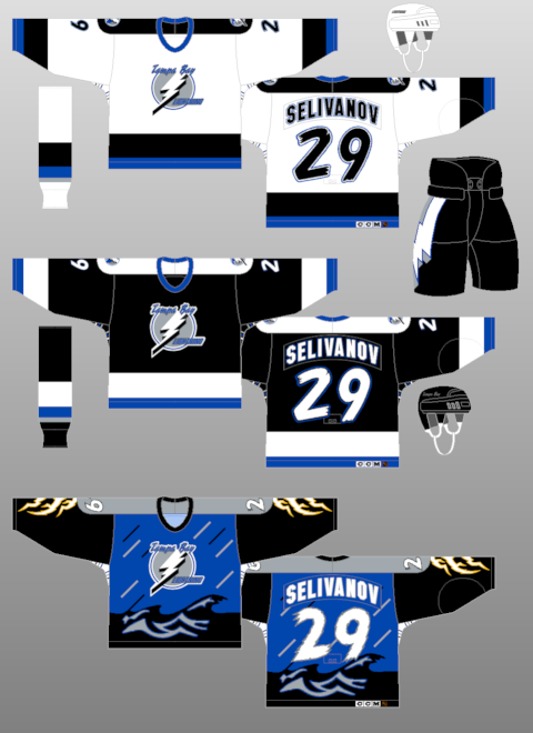
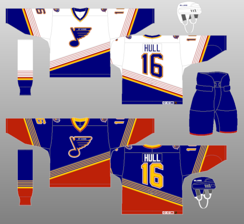
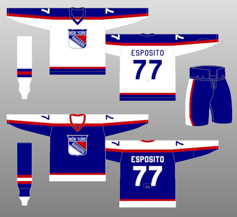
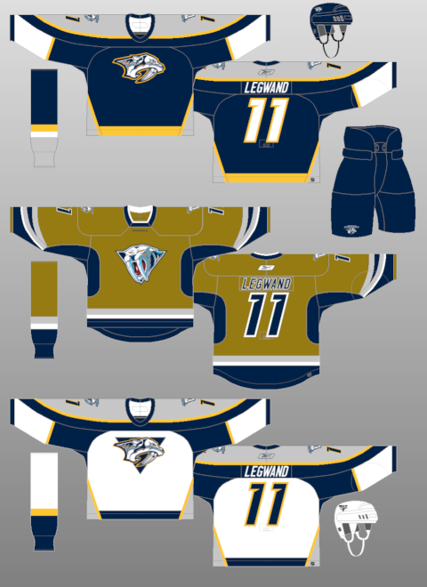
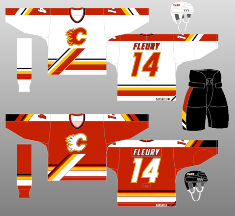
Not So Much: Buffalo Sabres 2006-Present, Tampa Bay Lightning thirds (storm) 1996-99, St. Louis Blues 1995-98, New York Rangers 1976-78, Nashville Predators thirds (mustard) 2001-07, Calgary Flames 1995-2000
But, as we all know-- it's all in the eye of the beholder. One persons trash is another person's treasure. Which is why many of the horrible jerseys and trends (Cooperalls) from yesteryear are so revered this many years later. Why else would the "Flying V" Canucks jerseys be ironically hip because of how terrible they were??
Wednesday, September 02, 2009
Flames Third and 30th Officially Revealed
The Calgary Flames join the long line of teams to hark back to the '80s with their latest third jerseys. Also, they officially unveiled their 30th Anniversary logo, which was leaked on their website last month.The jerseys themselves are classic. They are the original Flames wear and one where they had most of their glory days and when they won their Stanley Cup. Plus, it breaks up the streak of most teams donning the black third jerseys, like they did with their horse-head jersey back in the late '90s. It's the one I most remember of the Flames and will give the "'C' of Red" even more clout when they play in the Saddledome.
As far as the 30th Anniversary logo goes...I'm not too sure. It has the the silhouette of the downtown Calgary skyline with the Calgary Tower prominently displayed and the only red in the skyline. However, the large 30 in the logo is a bit off-putting. It doesn't really flow with the whole font or feeling of it to be honest. It seems to overshadow the design of the great logo, otherwise. However, if the team feels it's good, sobeit.As a whole, it's a passing day for the Flames. They put out a great jersey design, one of which many where waiting on for a while, and they have a semi-decent anniversary logo to go on throughout the whole season. It's better than most.
Labels:
Calgary Flames,
New Jerseys,
Retro Jerseys,
Third Jerseys
Friday, November 14, 2008
Canucks Third Baffles
The Vancouver Canucks officially released their third jersey this afternoon....and it's really uninspired. Basically, it's the same jersey design with a different logo and shoulder patches.
As you see Mattias Ohlund displaying the jersey, it's a modified version of the stick-in-rink design that they use on their normal shoulder patches.
Now, as I mentioned with the Bruins design, I don't understand why a team would have an alternate jersey the same color as the home jersey that is used, yet-- the Canucks have taken this to another level. Not only is it the same color, it's the same jersey. How is that an alternate?? How can you claim it as an alternate if it's the same friggin' thing?? At least the Thrashers made an effort to make some kind of alternate, as hideous as it may be.
The only really bold change to the whole jersey is that the white striping is thicker at the hem and arms, but that's about it. That's the only vast difference of the entire jersey set. People will still buy it because the Canucks fans like the stick-in-rink design that the team uses, but I don't see why they wouldn't have made that the logo when they came out with the redesign last season. It would have completely made it an epic win rather than have people wonder why "Vancouver" was put above the orca logo.
There have been some leaks to the San Jose Sharks third, but until there's a better picture, I won't be critiquing it as of yet.
As you see Mattias Ohlund displaying the jersey, it's a modified version of the stick-in-rink design that they use on their normal shoulder patches.Now, as I mentioned with the Bruins design, I don't understand why a team would have an alternate jersey the same color as the home jersey that is used, yet-- the Canucks have taken this to another level. Not only is it the same color, it's the same jersey. How is that an alternate?? How can you claim it as an alternate if it's the same friggin' thing?? At least the Thrashers made an effort to make some kind of alternate, as hideous as it may be.
The only really bold change to the whole jersey is that the white striping is thicker at the hem and arms, but that's about it. That's the only vast difference of the entire jersey set. People will still buy it because the Canucks fans like the stick-in-rink design that the team uses, but I don't see why they wouldn't have made that the logo when they came out with the redesign last season. It would have completely made it an epic win rather than have people wonder why "Vancouver" was put above the orca logo.
There have been some leaks to the San Jose Sharks third, but until there's a better picture, I won't be critiquing it as of yet.
Tuesday, July 29, 2008
Going Retro: In Design and Progress

It was brought about by Howard Berger of the Fan 590, but I read it from my good buddy (so I say to get better street cred) Greg Wyshynski from Yahoo, but some leaks have come out concerning the new third jerseys in the NHL this season. As you can see from the post, the lay out has happened for those teams.
First off, touching on the retro designs-- for me, it's a toss up. There are some that are really, really nice to hang onto and bust out on occasions, then there are some really bad one that become cool out of spite, with another section being very dull and uninspiring....like the Leafs one is; because be honest, there isn't much of a change between that and their current unis.
However, the retros better not too out of control. It seems that the MLB has been having a constant retro night for most of the teams. In fact, the Blue Jays have instilled a retro Friday, where every Friday home game, the Jays wear their powder blue uniforms. That's a little much for me, though some of the old MLB uniform are so delightfully horrible, they're classic.
Point is, the retro duds really should be used for special ocassions, while a new third jersey should be produced to make some kind of fresh look to it. It's not hard to make a "modern-retro" jersey-- just ask the Penguins and the Capitals. Both teams took an old design and updated it to make it a little more sleeker and with the times, as it were. All being said, I'd take the original Sabres logo over the Buffa-slug and Goathead anyday of the week.
Aside from the black alternate jersey trend that's happening again, it seems that teams are getting a tad lazy. With the Senators and Thrashers just using a wordmark as their alternate, it almost seems that the creativity has gone down the crapper. Especially considering both teams could have come up with uniform gold ("Gold, Jerry!! Gold!!"). Granted, the thought is that the new RBK Edge fabric really limits the ability to have anything elaborate on the uniforms themselves.
When all is said and done, at this point-- it's a wait and see. Much like the Edge uniform, all of these designs are speculation and may be able to change at a moments notice. Fun times in hockeyland when the uniforms are the hot-button issue.
Labels:
Atlanta Thrashers,
Buffalo Sabres,
NHL,
Ottawa Senators,
Retro Jerseys,
Third Jerseys,
Uniforms
Subscribe to:
Posts (Atom)