That logo above is for this year's Thanksgiving Showdown. To me, not only does it give the Bruins/Red Wings game a title, but it shows that the NHL love logos. They'll make a logo for any kind of event and will often make reasons to have their design team come up with something.
 With that in mind, and the fact we're awaiting the player draft logo for this year's All-Star Game, a list of my favorite event logos that the NHL has rolled out with-- in no particular order, of course. (Thanks to SportsLogos.net for all the logos anyone could ever ask for.)
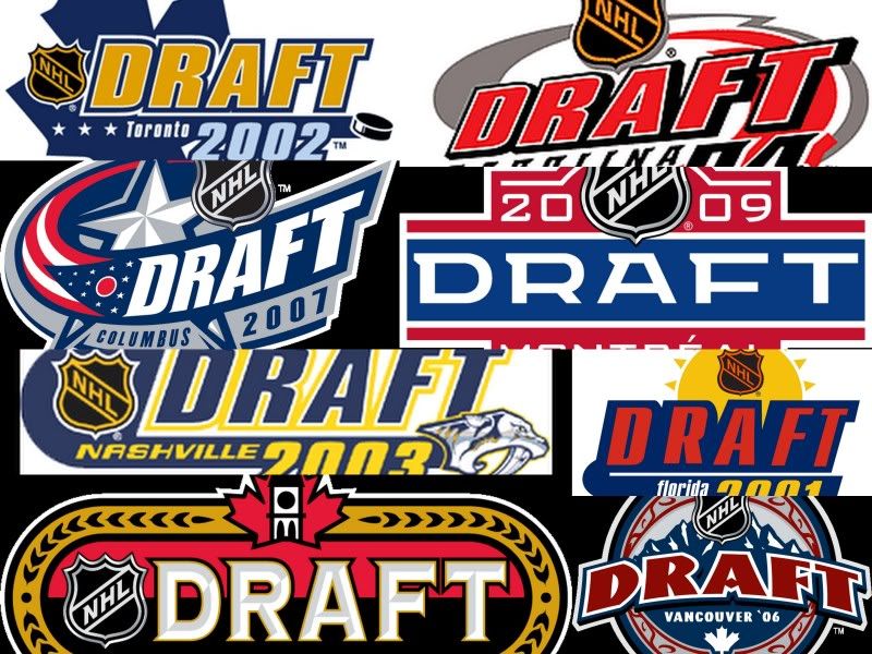
-Draft Logos 2001-2009: The reason these stand out is because there's not templated design like we see now. The identity of the teams were well represented in these logos, which gave it a personalized feel for the events in terms of the host city and allowed plenty of freedom for designers. Now, with the templated work they have now, it's basically just adding small elements of the host city in the already made main logo.
-2009 Winter Classic: While many of the Winter Classic logos do have elements of the host city into it, the iconic use of the Wrigley Field scoreboard helps set this one away from the rest. Plus, it's the only logo in the Winter Classic cluster that is tilted to give a three-dimensional appeal to it rather than just being flattened.
-1994 All-Star Game: New York City is one of, if not the most, iconic city in the world. Their skyline is one of the most memorable, so when you combine that with an All-Star logo, you're basically yelling for it to be a fantastic one. While the jersey selection disappointed, the logo itself is one of the more fantastic logos of any ASG.
But, I couldn't let the NHL have all the fun....
-1999 ECHL All-Star Game: Sure, it's not the NHL, but the incorporation of the coast line and the lighthouse element is pretty damn fancy for the ECHL.
-2011 AHL All-Star Game: Where to start-- the Bear slapping a Hershey's Kiss; the HersheyPark roller coaster coupled with the Hershey's chocolate factory, coupled with the Giant Center in the top silhouette; the team logo inclusion-- it all makes for a fantastic event logo.
Though, you always have to have a logo to show during the breaks and to promote a product (read: All-Star Fantasy Draft), some times it's a bit overkill....like this game and the event I mentioned in parenthesis. Yet, at the same time-- logo nuts like me will clamor for something like these to come out because we enjoy the aesthetics of it all.