Showing posts with label Hockey Team Identity Project. Show all posts

Thursday, February 24, 2011

Hockey Team Identity Project: Cincinnati Cyclones

After a hiatus, I've decided to try to resurrect this thing from the dead. With that, I've decided to go with a team that has a lot of resurrections itself, the Cincinnati Cyclones. You see, while the Cyclones have been around since 1990, the fact is that it has been three different franchises as a whole, starting in the 1990-91 season.

For some information, I turned to Sean Lynn of the Cyclones, who in-turn directed me to Jim Farmer, of the Society of Cincinnati Sports Research-- which is a group of Cincinnati sports fans and historians, who have done a lot to compile the history of their city and its sports.

"The first team played in the ECHL from 1990 to 1992. The club did very well so the owner, Doug Kirchhofer, applied and was excepted for an expansion team in the more visible International Hockey League," Farmer said. "The first Cyclones franchise was then relocated to Birmingham while the name, original logo and colors were shifted to the second incarnation of the Cyclones in the IHL. After a few moves to different cities, the first Cyclones team eventually landed in Stockton where they currently reside as the Thunder."

The colors of the team were carried over, which was primarily black, red, and gray with the logo being a goalie's upper body. The team in the IHL went from 1992-93 season until the IHL disbanded in the 2000-01 season. However, between then, the Cyclones did a little tinkering, switching to a Twister as the logo and mascot (of the same name) and adding yellow to their scheme, while damping the gray a bit.

The demise of the IHL and this second Cyclones did not last for long, as a new owner bought the two-year dormant Miami Matadors' franchise in the ECHL, who moved to Miami from Louisville and were known as the River Frogs.

"When the second club folded a new ownership group came along, bought the colors, team logos, nickname and a dormant ECHL franchise which began in Louisville," Farmer expained. "This ownership group moved the dormant franchise to Cincinnati and this gave birth the THIRD Cyclones team. This Cyclones team began play in Cincy for the 2001-02 season and is the current franchise that we know and love today."

However, it's not like the Cyclones had it easy in the Cincinnati market, as pressure from a higher league happened.

"This third Cyclones team DID in fact go dormant for the 2004-05 & 2005-06 season because they were in direct competition with the Cincinnati Mighty Ducks of the AHL," said Farmer. "But when Cincy lost their AHL club, the owners of the Cyclones (Nederlander Cincinnati) relaunched the franchise for the 2006-07 season. It has remained active since."

Even with all of that, the heritage of the Cyclones' franchise priors still remains.

Farmer divulged that the ECHL team statistics go back to the Louisville days, which is why some of the fans don't see their IHL favorites on the all-time stats list. However, Farmer did tell me that the numbers that the Cyclones have honored from all eras still remain honored by the 'Clones to this day.

Even so, the Cyclones have been through quite the cavalcade of jerseys-- including a fancy Reds jersey, to honor the MLB team. The jersey is also one that was worn by the twins in the great movie starring Seth Green and Shane McDermott, "Airborne."

Even more recently, the great Greg Wyshynski uncovered the latest viral hit from the Clones, which parodies The Lonely Island's, "I'm On a Boat."

Lynn did add one thing about keeping the name of the team, "The Cyclones brand is one that this market has thoroughly supported since day one. Changing it and alienating a loyal fanbase is not in anyone’s best interest. While staff, players, and even fans have come and gone, the Cyclones name has always been consistent in the Cincinnati Sports landscape."

Thanks again to Jim Farmer of the SCSR and Sean Lynn of the Cincinnati Cyclones for the information for this entry.

Friday, August 27, 2010

Hockey Team Identity Project: Milwaukee Admirals

As going with this whole concept, The Girl and I always try to go in behind the name, which has more often than not worked. This one should also go along with the idea behind the concept of starting this up. This one is especially interesting considering the city of Milwaukee is not known as a big naval center, like Norfolk is.

However, with it comes to the Admirals of Milwaukee, it really has nothing to do with the rank of Admiral. In fact, the name was brought about by one part of the original group of investors, Edwin Merar. Merar owned an appliance store and actually named the team after one of the appliances that was sold in his store. The first incarnation of the team started in the 1970 with a generic hockey player with a red, white, and blue background and "Milwaukee Admirals" around the border. The first "skating sailor" logo didn't come into play until 1977 when they moved into the IHL. As you see by this logo, the sailor does look a little dopey with the hat over his eyes, but it was beefed up in 1982 with the sailor looking a little meaner and bulkier.

The color scheme stayed red, white, and blue until 1998, when the colors changed to a burgundy, bronze, and navy scheme. The logo itself was reinvented to just a head-shot logo, with a more pronounced hat onto of his strong-jawed head. While the jersey design prior was plain, the new colors brought in a new scheme with a wave design along the hem of the jersey, which was more solidly done than what the Islanders did with their fishermen gimmick.

One interesting thing about the Admirals happened when they came into the AHL in the 2001-02 season. The Admirals were a part of the IHL teams that moved to the AHL, but there was already an Admirals place in Norfolk who had arrived to the AHL one year beforehand. Both brands where strong in each of their markets, but was there going to be any pressure for the new Admirals to change or would there be a CFL situation where there were two teams with the same name at the same time??

"There was no pressure to change our Admirals name when we came into the AHL," said Tim Van Wagoner, Director of Marketing for the Milwaukee Admirals. "Maybe if we were in the same conference with Norfolk it might have been a different story."

So, there you go; the league could be able to co-exist with two teams with the same name around. And it worked well for the Admirals, as they saw success in the new league and it got them a Calder Cup championship within two seasons of being in the AHL.

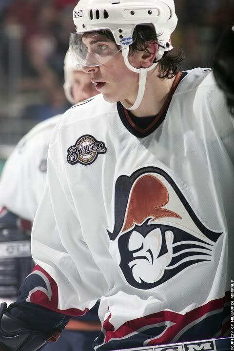
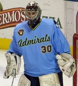
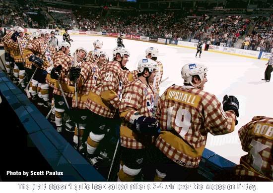
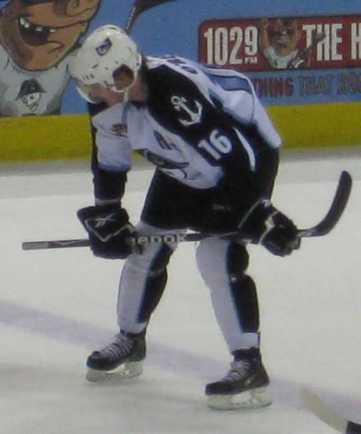
One interesting thing is the inclusion of the Milwaukee Brewers logo on the jersey seen here and here, with many Brewers themed nights, as seen in the second picture. That's because the investment group that owns of the Admirals consists of many in the Brewers organization, including Brewers owner Mark Attanasio, Brewers assistant GM Gord Ash, and former Brewers pitcher Ben Sheets. The Admirals got very much into the Brewers theme, having a night dedicated to Brewers announcer Bob Uecker, which brought about some of the most memorable jerseys ever to grace the ice.

However, with the new ownership coming into play, there was a time for a dramatic change to happen for the team. For years after they went with a theme close to red, white, and blue; the colors changed to black, white, silver, and ice blue. Moreover, the logo went from the actual human Admiral, to a skeleton in full Admiral attire. While the change was one that was a bit of a head-scratcher, it was all boiled down by Tim Van Wagoner

"We felt like we needed a new logo when ownership changed. Our new look is meant to stand out and cut through clutter, and appeal to the merchandise buying public, like teens and tweeners," Van Wagoner stated. "We sold more in the first month than the entire previous year and see our stuff around town frequently."

To go from a pretty well established brand in Milwaukee for close to 30 years and see the change be accepted that quickly shows how a drastic change can appeal to another demographic as well as the demographic you had following you previously. Plus, their jerseys have quite fantastic appeal-- with a set in ice blue, silver, white, and recently black. While the jerseys are pretty snazzy, the one thing that does irk me a bit is the socks with the vertical stripe. Maybe because it's new, but I've never been a fan of the vertical striping on the sock, even when it comes to the national teams.

As a whole, the Admirals scheme is a solid one, even if they did pull of a drastic change from what built up their identity. It has worked for them and seems to garnered new attention from a new fan base, which is something that feeds the identities in the first place.

Thanks to Tim Van Wagoner, Director of Marketing for the Milwaukee Admirals for helping with this piece. Head to MilwaukeeAdmirals.com for all information for the Admirals.

Wednesday, August 18, 2010

Hockey Team Identity Project: Florida Everblades

When The Girl and I were talking about doing this, the idea was trying to get an idea on why names were the way they were. While most in this project have been "Name the Team" contests, sometimes they seem to link into the location one way or another. This team is one of them, as the location of the ECHL's Florida Everblades is close enough to the Florida Everglades where the pun is solid and fitting.

"With the team being in proximity of the Everglades, the name formed along those lines," said Kevin Reiter, Broadcaster and Public Relations Manager for the Everblades. "It came from similar situations like the old Kentucky Thoroughblades."

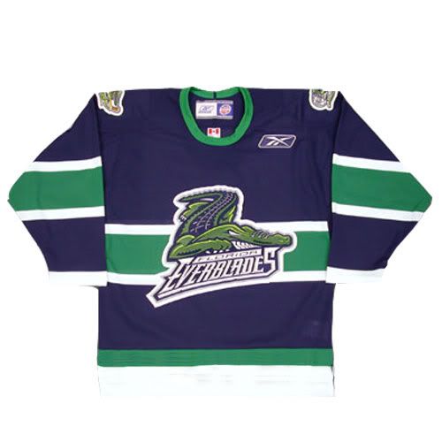
It may be an odd off-take, but it's something that is catchy and has obviously worked for the team, as the brand is one of the more noticeable when it comes down to it. In fact, only the Wheeling Nailers (1988) and South Carolina Stingrays (1993) have been in the ECHL longer than the Everblades, who have been in the league since 1998. The 'Blades have even used the same logo and color scheme throughout their entire tenure.

"The blue and green colors come originally from our affiliation and ownership being the current Carolina Hurricanes and old Harford Whalers. When our team was first introduced we played off the Whalers blue and green colors," Reiter informed me. And I must say, the blue and green combination is underused and a sharp look for most teams who do use it.

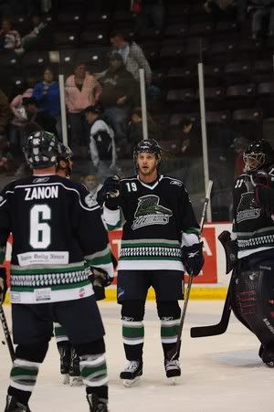
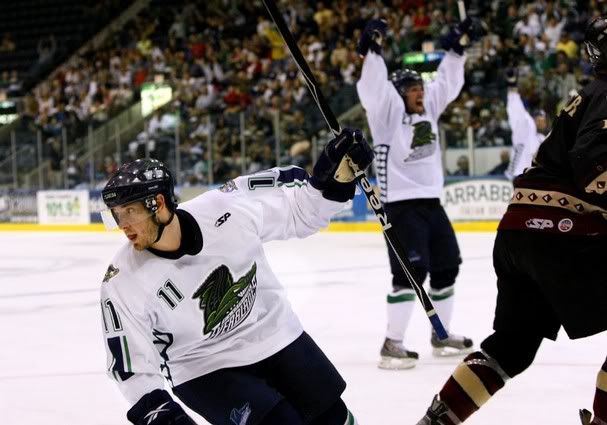
The jersey schemes they have used are very interesting. They currently use something similar to their parent Hurricanes, with the piping around the shoulder yoke, as well as alligator teeth along the hem. In the past they have done something similar to the Montreal Canadiens' scheme with the stripe across the middle, as well as template like the Nike Swift Olympic jerseys that many countries have used in the past, but with teeth under the arms. Even so, the colors and logo stay the same. At the start, they obviously used something like the Whalers used to use in the template.

I think the amazing thing, especially with the changing landscape of minor league hockey; the 'Blades never really compromised for their brand; logo and colors. Sure, their jersey schemes have changed through the years, but the basic principle of their identity has stayed in tact and really should be the blueprint for most minor league teams when trying to be successful.

Thanks to Kevin Reiter for the information on the 'Blades. Visit FloridaEverblades.com for all things to do with the 'Blades.

Sunday, August 08, 2010

Hockey Team Identity Project: Toledo Walleye

Thanks for the Girl reminding me, she put up another issue of the HTIP chronicles. This time, one of the newer teams on the block with an interesting name, for sure.
Meanwhile, a new name needed to be chosen. It seems the Mud Hens had been considering owning hockey and arena football teams for a while, and had actually registered the name "Walleye" with the US Patent and Trademark Office back in 2005, before they'd even purchased the hockey team. As for their arena football team, they pursued the name(s) "Woodpeckers" or "Peckers" or "Peckerheads". I kid you not. I know that doesn't have a lot to do with hockey or the Walleye name selection, but it is funny.
The rest, you can read when you click this different colored, underlined link. Though, she did steal one team that I love the jersey of.

Wednesday, July 28, 2010

Hockey Team Identity Project: Wheeling Nailers

Because I'm a silly goose, I retweeted Captain Hammer's latest HTIP, but never cross posted it here. But, it's a story about not only intertwining history, but also how the team had to change it's name for some reason.
The team began in 1981 as the Carolina Thunderbirds out of Winston-Salem, North Carolina. At the time they were part of the now-defunct Atlantic Coast Hockey League.The Thunderbirds moved to Wheeling, West Virginia in 1992. Apparently then there was a copyright dispute with the Seattle Thunderbirds. This seems quite strange to me, the Wheeling Thunderbirds' logo was nothing like Seattle's, and teams share names all the time--Rangers, Bruins, Wolves, Chiefs, and Americans just to name a few--so I don't know what the dispute was.
To find out how the new name was gotten and how it ties into the city of Wheeling-- click this direct link for it all. I'm sad to see it wasn't named after my former accounting teacher at MSJ, Jerry Naylor. If it had, the shoulder patches would have "Debit" on the left shoulder and "Credit" on the right shoulder.

Monday, July 26, 2010

Hockey Team Identity Project: Reading Royals

For this installment of the Hockey Team Identity Project that Captain Hammer (with a great history lesson on the Wheeling Nailers) and I are undertaking, I went to a particularly interesting case in terms of marketing and branding. For the Reading Royals, they prove that building the brand is something that is much more efficient than aligning with the parent team.

To start it off, the Royals are the reincarnation of the Columbus Chill, who voluntarily suspended operations to make way for the Columbus Blue Jackets. In the 2001-02 season, Reading was the spot for them, with the Royals name coming down from a Name-the-Team contest; but it was a solid choice. The name went in line with the affiliations they had, the Los Angeles Kings and Manchester Monarchs-- why not have the Royals as the three jewel in the crown, so to speak. The Royals went into the color scheme of having black, purple, and silver, again going along with the affiliation scheme.


The affiliation between the two went very well, but in 2008; the Kings went to the Ontario (Calif.) Reign as their top ECHL affiliate, but used Reading as a secondary affiliate. The Toronto Maple Leafs came in to become the primary affiliate for the Royals. In 2009-10, the Boston Bruins came in to be the secondary affiliate to the the Royals.

With two teams that don't have the same color scheme of as what you have now, what's a team to do?? The Royals decided to keep the name, logo, and colors they had always had, which was different from the teams they were affiliated with. Why, you may ask?? For that answer, I went to the Royals General Manager, Gordon Kaye for some insight.

"If you were to change the colors or name, you'd be throwing away seven years of brand away along with it," said Kaye. "People in Reading know the black, purple, and silver and equate it to the Royals. There's no reason to to force yourself into rebuilding what is already a good, vibrant brand when people in the area are already familiar with it."

That's not to say they didn't think about changing things around.

"We spent a lot time thinking about maybe going in a different direction, but in the end; we didn't want to lose the brand equity we had built up already. People know the name, know the logo, know the colors-- we aren't going to throw that away," explained Kaye.


This piece gave an inside look at how things go down and the process that happens should a parent affiliation decide to leave the minor league club. While you may think that some teams change just for the sake of change; it's good to know that the fans and the brand that has been instilled in the community were taken into consideration. The old adage hold true in this instance-- you don't throw the baby out with the bathwater.

Thanks to Royals GM Gordon Kaye for taking time out and provide information about the Royals history and the process that went along with it. Go to RoyalsHockey.com for more info about the Royals.

Wednesday, July 21, 2010

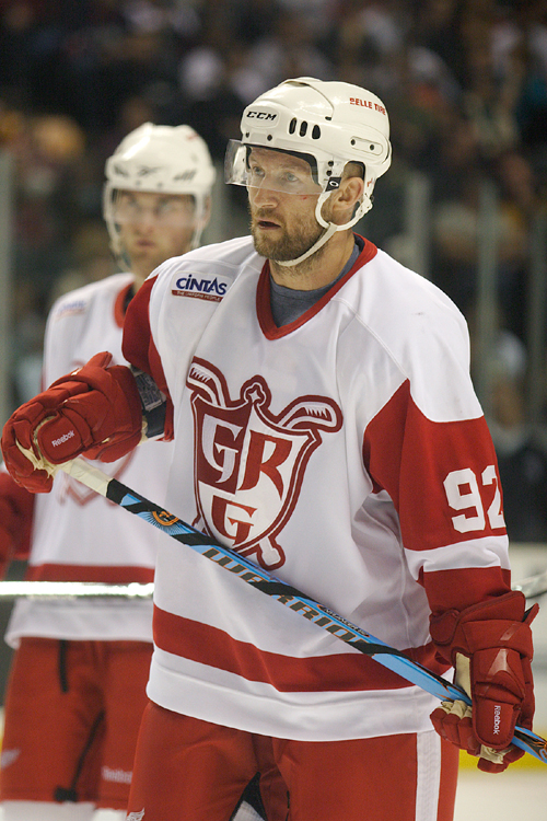
The Hockey Team Identity Project: Grand Rapids Griffins

With this installment of the HTIP, I've decided to go to a team who has kept the same identity though a merger/takeover, but only accented their look a bit when they got an affiliate who's colors were somewhat different to the team's original identity. This time, we're looking at the Grand Rapids Griffins and how they were able to blend in the theme of a parent club without compromising the original identity.

The Griffins' owners were awarded an expansion franchise by the IHL in fall of 1995. The team then went with a "Name-the-Team" contest, which drew thousands of entries. The name Griffins were on multiple entries and thus the name was born. The griffin is a mythological creature with the body of a lion, but head and wings of an eagle. When I asked Senior Director of Public Relations Randy Cleves about it, he said that the ownership thought the griffin's traits of being fierce, tough, aggressive, smart, and a bit of a smart-alec transferred very well to the identity of a hockey team.

The Griffins then had to turn to a logo, which was made by Sean Michael Edwards Design, which is based out New York. Edwards' design depicted the spirit of the team name properly with logo' giving it a fierce look while giving the elements of the mythological creature a modern feel to it. The original colors of the Griffins were navy, green, gold, silver, with red accents to the logo. That was the scheme that was used when the team entered the league in 1996, up until the end of the 2001-02 season, as seen below.

For the 2002-03 season, the Griffins dropped the green accents are added more red to them, as they had an affiliate with the Detroit Red Wings. The Griffins even started to incorporate the parent's team identity with an alternate jersey what was like the Red Wings, but with a whited-out alternate and primary Griffins' logo and jersey to match that of the Red Wings. Even so, the Griffins kept their identity from day-to-day, even though the red in the pants stand out from the rest of the navy motif they have for themselves; seen below.

While they may have changed a bit, it wasn't as drastic as many others that have come over from the IHL, though the Chicago Wolves have pretty much stayed the same, as have the Manitoba Moose. Either way, the unique name that ties into a solid mentality; plus a color scheme that gives the team their own identity while blending in the parent affiliation makes for a solid identity and one that people won't confuse for another.

Thanks again to Randy Cleves, Senior Director of Public Relations for the Griffins for the information. Check out GriffinsHockey.com for more info about the Griffins.

Thursday, July 15, 2010

The Hockey Team Identity Project: Regina Pats

Well, the Girl did it again-- going with the WHL again and head up with the Regina Pats.
As for the name, it comes from the Princess Patricia's Canadian Light Infantry battalion. The regiment was founded in August of 1914, as World War I was underway, Captain Andrew Hamilton Gault was willing to provide $100,000 to finance and equip a battalion for overseas service. The rest of the cost of building the regiment was financed by the Canadian Department of Militia and Defence. The existence of the Regiment was approved by the Governor-General, His Royal Highness, the Duke of Connaught.

Lieutenant Colonel Francis D. Farquhar was the Duke's military secretary suggested the new Regiment be named after the Duke's youngest daughter, Princess Patricia of Connaught. The request was sent to the Princess and she gave her permission.

When the junior hockey team was introduced in 1917, they chose to honor the Infantry battalion by selecting the same name. In fact, the modern Regina Pats still have the Regiment's insignia as their shoulder patch.
To read more and to find out why they use a bulldog-- CHECK OUT THE LINK!!

Friday, July 09, 2010

The Hockey Team Identity Project: Bridgeport Sound Tigers

Like was put forth by The Girl in her look at the Tri-City Americans yesterday, the key for this project is to get more inside the name of some of the unique team names. If anything, the Bridgeport Sound Tigers encompass that in that they have a very unique name and identity. In fact, so much so; many people think the location of the team is Bridgeport Sound, much like Owen Sound of the OHL. However, the city of Bridgeport is it's own entity, yet the name does have to do with a sound.

For this, I went to the Bridgeport Sound Tigers and got a great response from the Sound Tigers' Marketing Assistant, Mr. Tom Morris. The insight he provide from the team's name and how the color palette today came about.

When it came to the name, it's broken up in two bits. First, the Sound part of it has to do with the Long Island Sound. "The Sound, as it’s commonly referred to around here, is a huge part of the city’s economy and serves as the link to Long Island. We have been affiliated with the NHL’s New York Islanders from day one, so this stresses the link between the two organizations." Morris continued with the Tigers side, "Tigers are the key attraction at Bridgeport’s Beardsley Zoo and are also symbolic of the Barnum and Bailey Circus, which began in Bridgeport. P.T. Barnum is an iconic figure here and even served as mayor of Bridgeport at one point."

So, the name serves a very historical and symbolic pattern to the team and area. It's very apropos when including the Sound and having the symbolism that links Long Island and Connecticut, much like the Islanders connect to the Sound Tigers. While I'm sure I had some kind of idea of the Long Island Sound being a part of it, now that I definitely know about it-- makes it that much more awesome of a name.

Many of you may or may not know that the Sound Tigers were the first team on BroadcastMonsters.com and the old BCM Hockey Network that the Face Off Hockey Show is apart of and still is, though under the new All-In Broadcasting incarnation. When the team first started, their jerseys and color scheme was very unique and while they were connected with the Islanders, didn't have much of an Islanders trace to it, as shown below.


(Photo from "OneTigerFan" Flickr account via Google Image Search)

However, that's when the Sound Tigers were working as an ownership independent of the parent team. Morris went on to talk about why the team changed from that motif to a the color scheme closer to the Islanders.

"The change in colors came when the Islanders owner (Charles Wang) purchased our team, as well. The idea was to emphasize the affiliation to the benefit of both organizations, building the Islanders fan base in Connecticut and cross-selling the minor league team to die-hard Islanders fans who want to keep up with the team’s prospects. We tweaked our colors last year ahead of the Islanders upcoming change to new vintage-themed uniforms."

That change you can see on this photo below this text.

With all of this, the Sound Tigers seem like the perfect fit to this project. The name is something that many people may seem silly, but when you dig deeper into it, the meaning of name is a perfect fit to not only the affiliation, but the town as well. These are the connects that will mean much more than having most fan voting systems to pick names.

Much thanks once again to Tom Morris, the Marketing Assistant for the Bridgeport Sound Tigers. For more information, head to SoundTigers.com for all things Bridgeport Sound Tigers.

Thursday, July 08, 2010

The Hockey Team Identity Project

One day, during our splendid G-Chat conversations, The Girl and I thought about doing a project together, dealing with the identity of certain hockey teams. From the name to the logo, even to the color scheme; we wanted to know why they chose what they did to make their "brand." Now, NHL teams are easily accessable when it comes to finding out where the name and colors came from, so we decided that we would do the minors and junior hockey to find out what happened where.

My first piece should be coming out next week, but The Girl got right to it, starting off with her team-- the Tri City Americans.

Obviously, on this blog, I have to start with the Americans. Bear with me, it's not anything terribly unique or unusual, there are several other teams named the Americans in North America--Rochester Americans (AHL) who go by the annoying nickname "Amerks". Don't know why, but that IRKS me...heh. There's also the Allen Americans (CHL), who have a bitchin' logo.

The Rochester Americans have been in existence since 1956, to my knowledge the first to use the name "Americans". One of the more famous Amerks alumni being none other than Don Cherry himself. So how did our lovely team get the name Americans? The name came to be when the team moved to Tri-Cities in 1988, but that was not the beginning of this organization.....

For more on her piece, which is very well done, check it out AT THIS LINK and enjoy.