Showing posts with label RBK Edge. Show all posts

Friday, February 04, 2011

Friday Five: Skating and Fighting are Two Things Goalies Do

It's been quite the odd week coming out of All-Star Weekend, which seemed to give a nice punch in the arms to the traditional ASG. Plus, we saw others going back onto the IR after another a poor decision-- which is something you could say throughout his career.

1. Rick DiPietro is back on the IR with facial fractures and knee swelling. How's that make everyone feel??

You have to feel bad for DiPietro, but when you see him make a poor decision like fighting with 17 second left in the game-- you kinda knew something like this would come from it. The knee swelling is nothing new, though and odds are he would probably be out a bit from that, but when he got lit up by Brent Johnson-- you knew it was just a matter of time before this news would come out. Worse off, Evgeni Nabokov still sits-- which maybe isn't a bad thing. As friend of FOHS, Anthony pointed out-- Nabby could ruin the Isles lottery chances if he played out of his mind and got the Isles on a little run-- which would make the Isles fans hate him more.

2. Which was more unlikely to see-- goalie race at the skills competition or the goalie fight??

Both are very rare and should be looked at in awe. However, it's more likely to get the goalie fight than to have a goalie race, that is only one race and happens once-a-year, if the Olympics to see. Even so, unless the games get out of hand-- we won't get a goalie fight in the NHL all that often, because we haven't seen one since 2007 in the regular season. Oddly enough, I liked both sides of things, but the race was more of a dance-off, where the fights are actually settling things once and for all. But the goalie race is all but a guarantee for ASG weekend now, but goalie fights are much more unlikely in the NHL.

3. After this All-Star Weekend, how much more of a change can we expect out of future events??

There will probably be some adjustments to some of the events during the Skills session, but in the end not much will be needed to be changed. The NHL did a lot of tinkering and it seemed to work on an idea that many hate because of the fact it's not real competition. When all is said and done-- the atmosphere was right, the festivities were great by all accounts, and things worked out well. To be honest, I believe you have to have the ASGs in places that are not hardcore hockey moments,

4. With the retirement of Craig Conroy, have we seen the last of the non-cliched players in the league??

I don't think we'll see one that was a good as Conroy. We have the Sean Avery and BizNasty types, but people hate him. It'll be a long time before we see a likable guy who doesn't throw out cliche lines again. With all the media training some people get in juniors and such-- a lot of guys lose their personality and only the muckers and grinders have personality-- but not many care for what they have to say because they're trying to put themselves over. Maybe PK Subban will carry the torch, but odds are he'll get roped in before he could actually make the dent Conroy did.

5. While the Bolts jerseys are getting pans and praised-- are there any jerseys that you hated or liked, then had a change of heart??

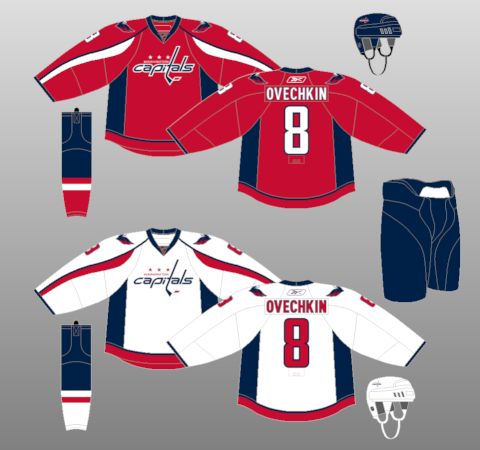
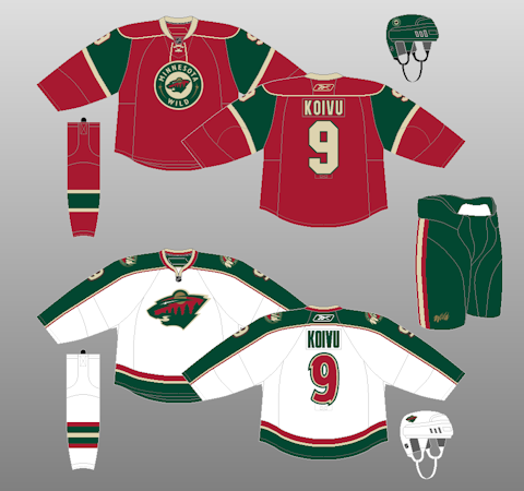
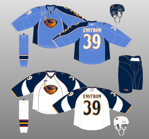
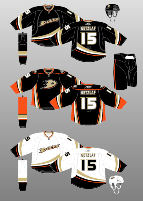
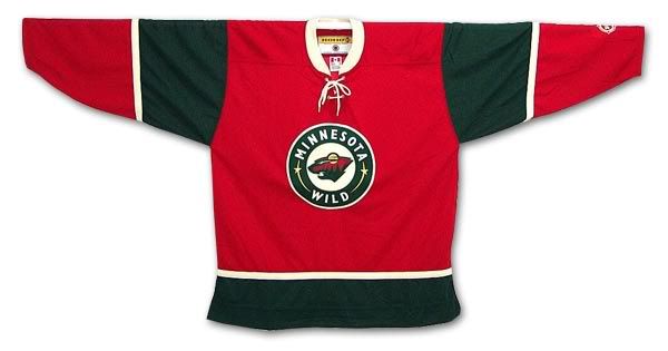
First and foremost, I hate the Caps new Edge jerseys when they first came out; as I mentioned when in Sombrero Guy's hotel room before we went to the Draft in Columbus. Yet, I love the Caps unis, especially the weagle patch. I think I finally came around to the Minnesota Wild's Christmas jerseys they use, as I did with the Atlanta Thrashers' baby-blue jerseys with the one-sleeve. At first I liked the Ducks' jerseys when they dropped the "mighty"-- but I turned on them when I thought there were really plain and then realized their alternates are what they should have done. Pretty sure that's all, but probably much more.

---------

And that's another week in the books. If you have questions or idea-- email me Scotty.Wazz@Gmail.com and give me some ideas or whatever. If you don't-- same clap-trap you get every week.

Wednesday, November 24, 2010

Mascot Off To A Booming Start

This is Boomer. He is the new Columbus Blue Jackets' mascot, but only when they wear their spiffy new third jerseys. According to CBJ's press release, this is the description of Boomer:
Also during the live unveiling, the team introduced a second, kid-friendly mascot, "Boomer," a cushy cannon character with a friendly face and fluffy moustache. This season, Boomer’s game-night appearances at Nationwide Arena will be reserved specially for those games in which the team wears the Third Jersey. Boomer will make his first start in conjunction with the official on-ice debut of the Third Jersey this Friday.
The jersey itself is something that I don't like, mostly because of the fact of navy blue being the new black in third jerseys, being overused. Plus, the logo seems to be overused with the logo being surrounded by text; however, I enjoy them keeping with the Civil War theme, so you have to like it, even though it looks a bit plain. It also incorporates the initials on the back neck line of former owner John H. McConnell, as the back neck line is another thing teams are using a lot of.

Yet, the big pull is Boomer....who, let's be honest-- looks very much like a penis. The jokes are just there, only with looking at the thing, the Face Off Hockey Show and Lyle Richardson of Spector's Hockey did 15 minutes of innuendo jokes on the November 24th show and it's been joked about on the Twitter, too. The question is how does this get through the marketing department without someone actually saying, "Hey, this could be a little racy." Not only did it have to get through the Jackets' marketing department, but it had to get through the NHL, too.

The shape itself and and the wheels on the side speak for itself, but the moustache is the real kicker. It's definitely something that will be (cannon) fodder for the short time until the novelty wears off (maybe), but you have to hand it to the Blue Jackets for thinking outside of the box....so to speak. They're going with two crazy mascots: A "bee" who gets mistaken as a fictional blue jacket bug because of the name and a cannon that looks sexual in nature and could have many lewd jokes made about it.

Tuesday, September 28, 2010

What's in a Nameplate??

As many of you who have followed this blog know, I'm kind of a fan of the aesthetics of a hockey team. It's part of why I started the Hockey Team Identity Project with The Girl. Now, you all know about my gripes about front numbers, templated design, and unnecessary piping on the new Reebok Edge systems, as I have voiced my displeasure on The Show and here. However, there's something new that's popping up that's starting to become my top annoyance, and it's really showing through in the new Canadian Hockey League third jerseys coming out.

Mismatched nameplates.

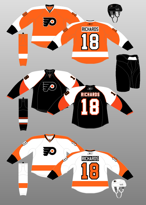
Now, this first came out with the Philadelphia Flyers presenting their third jerseys, which was a homage to their old jerseys in the 1960's and 70's, but they added the touch that wasn't there. Putting a white nameplate with black lettering on the orange jersey. For their Winter Classic jerseys, they put a black nameplate with white lettering on their white jerseys; which has now become their new jersey designs starting this season. While it's something that may not be too bad, considering it hadn't happened in a long while....or ever in the NHL (lack of fact checking makes me say that), it seems that it's gone above and beyond overkill now in the CHL.

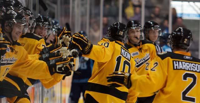
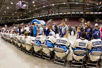
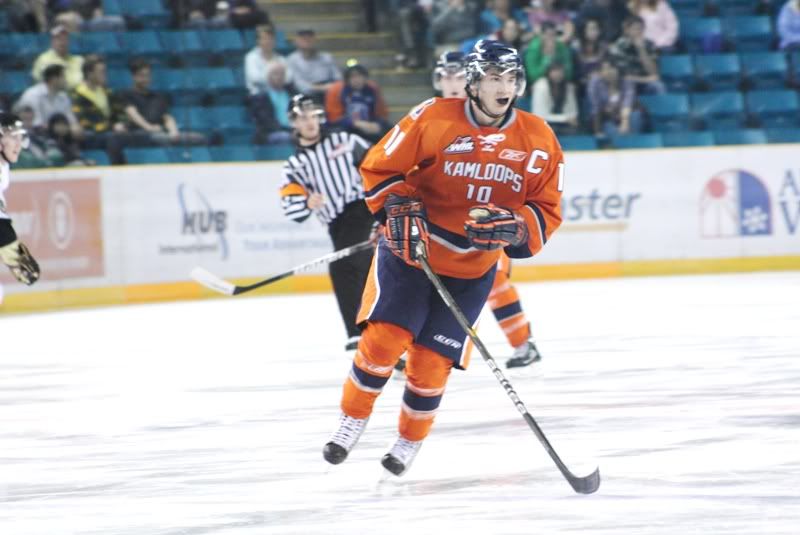
The CHL instituted third jersey for this year and so far, there's far too many teams using this new gimmick. The Kootenay Ice (pictured above) is one of the first, while the Kingston Frontnacs and Mississauga St. Michael's Majors have also instituted the contrasting nameplates. All the while the front numbers make an appearance with the Kamloops Blazers' third jerseys; but some teams like the Kelowna Rockets and Tri-City Americans have some kind of sanity when it comes with their new third jerseys.

But with the nameplates, I don't get the whole ordeal. To be honest, I don't think there were many teams who used it when they first instituted the rule of having names on the back of jerseys. It's almost like the ties on the collar, it creates a retro kind of feel, without actually having to deal with the heritage of a team. There's times where it's a neat idea and some times gives the look a very unique feel, but to do it in an overkill way kills any kind of uniqueness that a team could have by doing it.

Maybe, just maybe-- this will be the last of the craze, but at the same time-- I'm sure this could be the beginning of a trend that will rank up there with bad ideas. I understand that people do like the retro feel of some jerseys; but in the end-- to put unnecessary retro themes on teams that aren't really that retro (Kootenay was founded in 1996 when they were in Edmonton). It's to the point where you should almost have an unwritten rule of jerseys and how the make-up of one could be-- like if you've only been around for a decade, make something to not stray too much from the current identity; while a team that's been around for 25 seasons can actually make some retro designs for the years they've attributed into the league...or something.

In any case, I'll be hating this just like all the other stuff the Reebok Edge has given us.

Tuesday, November 24, 2009

At Least They Didn't Put "FLA" On The Front

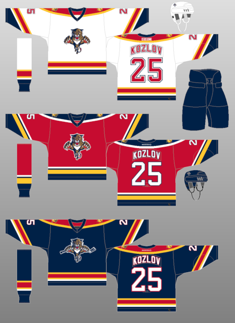
The Florida Panthers revealed their third jerseys on Monday night and it's....different.

As you see, it's got the mix of navy blue and baby blue and kind of rips off both the Pittsburgh Penguins thirds and the St. Louis Blues' third. So, as you can tell-- the creativity machine has been put into retirement with all of this coming to a head.

The logos themselves-- I have to say I enjoy the stylized panther-head logo. It's a little more sharper and modern than what they have on their regular jerseys. However, the sun logo with "FLA" on the shoulders....not a fan. Not only is it an eyesore to me and very out of place with the yellow sun standing out on the shoulder yoke, the FLA looks way too big for the logo and just not flowing with the rest of the scheme.

For a team who used to have a bitchin' red jersey design and solid foundation for jersey awesomeness; the templated piping with their Edge jerseys and unoriginality of their third jerseys, this is an ultimate example of horrific things can get if you don't have the best marketing team or any desire for creativity.

Though it just shows that blue is the new black. This year alone, the Predators went to a whole blue motif, the Avalanche going with the blues, combined with the other blue thirds out there (Blues, Sabres, Canucks, Pens, Isles, Oilers)-- it seems that any shade of blue is something that teams want to go to. You can bet the Capitals would have blues as a third since they don't have anymore options to go to, as well as the Rangers would probably go to a navy options like they did back in the day.

But in the end, there's more bad than good when it comes to the Panthers new thirds. It's something that could have been done a lot better, maybe even bringing the team back to their days of glory, when they made the playoffs and turned a lot of heads. Sadly, it's all for naught.

Thanks again to NHLUniforms.com for the image direction.

Thursday, November 12, 2009

Definition of "Meh"

As speculated months ago from my post about the Death of Creativity, the Colorado Avalanche unveiled their third jerseys and it was the same design as was speculated. Very meh and very underwhelming considering the leaks that came out and the lack of disagreement upon the leaks. It almost made this unveiling something we were waiting to get over with.

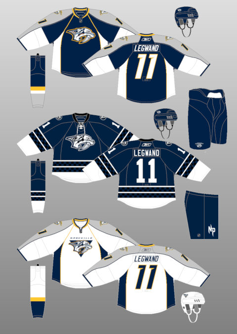
Another "meh" looking design is the next slated third jersey coming out, which is the Florida Panthers on the 23rd of this month. The Panthers are putting out strategic leaks, including the new crest on the jersey, as well as someone from the CCSLC posting a picture of part of the new third. And I have to say, I'm a bit underwhelmed by this, as well. I mean, the Panthers already have a navy jersey, and templated at that. You'd think with their old school red jerseys when they first busted onto the scene, they'd revert back to that color. It almost doesn't make sense to have two navy jerseys-- kind of like the Bruins having a black third jerseys with their black home jerseys. Same with the Predators this year and their navy third jerseys. Usually a third jersey is something completely different from the regular sets.

The entire third jerseys unveiled this year isn't that radical at all. They are kind of going through the motions and are just putting out something just to make some kind of cash. The Wild's thirds are very meh, with the green-- and the Predators jerseys are nothing ground breaking. Maybe it's the Edge system that's handcuffing the teams, but when you look at the Blues thirds and all the retro jerseys that are around; they are able to make something look decent and profitable. It goes back to the creativity issue and why some teams are lacking it. Maybe make some of these designs from CCSLC or other boards a look and a chance. You never know how much of a hit these designs could actually be, because most people seem to like it when it's posted out in public.

Yet, in the end-- it's a cash grab-- let's be honest. Even if the minority of people aren't down with it, there's going to be a majority of people slapping some cash down in order to get into the trend of the new jersey buying. Sunrise, sunset.

Wednesday, September 09, 2009

The CHL Edge is Here

Today, the entire CHL rolled out their Edge jersey designs. I'll go league by league and you can take a look for yourself at the links attached, which will pop up so you could follow along.

WESTERN LEAGUE: While you have some teams that went through the templated designed (like the Lethbridge Hurricanes and Kootenay Ice), the fact remains that some teams actually stuck to their old jerseys, with maybe some piping here and there. The Everett Silvertips kept their forest design at the bottom, while the Prince Albert Raiders, Red Deer Rebels, Spokane Chiefs, Medicine Hat Tigers, and others kept their trademark look. The Kelowna Rockets stylized their look a bit, but kept rocking the Ogopogo with fantasticness.

The big leap could be the Calgary Hitmen, who will use just a black mask for their white jerseys and, while they keep sort of a template design, they have the team colors on part of the sleeve on each of their jerseys. It looks pretty fancy and pulls off well.

Best Look: Kelowna Rockets-- I have a soft spot for the red, teal, black, and copper look. And they didn't stray away from much of the original design.

Worst Look: Brandon Wheat Kings-- something about their jerseys are much too plain and look like a practice jersey. They could have done much more.

ONTARIO LEAGUE: In this instance, there's some spot of template designs, but it seems that some teams are willing to take some risks. Some took a little much, like Mississauga and the piping and name at the hem; and some took just right like the barbershop design on Ottawa's sleeves. The Brampton Battalion were able to keep their insignias on their sleeves, as well.

London and Kingston both went to retro designs from the 70s, I believe-- though I think Kingston's looks classier than London's, but that's because I hate the Stars design.

Best Look: Ottawa 67's-- something about the barberpole speaks to me, and I enjoy that they were able to do it so classily....though that's not a word.

Worst Look: Mississauga St. Michael's Majors-- The big "M" on it, along with the team name on the hem on the homes and city name on the aways; not to mention the piping-- it's just a jumbled mess.

QUEBEC LEAGUE: The Q could be the template capital of the world. There's too many jerseys that look the same, just paint-by-numbers attached-- it's horrific. Some teams like Rouyn-Noranda Huskies' gradients, the Gatineau Olympiques' bright orange jerseys, or Chicoutimi Saqueneens' shoulder-poles think outside the box to a point. Overall, there's nothing that's breaking too much away from the pack.

Again, some teams stuck to their guns with their old designs like Montreal Juniors and Quebec Remparts; but it just seems like a complete dulls-ville for the Quebec League.

Best Look: Cape Breton Screaming Eagles-- they don't have a template gig, plus they are going with classic colors of black and yellow in sort of a Bruins motif, but lighter on the yellow. Classy look for them.

Worst Look: Montreal Juniors-- with the college number system and too plain design, all they needed was unnecessary piping for me to hate them to death.

--------------------

So that's that-- the unveiling was nice, not too many leaks out there on the open market and in general, aside from the QMJHL, I'm pleased with what many teams were able to do with the perimeters. They were able to make or keep their old identity without blending in with other teams out there in the league.

Thoughts, ideas?? Leave them in the comments.

Tuesday, August 25, 2009

Wild-ly Dull

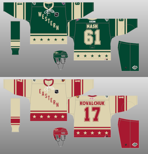
The leak is out for the third jersey for the Minnesota Wild by way of Icethetics. Essentially what the style is looks back to the Western Conference jerseys from the All-Star Game in 2004 when it was in Minnesota. However, it has a cursive script with Minnesota in the large letters and Wild at the bottom, which is the tail of the "a" in Minnesota....which doesn't makes sense because the end of the "a" has to double back in order to work. Also, it has the unneeded piping on the shoulders, which we all know I flipping hate.

As a whole, the style and look is classy. Minnesota is one of the area which is related to hockey and it's tradition. It's something that will keep the vibe there of a home-grown feel that the Wild seems to have with their organization and their fans. However, there's so much they could have done with the third jersey.

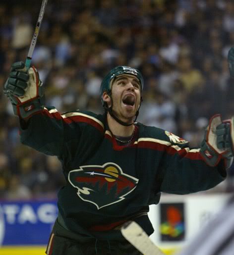
Of course, their last third jersey, which I like to think of as "The Christmas Jersey", morphed into their home jersey once the Edge came into play. This new jersey brought about the green feel they had when they came into the league. However, it doesn't have the pizzaz or eyecatching wonderment you often think about when it comes to third jerseys. The wordmark is overused and is a little "meh", especially when it looks just too streamlined when it comes to the color green. It's almost too much green in the scheme (poet and don't even know it) and makes me hate it. Green isn't my favorite color in the first place, but the Wild made it work with the gold and red accents they had in their old green jerseys. This just seems dull, out of place, and not something I will go crazy for.

Of course, this is just a leak and who knows if this is something to throw off the smell of the real jersey and what it could look like on the ice; but right now, I'm not a big fan of it at all.

Tuesday, August 18, 2009

Death of Creativity

If the above image is what the CCSLC and Adrian Dater are claiming to be the new third for the Colorado Avalanche....this could be the deathblow to the ideal of creativity of jerseys in the NHL and we shouldn't look forward to seeing any new, creative designs.

While I know that the "college" style of jersey and use of nickname/city name is in vogue for the NHL teams, I hate it. To me, it shows a bit of laziness on the part of the people who are putting together the jersey itself. I mean, not only is this lazy in terms of using a city name, but it's basically the Avalanche's old third jersey , but with color changes here and there. I loathe the Dallas Stars identity with "Dallas" on their jerseys; the Atlanta Thrashers atrocity speaks for itself, and while the Lightning and Senators hit it on the head in terms of jersey design, the use of nicknames when they could have done so much more with it makes me shake my head.

It just makes me wish for happier time where people were somewhat excited to see what a new third jersey could be. Recently, the use of nick/city name for the third jersey or a retro design shows that people within the organizations making up these third jerseys are just phoning it in and not really caring about what actually looks good, because they know it will sell. Once a third is on the market, regardless of how it looks, it will often sell hot when they reveal it and sell better than some other jerseys in the cartel. That's why we saw a lot of third jerseys become the regular jerseys in the pre-Edge NHL; like the Capitals black and coppers, the Senators reds, and the Stars star jersey to name a few.

Even the logos and jerseys that fail should be given credit for effort to think outside the box rather than be a cookie-cutter design or style. I mean, the Kings third jersey had a great logo for the Burger King, but the fact of the matter was that they were utilized horribly with the logo being on the top left hand side of the jersey. The Anaheim Mighty Ducks had Wild Wing bust out of the ice on the jersey and while it was campy and totally for kids-- it was something unique. In the same era, the Lightning's first attempt was something unique with rain and raging seas on their jersey. The Buffaslug was even something of a risk, which didn't pay off, but it tried to combine the era of the Buffalo Sabres to a hybrid, which has fallen short. While these jerseys aren't looked at highly in the court of public opinion, they took a risk and should be commended for trying something different and thinking outside the box. Hell, even the Blues un-used jersey was different, but horrendous at the same time.

While the marketing and creation (if they exist) departments of each teams should be definitely question in terms of decision making when making the final approval, you have to wonder how much input Reebok has on this whole process. It could be a long shot, but you have to wonder why we have gone from one extreme of teams taking a risk on something to just minimalist approach where it's just like creativity has gone out the door while we have much more technology and design tools than we did back then. It seems savvy to hate on Reebok for the Edge jersey and Nike for the Swift design.....but it could be a smoking gun.

I've spoke the praises of the CCSLC on FOHS and maybe on here, I can't remember-- but there are so many great designers with great ideas, why aren't their stuff picked up and ran with by the teams?? It's something that they may need to look into if things like this fail again. Especially with the notion that the Ottawa Senators may be changing their thirds to something that has been presented online from a designer making a mock-up.

If push came to shove-- I'd love to have 30 risks on the third jerseys and have all of them fail than one use of a wordmark if there's something that could be done. There's so much out there for some teams with their identity that they can create something spectacular, but more often than not they will play it much too safe and end up ruining something that could have been so great. Maybe I'm overreacting, but I'm getting tired of the laziness that recently has come about when it comes to third jerseys.

Sunday, June 28, 2009

Flags + Fire Reference = Flames Affiliate

The Abbotsford Heat, formerly the Quad City Flames and Ak-Sar-Ben Knights, are going to playing next season as the Calgary Flames affiliate. This past week, they put out their new identity which is something that was a change from the usual take the Flames jersey, paste a Flames-esque logo on the jersey, and play. Parts of that is true, but still.


As you see from the new set, the logo itself at the top is kind of....meh. Of course, the assumption that the Flames would bring back the old Atlanta Flames "A" for the jersey would have actually made sense and move some merchandise for those who love that logo and look for the Flames. In fact, looking at the logo-- it almost looks like it's a logo from a lacrosse team.

The jerseys are pretty much the Flames jerseys, but with the yellow in the Flames template being replaced with silver and the Alberta flag being replaced with the British Columbia flag, which make sense since the Heat will actually play in BC. I mean, I guess the scheme works, but you have to wonder....when has heat ever been silver?? I mean, I think heat, I think red, orange, yellow, and black as the aftermath. Maybe that's just me-- I'm old school like that.

As a whole, it's something we've come to expect from the Flames when it comes to their franchise affiliate and having something to do with the Flames name. It's been very rare that the Flames have had an affiliate without the matching named. I would have loved to see the flaming "A" on the jersey with like a Flames' template motif, minus the black on it-- just to see how it could hold up, but it is not to be. Once they take the ice, it'll be easier to judge, but now we have just take from this hope for the best later.

Friday, May 29, 2009

CHL Living On The Edge

Due to a small leak by the Halifax Mooseheads, it seems the Canadian Hockey League is switching to the RBK Edge templated jersey system. On Wednesday, the Mooseheads put up the screenshot above, which looks like it's the new Edge system design. This would make sense since most of the players from the CHL get drafted into the design in the NHL or get sent to the AHL, where they have the Edge design as well.

However, this irks me because this could be yet another way to go a templated design and have not any originality of it all. It also makes sense this would happen with the Windsor Spitfires switching jerseys mid-season to a design that is already in the Edge way of life, the Washington Capitals template. The Mooseheads are taking the Wild design and all kinds of fun stealing should follow I'm sure.

We'll keep an eye on this because I believe the CHL could be some of the best jerseys out there in the hockey world and who knows what kind of awfulness could come from this whole switch to the new streamlined designed of uniform system.

Thanks to "Dante X" at the CCSLC for the catch of design change.

EDIT: As I was looking more through the CCSLC, the London Knights have gotten a new retro logo for their jerseys next season. In the press release, it also says that the CHL and Reebok have the jersey agreement that can't be revealed until September. Fun.....

Wednesday, January 14, 2009

Around The Rink 01.14.09

-So, Brendan Shanahan has finally signed a deal with the New Jersey Devils, which will see him paid $800,000 divided by two, since we're in the halfway part of the season. While we can only wonder how much rust is in Shahahan's gears-- you can only hope he can help with some secondary offensive punch and get some leadership in the room while Marty Brodeur continues to sit on the sideline.

-The World Juniors could be the new way for drafted junior players stuck in Europe to get over and play in North America, should they have a problem with their club team. Point in case, Mikael Backlund, who played for Team Sweden last Monday, the Calgary Flames last Wednesday, and now has settled in Kelowna of the WHL. While his Swedish club Vasteras wasn't too keen on the idea, they, along with the IIHF and the Swedish Hockey Federation, signed off on the transfer for Backlund to play in the Dub. I'm sure it's a coincidence that Backlund's coaches had criticised him before he headed off to the WJC for his play on Vasteras. I couldn't translate it that well, but I think it was something to the effect of "Birdy-bird bork, bork, bork."

-So much hype has been build up between tonight tilt between the Caps and Pens, it's almost like the Caps are up 3-1 in a playoff series. This could be the most watched game tonight, especially with all the smack talk and random news stories that have come out in the past few days. I mean, the fact that Alex Ovechkin and Evgeni Malkin's friendship has cooled down a bit and it being headline news-- oof-ta. I think it'll be a fantastic game, but I doubt it'll have the bloodshed of a Federal League game that the media is hoping for.

-Roberto Luongo is ready to come back, which means that one of the goalies for the Canucks has to be placed on waivers and sent down. Since they recently acquired Jason LaBarbera, as well as his lack of consistent play down the stretch; Curtis Sanford was placed on waivers. Way to go, you big dummy.

-Speaking of LaBarbera, what the hell is with this guy?? There are times where he looks like the second coming of Ken Dryden, then other nights he looks like Hardy Astrom. Why wouldn't the Canucks place LaBarbera on waivers and let him walk out?? If a team wants to pick him up after seeing his pure bi-polarism in net in both Los Angeles and now Vancouver-- more power to them. He could be one of the best minor league goalies in history, but the hype of him being able to make the jump to the show is completely wasted.

-The Edge jersey has finally made its way to the ECHL. The All-Star Game in Reading will have both the American and National teams wearing the Edge uniform. The thing that I have wondered is the actual statistics on whether or not the Edge uniform system is actually that much better that it's going to the top-three professional hockey leagues and be hailed as the greatest thing in hockey since they stopped using cow-shit as a puck. I'd be willing to conduct this study for a nominal fee, of course.

-Just some blog issues to take care of, so just feel free to skip it if need be. Soon, I'll be trying to integrate video to this blog for the fact that it'll be a lot funner for you folks to watch and listen rather than read.....and it cuts down on my typing. We'll see how that goes. Also, there could be a nice little project coming up here in the next few weeks that I'm sure with be...just....just super.

Saturday, September 20, 2008

Piping and Pit-Stains: The Sabres and Third Jerseys in General

You know, looking at it-- it's not too, too horrible. We all know my hatred for front numbers and piping, but the new pit-stain look the Sabres have brought into the Edge template could make it up there with the rest.

Overall, RBK is doing a good thing by putting out the decent jerseys first, like the Canes and Bruins, granted the Bruins didn't change too, too much-- keeping a black jersey. It doesn't make sense for the Bruins to do that, mostly because they have a black jersey for their home unis-- worthless.

The reason I think RBK is doing this now is to get a good taste in our mouth before the reportedly terrible ones come out with teams nicknames on them, like the Lightning (Bolts) and Senators (Sens) in some kind of diagoninal set across the front. Also, some others that are really up in the air right now, like Dallas creating a white set like their black set and Atlanta with the college numbers on the front. Who could forget the Roadkill Coyote that could be coming out soon.

Yet, the "vintage" thirds that teams like the Islanders, Maple Leafs, Canucks, Oilers, Penguins and Flyers are coming out could be save the whole show for some. Just depends if they look decent and not get screwed up in the design room. One can only hope for the best, but often accept the worst that RBK has to offer.

Here's hoping we get some more interesting third and unveilings like such, but there are plenty teams who are waiting until the season actually starts-- which could be a good idea. Let's be honest, if the set stinks, people won't have some of the off-season and training camp to bitch and complain about them. Luckily for the teams who have unveiled them now, the response has been mainly positive.