 Now that I have your attention......The Hockey News' "Greatest Jerseys of All Time" issue is on the newsstands and I did in-fact pick it up. Now, I have to say, it was a decent read in terms of how they were able to uncover the facts of some the jerseys that they did and actually getting some of the vintage sweaters from the pre-Original Six days from the Hockey Hall of Fame and put it on display as they did.
The issue itself was a little bit of a letdown. There's a nice pictorial of jerseys throughout most of the issue, but it seems to jump around from topic to topic. The articles that were thrown in there were actually very well put out; like the debate of white jerseys being worn on the road, the wool jerseys being phased out, the jerseys of Mike Sillinger , and plenty more. There's a lot of helpful tidbits of knowledge you may have or may not have known when it comes to the hockey jerseys we've known since the first day we set eyes on the game of hockey. However, the layout is so frantic, it's hard to keep a good flow to the whole thing. Too much of a rapid change, which makes it a little frantic. I will say, the history they gave on each team, including the longest name on the back of the jersey, was a very nice touch to the issue.
But the eternal debate is what makes a good jersey, what makes a memorable jersey; especially with the new teams and new identities coming out. Personally, the logo will make or break a jersey. You can have a greatest jersey design in the world, but if the logo is crap or positioned horribly, it breaks a jersey into horri-bad status. That's where many jerseys go wrong, the logo kills it all.
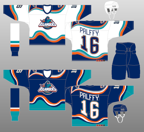
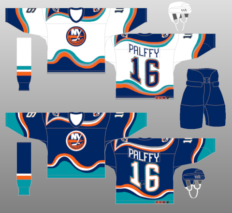
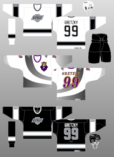
A couple examples are the Islanders' fisherman jersey-- the logo itself was quirky, but awful for the jersey design it was on. Yet, if you put the logo they have right now onto the jersey-- like they did-- and it looks pretty decent with the jersey designed they picked out. Sure, the waves were a bit on the radical side, but it worked in one instances and not the other. An example of the logo being good, but placement and jersey being wrong is the LA Kings third jerseys from 1996. The logo itself is pretty nice, it's a solid logo when you look at it just as a logo. But, you look at the placement on the jersey; which was the upper left breast; along with the random black-to-gray swoosh on it-- that equals an awful jersey.
But, you can't go on with a jersey post without doing your best and worst jerseys. Of course, I could do a hack bit like that......and I probably will, but I'm not going to do it in the traditional way. My thoughts are that I have too much of a quirky personality to limit them all. However, I'll do my best for favorites and hatred.
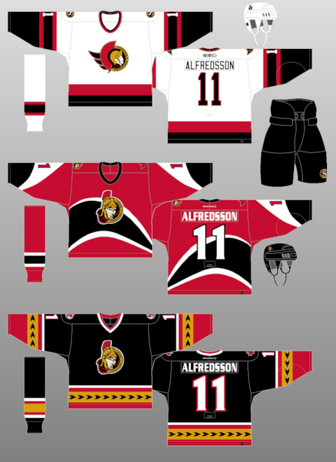
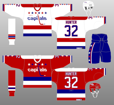
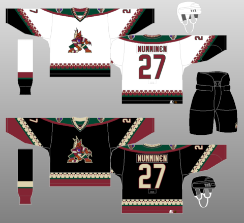
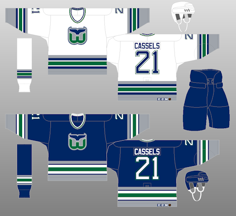
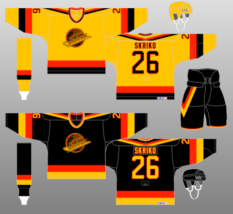
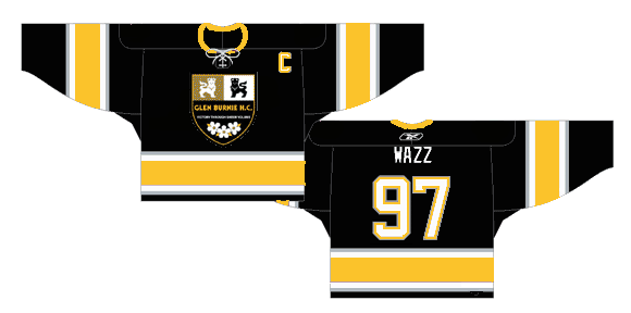
Favorites: Ottawa Senators 1930-31, Ottawa Senators thirds (black) 2000-07, Washington Capitals 1987-95, Phoenix Coyotes 1996-2003, Hartford Whalers 1992-97, Vancouver Canucks 1985-89 Baltimore Bandits 1996-97 (Honorable Mention: Glen Burnie HC 2005-07)
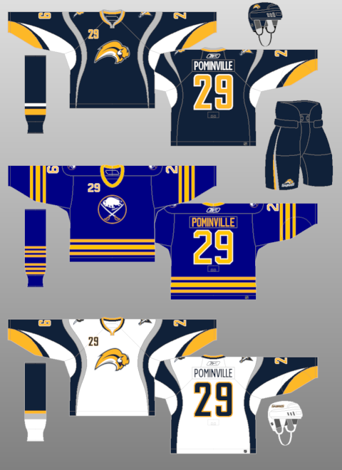
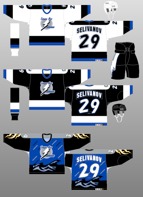
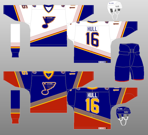
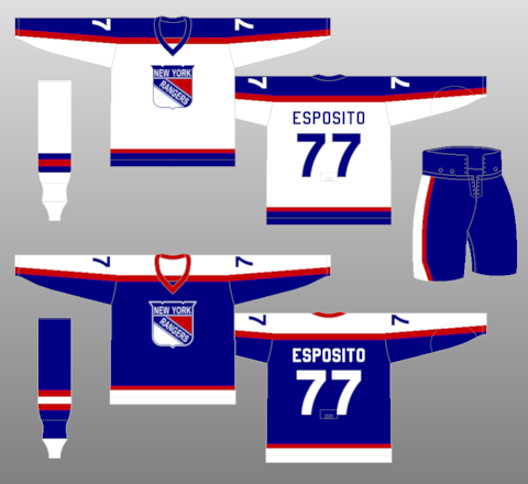
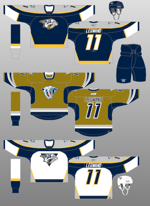
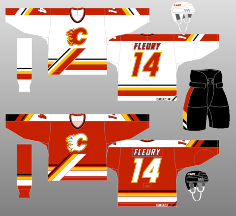
Not So Much: Buffalo Sabres 2006-Present, Tampa Bay Lightning thirds (storm) 1996-99, St. Louis Blues 1995-98, New York Rangers 1976-78, Nashville Predators thirds (mustard) 2001-07, Calgary Flames 1995-2000
But, as we all know-- it's all in the eye of the beholder. One persons trash is another person's treasure. Which is why many of the horrible jerseys and trends (Cooperalls) from yesteryear are so revered this many years later. Why else would the "Flying V" Canucks jerseys be ironically hip because of how terrible they were??

1 comment:
I know this is 3-ish years old, but I had never stumbled across it. I greatly appreciate your links to the jersey images and your quick review of the THN's jersey issue.
Oddly enough, the thing that brought me here and the reason I looked was because I'm looking for ideas to help develop a custom jersey for my wife. She's rather artsy-fartsy, but she likes hockey and actually sees the great aesthetic value in jerseys. I've got my work cut out for me on this task....
Post a Comment