
I have to say, the jersey itself is great and part of the logo is fine. But there's something about the logo I'm not too fond of.
I think it's the arch.
I like the way that the logo is much like what that Minnesota Wild put out in their original third, now home Christmas jersey; but the arch almost makes it look too cluttered in my opinion. Other than that-- another solid turnout that isn't anything over the top, and begs the question that Shynner put up: when will this become the home jersey for the Blues??
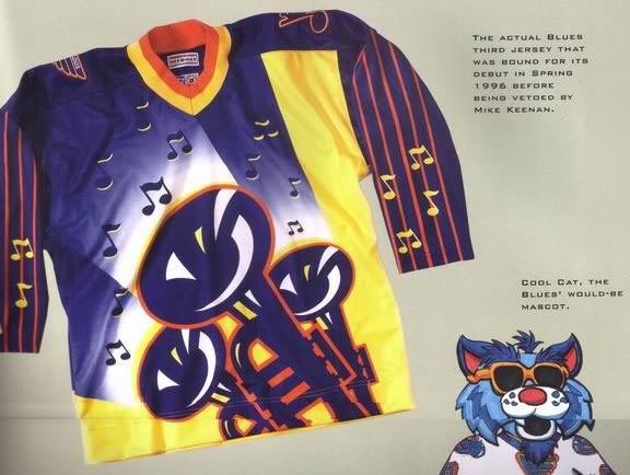
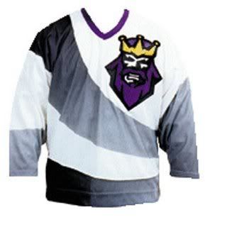
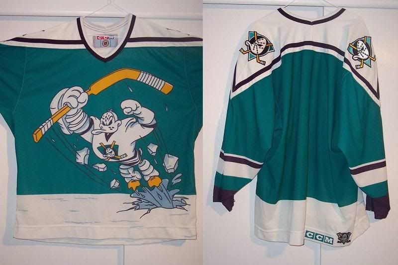
However, I disagree with Greg for the one reason that is I liked the extreme trumpet jersey. I mean, this was the same era as the first Kings third and the god-awful Mighty Ducks third. Oddly enough, when I was young and naive, I liked those looks. Maybe it was to catch younger kids attention, which it did in my case.

No comments:
Post a Comment