 As going with this whole concept, The Girl and I always try to go in behind the name, which has more often than not worked. This one should also go along with the idea behind the concept of starting this up. This one is especially interesting considering the city of Milwaukee is not known as a big naval center, like Norfolk is.
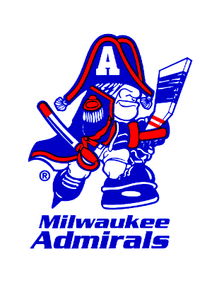
However, with it comes to the Admirals of Milwaukee, it really has nothing to do with the rank of Admiral. In fact, the name was brought about by one part of the original group of investors, Edwin Merar. Merar owned an appliance store and actually named the team after one of the appliances that was sold in his store. The first incarnation of the team started in the 1970 with a generic hockey player with a red, white, and blue background and "Milwaukee Admirals" around the border. The first "skating sailor" logo didn't come into play until 1977 when they moved into the IHL. As you see by this logo, the sailor does look a little dopey with the hat over his eyes, but it was beefed up in 1982 with the sailor looking a little meaner and bulkier.
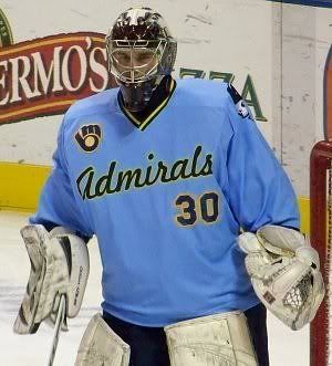
The color scheme stayed red, white, and blue until 1998, when the colors changed to a burgundy, bronze, and navy scheme. The logo itself was reinvented to just a head-shot logo, with a more pronounced hat onto of his strong-jawed head. While the jersey design prior was plain, the new colors brought in a new scheme with a wave design along the hem of the jersey, which was more solidly done than what the Islanders did with their fishermen gimmick.
 One interesting thing about the Admirals happened when they came into the AHL in the 2001-02 season. The Admirals were a part of the IHL teams that moved to the AHL, but there was already an Admirals place in Norfolk who had arrived to the AHL one year beforehand. Both brands where strong in each of their markets, but was there going to be any pressure for the new Admirals to change or would there be a CFL situation where there were two teams with the same name at the same time??
"There was no pressure to change our Admirals name when we came into the AHL," said Tim Van Wagoner, Director of Marketing for the Milwaukee Admirals. "Maybe if we were in the same conference with Norfolk it might have been a different story."
So, there you go; the league could be able to co-exist with two teams with the same name around. And it worked well for the Admirals, as they saw success in the new league and it got them a Calder Cup championship within two seasons of being in the AHL.
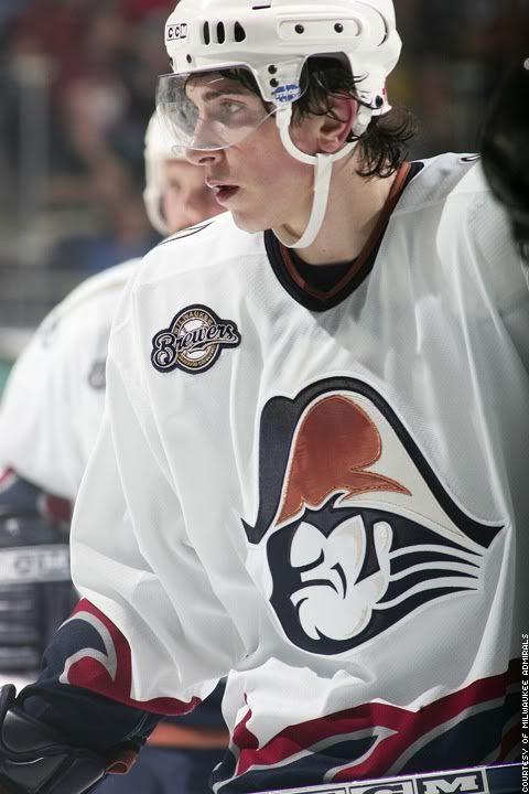
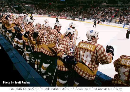
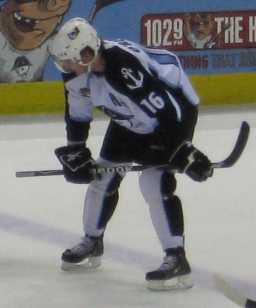
One interesting thing is the inclusion of the Milwaukee Brewers logo on the jersey seen here and here, with many Brewers themed nights, as seen in the second picture. That's because the investment group that owns of the Admirals consists of many in the Brewers organization, including Brewers owner Mark Attanasio, Brewers assistant GM Gord Ash, and former Brewers pitcher Ben Sheets. The Admirals got very much into the Brewers theme, having a night dedicated to Brewers announcer Bob Uecker, which brought about some of the most memorable jerseys ever to grace the ice.
However, with the new ownership coming into play, there was a time for a dramatic change to happen for the team. For years after they went with a theme close to red, white, and blue; the colors changed to black, white, silver, and ice blue. Moreover, the logo went from the actual human Admiral, to a skeleton in full Admiral attire. While the change was one that was a bit of a head-scratcher, it was all boiled down by Tim Van Wagoner
 "We felt like we needed a new logo when ownership changed. Our new look is meant to stand out and cut through clutter, and appeal to the merchandise buying public, like teens and tweeners," Van Wagoner stated. "We sold more in the first month than the entire previous year and see our stuff around town frequently."
To go from a pretty well established brand in Milwaukee for close to 30 years and see the change be accepted that quickly shows how a drastic change can appeal to another demographic as well as the demographic you had following you previously. Plus, their jerseys have quite fantastic appeal-- with a set in ice blue, silver, white, and recently black. While the jerseys are pretty snazzy, the one thing that does irk me a bit is the socks with the vertical stripe. Maybe because it's new, but I've never been a fan of the vertical striping on the sock, even when it comes to the national teams.
As a whole, the Admirals scheme is a solid one, even if they did pull of a drastic change from what built up their identity. It has worked for them and seems to garnered new attention from a new fan base, which is something that feeds the identities in the first place.
Thanks to Tim Van Wagoner, Director of Marketing for the Milwaukee Admirals for helping with this piece. Head to MilwaukeeAdmirals.com for all information for the Admirals.

No comments:
Post a Comment