 When The Girl and I were talking about doing this, the idea was trying to get an idea on why names were the way they were. While most in this project have been "Name the Team" contests, sometimes they seem to link into the location one way or another. This team is one of them, as the location of the ECHL's Florida Everblades is close enough to the Florida Everglades where the pun is solid and fitting.
"With the team being in proximity of the Everglades, the name formed along those lines," said Kevin Reiter, Broadcaster and Public Relations Manager for the Everblades. "It came from similar situations like the old Kentucky Thoroughblades."
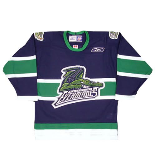
It may be an odd off-take, but it's something that is catchy and has obviously worked for the team, as the brand is one of the more noticeable when it comes down to it. In fact, only the Wheeling Nailers (1988) and South Carolina Stingrays (1993) have been in the ECHL longer than the Everblades, who have been in the league since 1998. The 'Blades have even used the same logo and color scheme throughout their entire tenure.
"The blue and green colors come originally from our affiliation and ownership being the current Carolina Hurricanes and old Harford Whalers. When our team was first introduced we played off the Whalers blue and green colors," Reiter informed me. And I must say, the blue and green combination is underused and a sharp look for most teams who do use it.
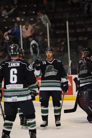
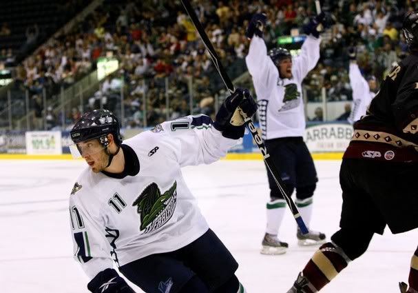
The jersey schemes they have used are very interesting. They currently use something similar to their parent Hurricanes, with the piping around the shoulder yoke, as well as alligator teeth along the hem. In the past they have done something similar to the Montreal Canadiens' scheme with the stripe across the middle, as well as template like the Nike Swift Olympic jerseys that many countries have used in the past, but with teeth under the arms. Even so, the colors and logo stay the same. At the start, they obviously used something like the Whalers used to use in the template.
I think the amazing thing, especially with the changing landscape of minor league hockey; the 'Blades never really compromised for their brand; logo and colors. Sure, their jersey schemes have changed through the years, but the basic principle of their identity has stayed in tact and really should be the blueprint for most minor league teams when trying to be successful.
Thanks to Kevin Reiter for the information on the 'Blades. Visit FloridaEverblades.com for all things to do with the 'Blades.

No comments:
Post a Comment